


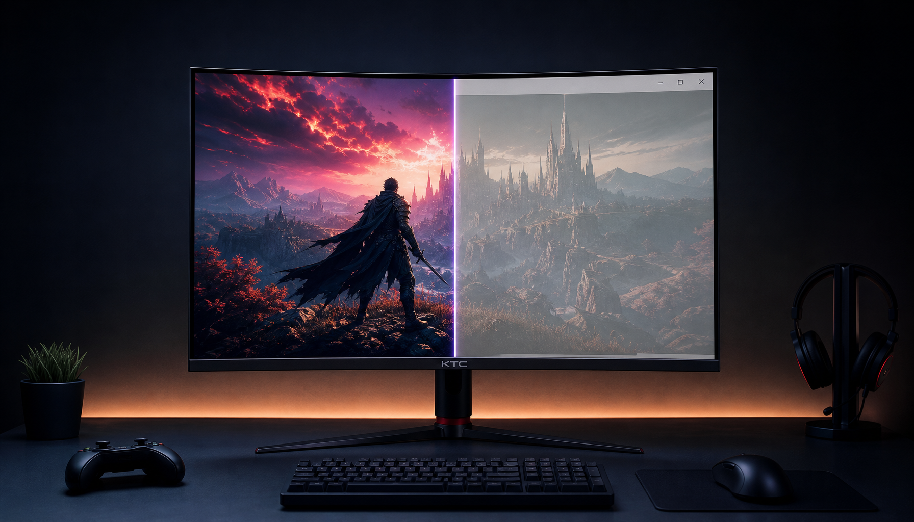
KTC monitor calibration without tools starts with a fast day-one sanity check, not a lab result. If the screen looks neutral after warm-up, with clean grayscale and no obvious tint, you may be fine for casual creator work. If you see clipping, banding, or a strong color cast, keep testing before you decide whether to calibrate or exchange it.

What You Can Check on Day One
On day one, you can learn whether the panel is obviously off, not whether it hits a specific Delta E number. A quick Delta E explainer for creative work helps if you want the measurement context, but the home check is simpler: look for neutrality, clean shadows, and stable whites.
The best first pass is to judge the monitor in a consistent room, after it has warmed up. As a practical rule, give it time to settle before you trust white balance or uniformity. Then look for the problems that usually matter on arrival: warm or cool tint, crushed dark tones, clipped highlights, or patchy corners.
Two decision sentences matter here. If the image already looks balanced and the grayscale steps separate cleanly, factory calibration may be good enough for office work and light creator tasks. If the picture looks uneven or tinted even after setup changes, paid calibration or an exchange becomes more worth considering.
For a broader buying context, the Creator Value Audit is a useful follow-up because it frames calibration as part of the overall value check, not a separate afterthought.
Set Up the Test Environment First
Before you judge anything, remove the easy variables. Room light can make a good panel look bad, and a too-bright screen can make whites seem clipped even when the display is behaving normally. A too-dim setting can hide shadow detail and make the picture look flatter than it really is.
Warm Up the Panel Before You Judge It
Panels can shift a bit right after power-on, so do not make a final call immediately. Let the display run long enough to settle, then recheck white balance and grayscale. KTC's own warm-up guidance recommends a practical 20- to 60-minute window, which is enough for a home check without turning the process into a chore.
What this means in practice is simple: if the screen looks strange during the first few minutes, that does not automatically mean the factory tune is bad. Revisit the same pattern after warm-up and see whether the tint or uniformity concern still stands.
Match Brightness to the Room
For most people, brightness should be close to the room's use case, not maxed out by default. In a dim bedroom office, a bright monitor can make white backgrounds feel harsh. In a sunny desk setup, very low brightness can hide banding or shadow problems.
Check a plain white window and a dark gray window side by side. If white looks painfully bright but gray still holds detail, lower brightness first. If the image looks muddy and blacks disappear into each other, raise brightness a little before you judge contrast.
Use the Right Picture Mode First
Start from the most neutral mode the monitor offers. Gaming presets often boost saturation, sharpen edges, or change gamma in ways that make a screen look more exciting than accurate. That can hide the very issues you want to spot.
For this kind of KTC monitor calibration without tools check, choose a standard or custom mode, then keep the rest of the setup steady. If the monitor looks more believable in that mode, you have learned something useful: the factory panel may be fine, but the preset you chose was misleading.
Reset the Obvious Variables
Turn off extra image processing that adds punch rather than accuracy. Dynamic contrast, artificial sharpening, and oversaturated picture modes can make a monitor look better in a showroom and worse for creator work.
This is a good friction check. If you need multiple "fixes" just to make the image look normal, the monitor may not be the easiest fit for your workflow. If a neutral preset and sensible brightness are enough, you are probably closer to the finish line.
Run the Free Visual Checks
Use a step-by-step sequence so you can stop as soon as a clear issue appears. Standardized patterns such as grayscale ramps and SMPTE-style bars are useful for initial visual checks of brightness, contrast, and basic color balance, as described in the NIST test-pattern guide. That makes them a good screen, even though they do not replace hardware measurement.
- Check grayscale first. Open a grayscale ramp or step pattern and look for smooth transitions. You want to see distinct steps, not sudden jumps or obvious color tint in the gray.
- Check white and black fields. Use plain white and black screens to spot uneven corners, clipped whites, or shadow crushing. Small variations are normal; strong blotches are more useful as a warning sign.
- Check primary colors. Use red, green, blue, and the common SMPTE-style bars. You are looking for weird saturation changes, strange hue shifts, or one channel that appears obviously weaker than the others.
- Check a familiar photo. A face, product shot, or landscape you know well can reveal oversaturation or poor skin tones faster than a spec sheet can.
- Write down the result. If the screen passes the basics, you have enough evidence to keep using it. If the same flaw appears in multiple patterns, the issue is probably real.
OEM Monitor Buying Checklist for Value Shoppers is a helpful follow-up if your visual test exposes several compromises and you want a better pre-buy filter next time.

Read Delta E Without a Colorimeter
Delta E is a measured color-difference metric defined by CIE standards; a visual check can only give you a rough sense of whether the image is close, not a precise number (CIELAB color space). That is why a KTC monitor calibration without tools check is useful for screening, but not for proving a spec value on paper.
| Method | What It Shows | What It Does Not Show | When It Is Enough |
|---|---|---|---|
| Spec sheet or product claim | The maker's stated calibration target or gamut claim | Whether your exact unit matches that claim | When you are deciding whether to test further |
| Visual check at home | Obvious tint, clipping, banding, or uneven whites | A numeric Delta E result | When the image looks either clearly acceptable or clearly off |
| Hardware colorimeter | Measured color accuracy and repeatable calibration data | Nothing, if you trust the setup and workflow | When color-sensitive work depends on the result |
The useful boundary is this: if you mainly need to know whether the screen is plausibly usable, visual testing is enough. If you need to match print work, compare multiple displays, or verify a number for client-facing work, you need hardware.
The other thing to remember is that a low factory Delta E claim can still be helpful even if you cannot verify it exactly by eye. It lowers the risk that the panel is badly tuned on arrival, but it does not guarantee every unit will look identical.
For readers who want the measurement context in plain language, the linked Delta E article is the right next step. It explains why the number matters, and why a home visual check should be treated as a practical approximation rather than proof.
Decide Whether Paid Calibration Is Worth It
Paid calibration is worth more when the screen is being used for color-sensitive work such as photo editing, print matching, or client-facing design. It is also more defensible when two displays need to match closely, or when you already see a strong tint problem that does not go away after basic setup changes.
Keep factory calibration if the panel looks balanced after warm-up, grayscale is clean, and your work is mostly office tasks or occasional creative use. That is the point where paid calibration can become optional rather than necessary.
A wide-gamut monitor can still look oversaturated if the wrong picture mode is active or if the app is not color-managed correctly. That is a common regret trigger, because people blame the panel when the real issue is usually the mode or workflow.
If you are comparing KTC's creator-friendly options, KTC 27" 5K@60Hz 2K@120Hz Home&Office Monitor | H27P3 is the cleaner fit when sharp text and creator work matter more than gaming speed. KTC 27" 4K 160Hz/1ms HDR400 Gaming Monitor | H27P22S makes more sense if you want a mixed-use 4K desk display with higher refresh headroom. For more HDR-heavy wide-gamut use, KTC Mini LED 27" 200Hz 2K HDR1000 Gaming Monitor | M27T6S is the more aggressive pick.
Keep Your Check Results Useful
Save screenshots or notes from the first day so you can compare them later if the panel seems to drift or develop a tint issue. A simple record of the same grayscale and white-field tests is enough to show whether anything changed after setup and normal use.
Recheck the monitor after a few days. Initial impressions can shift once the panel has warmed up repeatedly and the room lighting is settled. That second look often tells you whether the first-day concern was real or just the result of a bad setup.
Use the result to choose between keeping the monitor, requesting an exchange, or paying for hardware calibration later. If the screen is close enough for your use, stop there. If it still looks off after the basic checks, do not force it into a color-critical workflow.
For browsing next steps, the Office Monitor collection is the safer path for work-first setups, while the 2K Monitor collection is better if you want a sharper general-purpose desktop panel without moving up to 4K. If you prefer a broader color-centric browse path, the IPS Monitors collection is the most relevant starting point.
KTC Monitor Calibration Without Tools: What to Do Next
The practical goal is a go or no-go decision, not a perfect lab match. If the monitor passes grayscale, white, and photo checks after warm-up, you can usually keep using it and revisit calibration later if needed. If it fails those checks in multiple ways, the safer move is exchange, return, or paid calibration depending on how important color is to your work. Compare your notes against the original test patterns and decide within a week while return windows remain open.


