


Consistent color starts with the right panel type, stable lighting, smart positioning, and calibration. For most office, gaming, and creative setups, an IPS monitor aligned at eye level, warmed up before evaluation, and calibrated to a 6500K white point gives the most reliable everyday result.
Does your image look rich from the center of the screen but washed out when you lean back, share the display, or glance at a side monitor? A well-set display can make spreadsheets easier to scan, game worlds more believable, and product colors less misleading across a real desk setup. Here is how to choose, position, tune, and verify a monitor so color stays dependable from more than one viewing angle.
Why Viewing Angle Changes Color
Viewing angle is the angle between your eyes and the center of the screen. When you move off-center, some panels shift in brightness, contrast, and color because the light passing through the panel no longer reaches your eyes in the same way.
Panel technology matters most. IPS panels are widely favored for color consistency and wide viewing angles, while VA panels usually deliver deeper blacks but can shift more noticeably off-axis. TN panels prioritize speed and low cost over consistent color. OLED can look exceptional from many angles because of its self-emissive pixels, but static office interfaces and brightness behavior require more care over time.

For a practical example, imagine two people reviewing a slide deck on a 27-inch monitor. If one person sits centered and the other sits 2 ft to the side, a weaker panel can make gray backgrounds, skin tones, and brand colors look different to each viewer. That is not a file problem; it is a viewing-system problem.
Start With the Right Panel
If color consistency across angles is a buying priority, choose IPS first unless you have a specific reason not to. General monitor buying guidance consistently ties IPS panels to stable color and wide viewing angles, which is exactly what you want for shared desks, dual-monitor setups, design review, coding plus preview workflows, and portable productivity screens.
VA can still be a strong value choice for gaming and entertainment because it often offers higher contrast. The tradeoff is that dark tones and midtones may shift when viewed from the side, especially on larger flat panels. TN is acceptable for basic secondary displays or very low-cost setups, but it is usually the weakest choice when consistent color matters. OLED is the premium visual option for deep blacks and immersion, though it is less carefree for static dashboards, taskbars, and office documents left on-screen for hours.
Panel type |
Main strength |
Main tradeoff |
Best fit |
IPS |
Stable color and wide viewing angles |
Contrast is often lower than VA or OLED |
Office, creative work, shared screens, multi-monitor setups |
VA |
Strong contrast and deep blacks |
More off-axis color and shadow shift |
Immersive gaming, movies, value-focused large screens |
TN |
Fast response and low price |
Weakest color consistency |
Budget secondary screens, basic tasks |
OLED |
Excellent blacks and contrast |
Static-image and brightness-management concerns |
Premium gaming, media, color-rich visual work with care |
Position the Screen Before You Calibrate
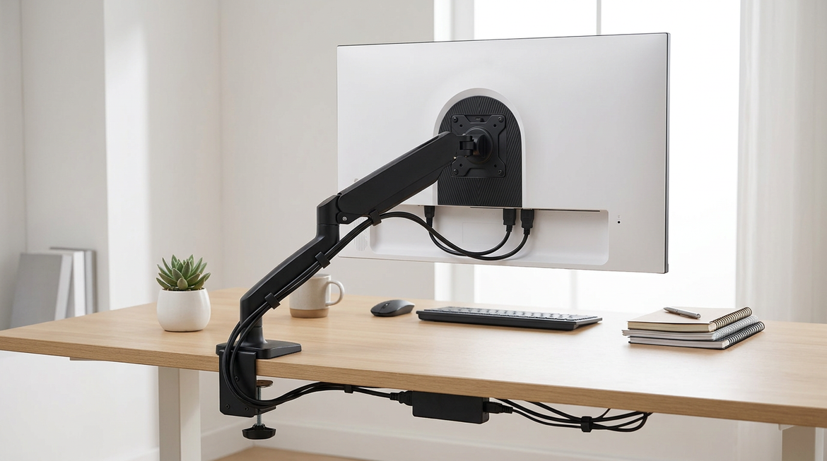
Even a strong IPS monitor can look inconsistent if it is physically misaligned. The center of the display should face your natural seated position, and the top edge should sit at or slightly below eye level. Multi-monitor setups need extra discipline: align the heights, angle side screens inward, and avoid placing a color-critical display far off to the side.

Ergonomic monitor guidance emphasizes tilt, swivel, and height adjustment because display comfort and visibility change when the screen is shared, raised, lowered, or rotated. For a dual setup, place your primary color-critical screen directly in front of you. Put chat, email, logs, or references on the side screen. If you edit photos, review brand colors, or compare product imagery, do not make final color calls on a monitor sitting at a steep angle.
A simple desk test works well. Open a neutral gray window and a white document, then sit in your normal posture. If either screen looks warmer, cooler, darker, or lower contrast before any software changes, fix the angle and height first.
Stabilize Lighting and Warm-Up Time
Color consistency is not only about the monitor. Room light, screen brightness, power source, and panel temperature all affect what you perceive. A display that looked neutral in the morning can look too cool under daylight and too warm under a desk lamp at night.

Calibration-focused advice recommends letting the monitor stabilize before judging color, and many workflows use roughly 20 to 30 minutes of warm-up before serious evaluation. That matters because brightness and white balance can settle as the panel, backlight, and electronics reach normal operating conditions.
For office productivity, reduce dramatic light changes. Use blinds if sunlight moves across your desk. Keep your main desk light neutral and consistent. For portable smart screens, avoid making color decisions immediately after moving from a bright room to a dim one, or after switching from wall power to laptop USB-C power. The screen may not be wrong; the environment may simply be changing faster than your eyes can adapt.
Use Sensible Picture Settings
The fastest way to improve angle consistency is to stop using aggressive display modes. Vivid, Movie, FPS, Dynamic Contrast, and heavy blue-light modes can exaggerate saturation, crush shadows, or change white balance. They may look impressive in a store or in a single game scene, but they are poor baselines for dependable color.
Start with Standard, Custom, User, Creator, or sRGB mode. Display calibration guidance explains that picture mode is the best starting point because presets often change several settings at once. For SDR web, office, and gaming work, a 6500K white point and gamma near 2.2 are common practical targets. Brightness should match the room rather than defaulting to maximum; a screen that is too bright in a dark room can make blacks look gray and whites harsh.
Here is the real-world adjustment sequence I trust on new desk setups: switch to a neutral picture mode, disable dynamic contrast and auto-brightness, set native resolution, adjust brightness for the room, then check white and gray screens from your normal seated angle and from the side positions people actually use.
Calibrate for the Work That Matters
Software tweaks help, but hardware calibration is the reliable route when color decisions affect clients, print output, product images, or video delivery. A colorimeter measures the monitor and creates a profile for that specific unit. That distinction matters because two monitors with the same model number can still differ due to panel variance, age, coating, and backlight behavior.

Full calibration requires dedicated equipment and software, and experienced display users often treat a colorimeter as a reusable tool across many monitors. ICC profiles are useful, but copying someone else’s profile is not the same as measuring your own screen.
For everyday users, calibrating every few months is usually enough. For color-sensitive creative work, monthly checks are more defensible. If you run a mixed setup with one premium main monitor and one budget side monitor, calibrate the main display first, then bring the secondary display close enough that it does not mislead you during comparison work.
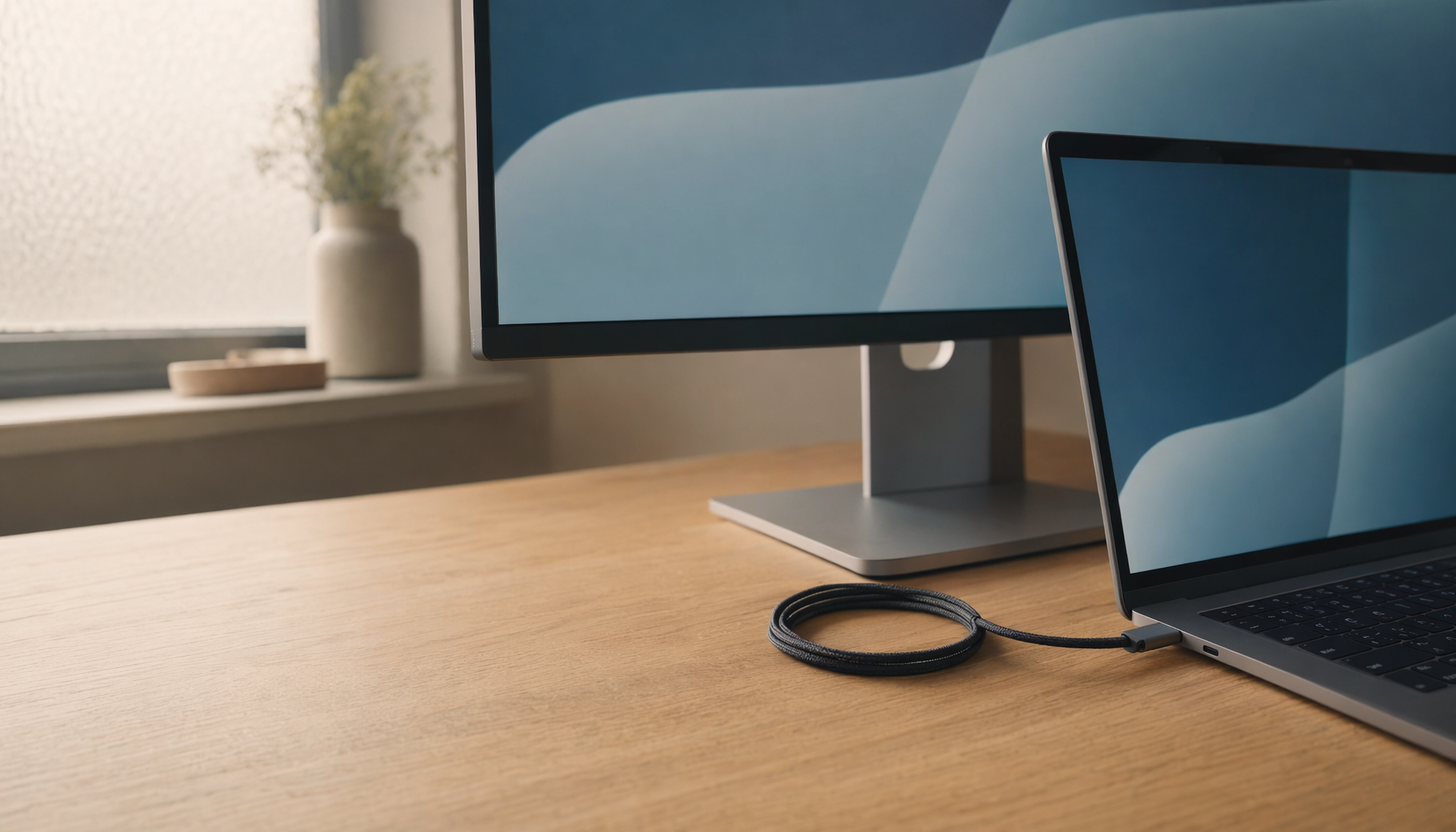
Match Multi-Monitor Setups Realistically
Color matching across multiple monitors is harder than making one monitor look good. Matched models help because they reduce differences in size, panel behavior, brightness range, and coating. Dual-monitor buying advice often favors matched 24- to 27-inch displays for productivity because matching panels reduces color and alignment inconsistencies.

Still, perfect matching is not always realistic. A 27-inch IPS main display, a VA gaming ultrawide, and a portable USB-C screen will not behave identically from every angle. The smart goal is to make the primary screen trustworthy and make the others consistent enough for support tasks.
Multiple-monitor workflows can improve productivity by keeping references, communication, dashboards, or previews visible. Research on multi-monitor setups cites examples where additional displays reduce window switching and workflow interruptions. For color work, that productivity gain is strongest when the secondary screens do not become accidental color judges. Keep the final preview, product image, or brand asset on the calibrated primary screen.
Quick Troubleshooting When Color Still Shifts
If the screen changes color when you move your head, the issue is probably panel behavior or placement. Recenter the monitor, reduce extreme side angles, and confirm you are not sitting too close to a large display. A 32-inch screen on a shallow desk can force your eyes to view the edges at sharper angles, which makes even a decent panel feel less consistent.
If color changes throughout the day while your position stays the same, suspect lighting, auto-brightness, night mode, HDR being enabled for SDR work, or display warm-up state. If one monitor always looks warmer than another, check white point first. A blank white document and grayscale ramp can reveal whether the problem is brightness, color temperature, or contrast.
If games look great but documents and images look exaggerated, you are probably using a gaming preset that boosts saturation or contrast. Keep a performance mode for competitive play if you like it, but use a neutral mode for work, media review, and anything color-sensitive.
The Reliable Setup Formula
For consistent color across viewing angles, choose IPS or high-quality OLED when the budget allows, keep the screen centered and height-adjusted, use neutral picture modes, control room lighting, and calibrate the monitor you actually own. The payoff is practical: fewer false color decisions, cleaner multi-screen work, and a display experience that stays immersive without becoming misleading.


