


Your monitor usually looks more saturated than your camera because the display is stretching sRGB content into a wider color gamut, using a vivid preset, applying the wrong color profile, or showing SDR images through HDR-style processing.
Does your camera preview look balanced, while the same photo turns into neon reds, electric greens, and overcooked skin tones on your desktop monitor? A 15-minute display check can often reveal whether the problem is a preset, brightness setting, gamut mode, or profile mismatch before you spend money on new gear.
Why Your Monitor Looks More Saturated Than Your Camera
The most common cause is simple: your camera file is being displayed in one color space, while your monitor can show a much wider one. Most web images, office apps, SDR games, and many camera JPEG workflows are built around sRGB. Many modern gaming and creator monitors cover wider gamuts such as DCI-P3. When sRGB content appears on a wide-gamut screen without proper color management, standard sRGB content can be expanded beyond its intended color values.
For example, a red shirt photographed under normal daylight may look natural on your camera’s rear screen. On a wide-gamut desktop display in Vivid mode, that same shirt can shift toward glowing crimson. The file did not gain more color; the monitor is interpreting the color too aggressively.
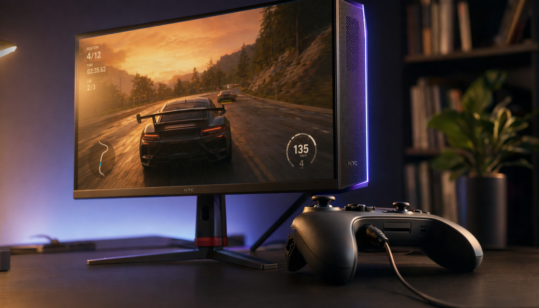
This is especially noticeable on gaming monitors because they are often tuned to impress in a store or spec sheet. High refresh rates, strong contrast, wide color coverage, and HDR capability are useful, but they can become liabilities for photo review if the monitor is left in a punchy entertainment preset.
The Camera Is Not Always the Reference
Your camera’s rear display is useful for exposure review and field checks, but it is not a trusted color reference. It is small, brightness-limited, affected by ambient light, and often optimized for visibility rather than strict accuracy. If you judge color only from the camera LCD and then compare it to an uncalibrated wide-gamut monitor, you are comparing two imperfect displays.
The camera file itself matters more than either screen preview. A JPEG shot in sRGB, a RAW file opened in a color-managed editor, and a cell phone image viewed through a browser can all behave differently. A calibrated monitor does not change the photo; it gives your software a better map for showing that photo accurately.

For practical work, think of your camera as the capture device and your calibrated monitor as the decision screen. If you edit saturation, skin tone, product color, or shadow contrast, the monitor needs to be controlled first.
Wide Gamut Without an sRGB Clamp
What an sRGB Clamp Does
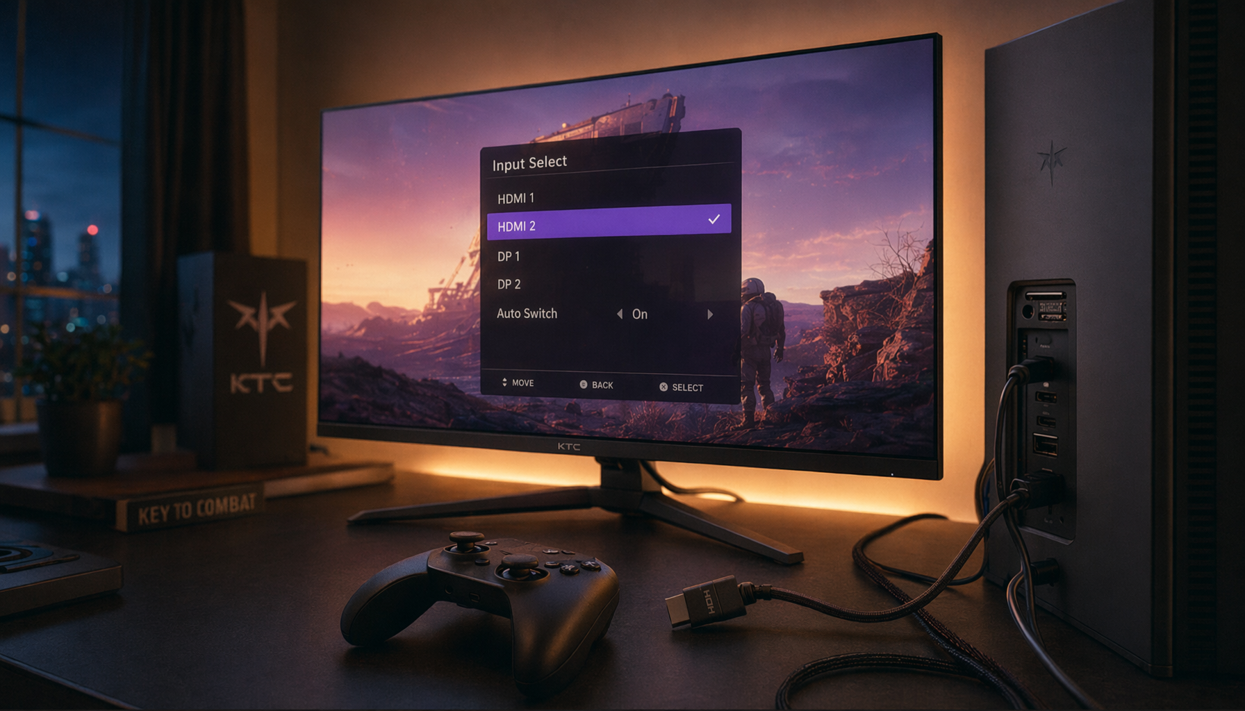
An sRGB clamp is a monitor mode that limits the display’s output to the sRGB color space. On many gaming and productivity monitors, it may appear in the on-screen display as “sRGB,” “sRGB Emulation,” “Standard,” or “Rec.709.” For SDR photos, browser images, spreadsheets, web design checks, and most everyday PC content, an sRGB clamp is often the fastest fix for oversaturation.

The tradeoff is that sRGB modes may lock brightness, contrast, or color controls. That can feel restrictive, especially if the default locked brightness is too high for office work. Still, it is an excellent diagnostic step. Switch from Native, Vivid, DCI-P3, or Wide Color into sRGB, then reopen the same camera image. If reds and greens immediately calm down, you have found the main cause.
When Wide Gamut Is Actually Useful
Wide gamut is not bad. It is useful for HDR movies, HDR-capable games, DCI-P3 video workflows, and some professional editing pipelines. The problem is using full native gamut for content that was authored for sRGB. For a mixed setup, the best workflow is usually two modes: sRGB or Rec.709 for SDR work, and native wide gamut or HDR mode for media that actually needs it.
Use Case |
Better Monitor Mode |
Why It Helps |
Camera JPEG review for web |
sRGB |
Prevents standard colors from looking artificially boosted |
RAW photo editing for web delivery |
Calibrated sRGB or profiled workflow |
Keeps edits closer to what most viewers will see |
HDR games and movies |
HDR or native wide gamut |
Uses the monitor’s expanded color and brightness capability |
Office dashboards and slides |
sRGB, Rec.709, or Standard |
Keeps flat UI colors readable and less harsh |
Vivid Presets, HDR, and Brightness Can Fool Your Eye
Entertainment presets are another frequent cause. Modes named Vivid, Dynamic, Cinema, Game, or FPS may raise saturation, contrast, sharpness, and brightness together. That can make game worlds look intense, but it can also make camera output look inaccurate. For photo review, start with Custom, User, Standard, sRGB, or Rec.709 instead of a showroom-style preset.

Brightness also changes your perception of color. Many LCDs ship far brighter than needed for desk work, and excessive default brightness can create eye strain while making colors feel harsher than they really are. A practical test is to place a white document or webpage next to a well-lit book or sheet of paper. If the screen looks like a light source instead of a comfortable page, lower brightness before judging saturation.
HDR can complicate this further. If your operating system, monitor, and content are not aligned, SDR photos may be tone-mapped in a way that changes perceived contrast and color. For normal camera review, web uploads, office work, and SDR editing, keep HDR off unless you are intentionally working in an HDR pipeline.
Color Profiles Help, But They Are Not Magic
A color profile describes how a display reproduces color so color-managed applications can translate image values correctly. Calibration adjusts the display’s behavior; profiling records that behavior. Profiling creates an ICC profile that applications can use to convert and display colors more accurately.
The nuance is important: an ICC profile does not force every app, game, browser, or video player to behave the same way. Color-managed software can use the profile properly, while unmanaged software may still send raw RGB values to the screen. That is why a photo may look controlled in a professional editor but oversaturated in a game overlay, older viewer, or non-managed app.
There is also a double-correction risk. If you use an ICC profile, a GPU LUT, a third-party color tool, and a monitor sRGB clamp all at once, some color-managed apps may look muted or wrong. Start clean: choose the right monitor mode first, then calibrate, then use one clear profile workflow.
How to Calibrate for Camera-to-Monitor Matching
Start With the Monitor Hardware
Use the monitor’s own controls before changing GPU driver sliders. Hardware-level settings are easier to reason about and less likely to affect desktop, video playback, and games differently. A sensible baseline is native resolution, correct refresh rate, Standard or Custom mode, default saturation, neutral sharpness, gamma near 2.2, and a D65 white point.
For brightness and contrast, use test images rather than taste alone. Brightness should keep near-black detail visible without turning black into gray. Contrast should make whites bright without clipping fine highlight detail. RGB balance should make grays look neutral, not pink, green, or blue.
Most desktop operating systems include a built-in calibration path that can guide users through gamma and brightness adjustments. This is better than doing nothing, but it still depends on your eyes, room light, and patience.
Use a Colorimeter for Serious Photo or Product Work
For camera matching, a hardware colorimeter is more reliable. A calibrator sits on the screen while software displays known color patches, measures the actual light output, and builds a monitor-specific profile. Monitor calibrators are designed for photographers and creators because uncalibrated screens can make images look oversaturated, muted, or color-shifted.

A practical target for most photo and web work is D65, gamma 2.2, and comfortable luminance for your room. Many creators use moderate brightness rather than maximum output, because editing on an overly bright monitor often leads to dark, undersaturated exports. Before calibrating, let the monitor warm up for about 30 minutes, keep room lighting consistent, and disable automatic brightness or eco modes.
Pros and Cons of the Main Fixes
Fix |
Pros |
Cons |
Switch to sRGB mode |
Fast, free, effective for SDR content |
May lock brightness or color controls |
Lower brightness |
Improves comfort and reduces harsh color perception |
Does not solve gamut mismatch by itself |
Use built-in calibration |
Free and accessible |
Subjective, less precise than hardware |
Use a colorimeter |
Best for repeatable camera-to-monitor matching |
Costs extra and requires periodic recalibration |
Keep wide gamut active |
Great for HDR and supported creative workflows |
Can oversaturate unmanaged sRGB content |
A Reliable Workflow for Gaming, Office, and Camera Review
For a hybrid gaming and work display, set up modes intentionally. Use sRGB or Rec.709 for camera review, web publishing, office documents, and SDR content. Use native gamut or HDR only when the content and software are designed for it. If you play competitive games, accurate color can also be an advantage because enemy outlines, uniforms, UI warnings, and environmental contrast appear closer to the intended design instead of being distorted by exaggerated saturation.
When shopping for your next monitor, do not stop at “99% sRGB” or “wide color.” Look for a real sRGB mode, good factory calibration, IPS or another color-stable panel type, a matte finish if you work under office lights, and review data from reputable monitor testers. For a long-term desk setup, reliable control matters more than the loudest showroom color.
FAQ
Why does my camera photo look fine on my phone but too colorful on my monitor?
Your phone and monitor may use different display modes, brightness levels, and color management. If the monitor is wide-gamut and set to Vivid or Native mode, it can stretch sRGB photos beyond their intended saturation.
Should I edit photos in sRGB or DCI-P3?
For web, social, general client delivery, and most office use, sRGB is the safer target. DCI-P3 is useful when your full workflow supports it, including the editing software, export settings, viewing device, and delivery platform.
Can I copy someone else’s ICC profile?
It is not a reliable fix. Even two units of the same monitor model can measure differently, so a profile made for another display can create new color errors.
Bottom Line
Oversaturation is usually not a camera failure; it is a display pipeline problem. Put the monitor in the right mode, control brightness, avoid unnecessary HDR for SDR photos, and calibrate with hardware when color decisions matter. A fast screen should still be a trustworthy screen.


