


You can evaluate most accessibility risks on your current monitor by combining browser controls, OS accessibility settings, automated checks, keyboard testing, and assistive technology previews. The goal is not to perfectly simulate every user’s display, but to catch barriers before they ship.
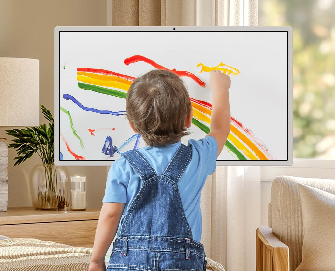
Does your interface look sharp on your 27-inch work monitor, yet fall apart when text is enlarged, colors shift, or the mouse is removed? A practical test bench on one display can reveal contrast failures, keyboard traps, missing labels, weak focus states, and layout stress before users find them. Here is a repeatable way to evaluate accessibility without switching between screens.
Start With the Right Definition of Accessibility
Accessibility is not just “can I read this on my monitor?” It means people can perceive, understand, navigate, interact with, and contribute through digital products, including users with visual, auditory, cognitive, neurological, physical, speech, and motor disabilities. The Web’s core value is universality, so your evaluation should test experiences beyond your own eyesight, desk setup, and input habits.
For display-focused teams, this distinction matters. A high-refresh gaming monitor, a color-accurate office display, or a portable smart screen can make your own design review feel clean while still hiding problems for someone using screen magnification, keyboard navigation, captions, voice recognition, or a screen reader. The monitor is only one part of the access chain.
Build a One-Display Accessibility Test Bench
A strong single-display workflow starts with three layers: visual stress testing, interaction testing, and assistive technology testing. The U.S. Web Design System treats accessibility as continuous work, not a permanent state achieved by using accessible components once, and recommends combining automated checks, manual review, keyboard testing, zoom testing, touch testing, and screen reader testing. That mix is important because an automated checker can flag missing alt text, but it cannot fully judge whether the alt text is useful or whether a task feels coherent.
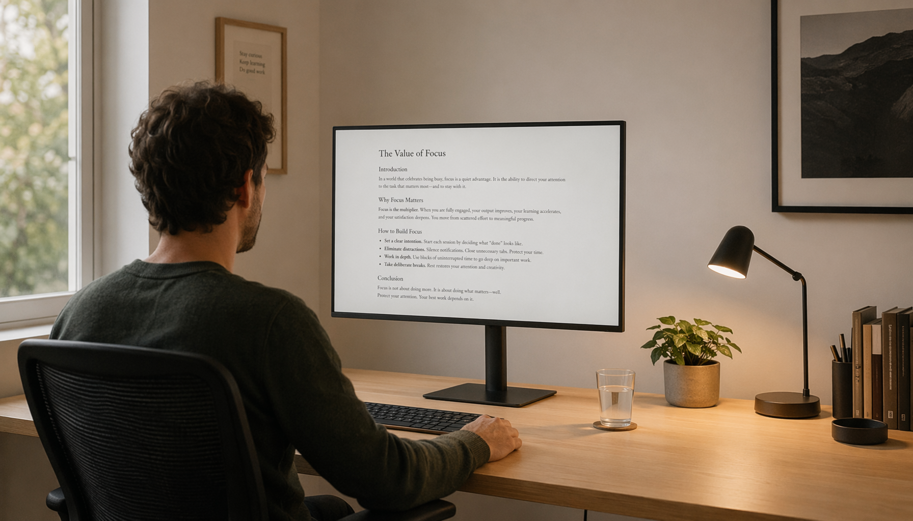
Set your display to its everyday working condition first. If you design on a 27-inch 1440p monitor, keep it there and test how resilient the interface is under common user adjustments. Increase browser zoom to 200%, enlarge system text, turn on high-contrast themes, reduce motion, and test in a narrow responsive viewport. A single monitor becomes a portable lab when you deliberately change software conditions instead of changing hardware.

Test Contrast, But Do Not Worship Maximum Contrast
Contrast is one of the fastest accessibility issues to check and one of the easiest to misunderstand. Designs need sufficient text-background contrast, and common accessibility frameworks use thresholds such as 4.5:1 for normal text and 3:1 for large text. The common barriers listed in federal guidance include poor color contrast and color-only meaning, both of which can prevent people from using websites effectively.
The practical test is simple. Check body copy, secondary labels, placeholder text, disabled states, chart labels, focus outlines, button text, and text over images. If your interface uses translucent panels, gradients, video backgrounds, or game-like HUD elements, test the actual rendered state rather than the design-token value. A gray label may pass on a white artboard and fail over a tinted panel.
There is also a readability nuance: maximum contrast is not always maximum readability. Pure black text on pure white backgrounds can feel harsh for some readers, especially during long office sessions. The better target is strong, stable readability with enough contrast, not visual aggression. On high-contrast panels, this distinction becomes more noticeable because blacks are deeper and edges can feel more intense.
Check |
What to Do on One Display |
What It Reveals |
Text contrast |
Run a contrast checker on actual foreground and background colors |
Low-contrast labels, links, and body text |
Color independence |
View the design in grayscale or color-filter mode |
Statuses that rely only on red, green, or blue |
Zoom |
Test at 200% browser zoom |
Broken layouts, clipped controls, unreadable navigation |
Focus visibility |
Tab through every control |
Missing or low-contrast keyboard focus states |
Evaluate Layout Resilience With Zoom and Reading Order
Browser zoom is one of the highest-value tests you can run without changing displays. At 200% zoom, a clean desktop layout often starts behaving like a portable screen, a magnified interface, and a constrained workspace all at once. The W3C accessibility introduction emphasizes evaluating accessibility early and throughout development, with automated tools supported by knowledgeable human judgment.
Watch for text clipping, overlapping buttons, sticky headers that consume too much vertical space, modals that cannot scroll, and cards that reorder visually while the reading order stays confusing. A dashboard can look efficient at 100% and become unusable when a user increases text size. If a filter drawer covers the results and cannot be dismissed from the keyboard, that is not a display problem; it is a product problem.
For a real-world example, consider a productivity display running a project board. At standard zoom, each task card may show title, assignee, status, and due date. At 200% zoom, the same card should still preserve the task name, expose controls without horizontal scrolling, and keep the next action reachable. If the title truncates before the unique project code, users lose orientation.

Remove the Mouse From the Review
Keyboard testing exposes accessibility failures that display checks never will. The DOJ notes that people may use assistive technologies such as keyboard navigation, screen readers, voice recognition software, captions, and refreshable Braille displays, so a design that requires a mouse is incomplete. The assistive technologies people use should shape how you verify task completion.
Start at the browser address bar, press Tab, and move through the page as if you cannot use a mouse. The visible focus indicator should be obvious on every interactive element. Navigation order should match the visual order. Menus should open, close, and announce state changes. Forms should expose labels, instructions, errors, and recovery steps without relying on placeholder text.

This is where gaming-interface discipline helps office software. Competitive players know that a control must be fast, predictable, and readable under pressure. Accessibility uses the same principle for different stakes: the user should not have to hunt for the active target, guess what changed, or memorize hidden paths through the interface.
Use Screen Reader Checks Without Becoming an Expert Overnight
You do not need to master every screen reader to uncover major issues. You do need to test whether headings, landmarks, links, form labels, and dynamic updates are understandable without the visual layout. Major platforms document supported screen reader and browser combinations and use landmark regions, headings, and structured navigation patterns in their accessibility approaches. That is a useful reminder: serious teams test real combinations, not just static screenshots.
A desktop review can include professional screen reader testing, while built-in screen readers can support desktop and cell phone workflows. For a lighter structural check, a text-mode browser can present pages in plain text so users can move through content more like a document, and the plain-text format can quickly expose cluttered navigation, weak headings, and link text that makes no sense out of context.

The key question is not “does the page make noise?” It is “can a person complete the task?” If a screen reader announces five identical “Read more” links, a button with no name, or a form error after the submit button with no clear path back, the visual design is not carrying enough semantic structure.
Check Content, Media, and Documents Like Product Surfaces
Accessibility does not stop at web screens. Office teams ship PDFs, slide decks, knowledge-base articles, charts, onboarding videos, and meeting recordings. NDRN’s guidelines for accessible documents and presentations call for built-in heading styles, sufficient contrast, accessible tables, captions, transcripts, and meaningful alt text. The accessible tables expectation is especially practical because many business documents fail when merged cells, missing headers, and layout tables confuse assistive technology.
For designers, the same standard applies to charts and product visuals. If a sales chart uses only green and red lines, add direct labels or patterns. If an image communicates a workflow, write alt text that explains the purpose, not every pixel. If a video demonstrates a setup process for a portable smart screen, captions should cover spoken content, while essential visual steps should be described in text or narration.
Know What Automated Tools Can and Cannot Prove
Automated accessibility tools are valuable because they scan consistently and help teams track progress over time. The University of Illinois Chicago describes an automated monitoring service that generates evaluations aligned with WCAG 2.2, regular reports, and trend analysis. That kind of system is useful for catching repeated errors across many pages.
But automation is not a verdict. The DOJ explicitly warns that automated checkers and overlays are not enough by themselves, and the manual review requirement is where many polished interfaces either pass or fail in practice. A tool can detect whether an image has an alt attribute; it cannot reliably decide whether “banner-final-new.png” is meaningful. It can flag color contrast; it cannot know whether the checkout flow makes sense to a keyboard-only user under time pressure.
Use automated results as a triage layer, then manually test priority flows. For a commerce site, that means search, product comparison, cart, checkout, account recovery, and support contact. For a gaming monitor control app, that means profile switching, brightness changes, firmware prompts, and error recovery.
Pros and Cons of One-Display Evaluation
One-display evaluation is fast, repeatable, and realistic for most design teams. It reduces hardware clutter, keeps reviews inside the same workflow, and makes accessibility part of daily QA instead of a special lab event. It is especially efficient for teams using high-quality monitors because you can inspect typography, contrast, motion, and responsive behavior with precision.
The limitation is that your display cannot fully represent every user environment. A glossy laptop in sunlight, a budget office monitor, a TV used across a room, a cell phone in one hand, or a screen reader with Braille output will each reveal different friction. That is why the U.S. Web Design System recommends real-user testing with people who use assistive accommodations, not only component-level checks.
A practical rule is to use one-display testing for early detection and regression control, then schedule deeper testing for major releases, redesigned flows, and high-risk services. If a task affects money, health, education, employment, public services, or account access, single-display review should never be the final gate.
A Reliable Workflow for Design Teams
Start every review by testing the core task, not the prettiest screen. Increase zoom, enlarge text, remove the mouse, check focus order, run a contrast scan, inspect headings, and listen to the page with a screen reader or text-mode browser. Then test the same task with motion reduced, color cues removed, and errors intentionally triggered.
Capture issues in language that makes fixes obvious. “Low contrast” is less useful than “secondary gray text in checkout totals fails against the tinted panel.” “Bad keyboard support” is less useful than “profile menu opens with Enter but cannot be closed with Escape.” Accessibility work accelerates when findings describe the user impact and the exact component behavior.
The best display setup for accessibility evaluation is not the biggest screen on the desk. It is a disciplined review loop that makes your current screen behave like many user contexts. Build that loop, and your designs become clearer, faster to operate, and more reliable for everyone who depends on them.


