


KTC monitor calibration is easiest if you treat it as a fast first-pass setup, not a proof of color accuracy. Start with a neutral picture mode, set brightness for your room, and use built-in software checks to see whether the screen is usable for editing. If your work is color-sensitive or has to match across devices, stop there and move to hardware calibration.

Quick Creator Baseline Settings
For most creators, the best first move is to strip away extra processing before you touch anything else. A review of a KTC Mini-LED model found a slightly cool out-of-box tone, and simple RGB or gamma changes helped bring the image closer to a balanced look for everyday creator work. That makes KTC monitor calibration settings for creators more about removing obvious bias than chasing perfection.
Start With a Neutral Picture Mode
Choose the least vivid preset you can find. Vivid or game-forward modes often push saturation and white balance too far for editing. If the monitor offers a creator, standard, or sRGB-style mode, that is usually the safest starting point for best color settings for KTC Mini-LED work.
The goal is not a final match. It is to get the screen into a predictable state so later checks mean something.
Set Brightness for Your Room
Set brightness for your desk lighting, not for the display's maximum punch. A screen that feels bright and clean in a dark room can look tiring near a window, and a dim screen can hide detail in normal indoor light. For a creator baseline, the right level is the one that keeps text comfortable and makes shadows easy to read without making whites feel harsh.
Leave Contrast and Sharpness Conservative
Keep contrast close to default unless highlights clip or dark areas disappear. Leave sharpness low or neutral so you do not create halos around type or image edges. For quick publishing, a restrained setup is more useful than an exaggerated one.
Use Creator Checks Before You Touch Everything
Before you start adjusting every menu item, look at a neutral gray image, a black detail sample, and a white detail sample. If the gray looks tinted, blacks crush, or whites blow out, make one change at a time and recheck. If the image already looks stable enough for your work, stop tuning and start using the display.

How to Verify Color Without Hardware
Windows includes a built-in color calibration tool that walks you through gamma, brightness, contrast, and color balance with visual patterns. On Mac, Apple's Display Calibrator Assistant gives you a similar visual workflow. These tools are useful because they give you a consistent starting point before you judge the screen by eye.
- Open the built-in calibration flow for your operating system.
- Follow the visual steps once, without trying to perfect every screen.
- Check a black detail image for crushed shadows.
- Check a white detail image for clipped highlights.
- Check a neutral gray image for a color cast.
- If all three look reasonable, stop adjusting and get back to work.
That last step matters. Visual checks can reveal obvious tonal problems, but they do not prove measurement-grade accuracy. A community calibration discussion on screen calibration without hardware makes the same practical point: useful screening is not the same thing as verified accuracy.
If you want a deeper walkthrough of the same check pattern, our monitor calibration checks guide is a good follow-up.
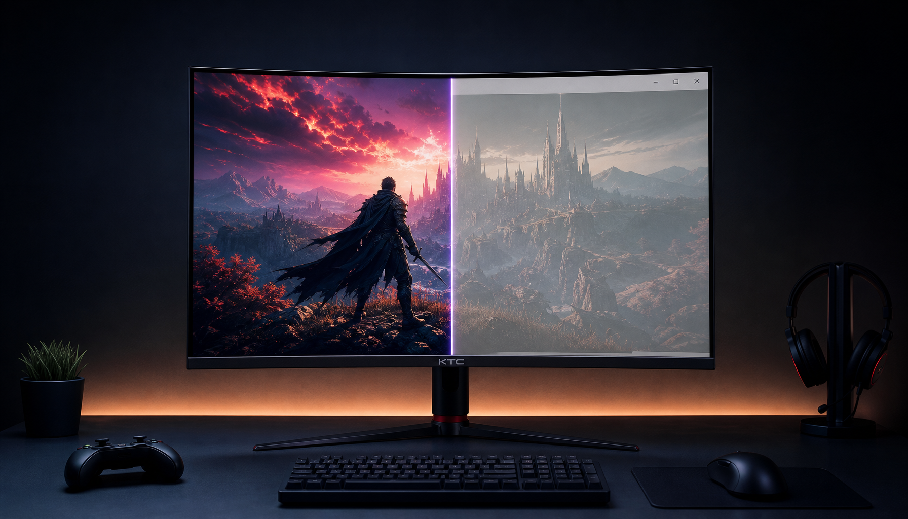
Mini-LED Settings That Matter Most
Mini-LED changes the equation because local dimming can improve HDR impact while also changing how SDR shadows behave. TFTCentral's KTC M27P6 review shows why creators should treat local dimming as a mode choice, not a default on/off shortcut for every task. In practice, that means one setting path for editing and another for HDR viewing.
Brightness and Local Dimming
On the featured KTC Mini LED 27" 4K 160Hz HDR1400 Gaming Monitor | M27P6, the Mini-LED backlight and HDR1400 positioning make it a capable mixed-use display. The product facts list 1152 local dimming zones, 99.5% sRGB, 98% DCI-P3, and 97% Adobe RGB coverage, which helps explain why it is being discussed here. Those are capability signals, though, not proof that every creator workflow is already calibrated.
For SDR editing, keep local dimming conservative or off if it changes shadow detail too much. For HDR viewing or testing, local dimming becomes the feature that justifies the panel. That is why the same screen can feel better in one mode and less predictable in another.
HDR Mode for Mixed Use
HDR can look impressive, especially on a Mini-LED screen, but it should be tested as a separate mode. Do not assume HDR output proves creator accuracy. It only shows that the display can make a brighter, more contrasty image when the source app and OS cooperate.
Color Space Choice for Creator Apps
If your work is mainly for the web, sRGB is the simpler baseline. If you edit for wider-gamut delivery, keep the app, export target, and display mode aligned instead of switching settings at random. Our color space switching guide covers that logic well.
A wider gamut can make the screen look richer, but richer is not the same as more accurate. That is the part many people miss when they search for KTC monitor color accuracy without hardware.
Creator Workflow: Brightness, Modes, and Switching
For hybrid creators, the real problem is not finding one perfect preset. It is deciding when to keep a conservative baseline and when to switch modes for gaming or HDR. The table below shows the safest starting point for common tasks and where the recommendation flips.
| Scenario | Safest Starting Mode | Brightness Approach | When To Stop Adjusting |
|---|---|---|---|
| Editing photos or video | Neutral creator or standard mode | Match the room, then leave it alone | Blacks, whites, and gray look balanced enough to judge work |
| Web review and publishing | Same neutral SDR baseline | Slightly brighter if the desk is lit | Text is comfortable and white pages do not glare |
| Gaming after work | Gaming or HDR mode if you want more punch | Raise only as much as the room needs | Motion and contrast look right without ruining the baseline |
| HDR testing | HDR mode with local dimming checked separately | Tune for the content, not for SDR edits | HDR looks coherent and you are not using it for SDR decisions |
For mixed-use desks, the safest rule is simple: keep one creator baseline, and only change modes when the task changes. If you need a more detailed refresher on matching mode to content type, the switching color spaces guide is the right internal reference.
When to Stop Tuning and Move On
Stop tuning when the screen is good enough for the task in front of you. If black detail, white detail, and neutral gray all look reasonable, the display is ready for normal creator work. If you need repeatable color across devices, client-proof output, or tight matching between SDR and HDR, software-only calibration is not enough.
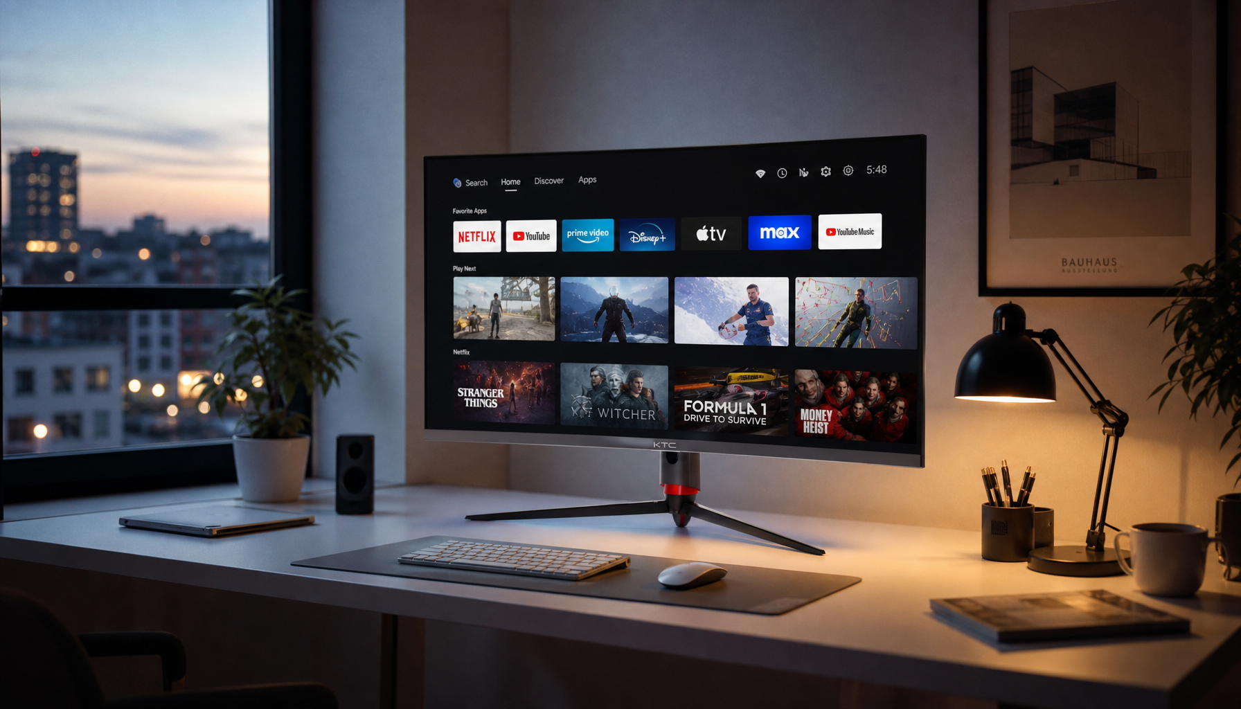
The M27P6 is a sensible fit for creators who want a Mini-LED monitor that can handle editing, streaming, and gaming without turning setup into a full lab project. If you want a broader browse path, compare it with all Mini-LED options or look at the office monitor range if your work leans more toward text, spreadsheets, and comfort than HDR punch.
Frequently Asked Questions
How Can I Calibrate a KTC Monitor Without a Colorimeter?
Use the operating system's built-in calibration flow, then verify the result with black, white, and gray test images. That gives you a practical first pass for KTC monitor calibration, but it does not replace hardware if your work depends on exact matching.
What Picture Mode Is Best to Start With for Creator Work?
Start with the most neutral preset available, usually standard, creator, or sRGB-style. Avoid vivid presets at first, because they can hide balance problems and make later checks less useful.
Why Does My Screen Look Different After I Lower Brightness?
Lower brightness changes perceived contrast, so the image can feel different even when the settings are technically fine. Recheck gray balance and shadow detail after you dim the screen, especially on a Mini-LED panel.
Can I Use One KTC Mini-LED Setting for Editing and Gaming?
You can use one neutral baseline as a compromise, but it will not be ideal for every task. Creators who game on the same desk usually get better results by keeping one SDR work preset and switching to a separate gaming or HDR mode when needed.
When Should I Stop Adjusting and Buy Hardware Calibration?
If the screen only needs to look acceptable for personal work, software tuning may be enough. If you deliver color-sensitive files, match across multiple displays, or need repeatable output, hardware calibration is the safer next step.


