


Yes. If one side of your monitor is dimmer, warmer, cooler, or tinted, you can easily “fix” a problem that exists on the screen rather than in the image file.
Does the corner of your photo always look too dark until you brighten it, only to find the export looks washed out on another display? A simple full-screen white, gray, black, and color check can reveal whether the flaw follows the image or stays locked to the same area of the panel. Here is how to tell when your monitor is steering your edits, what calibration can and cannot solve, and when a display is still reliable enough for serious work.
Why Monitor Uniformity Matters in Photo and Video Editing
Monitor uniformity is the consistency of brightness, color, and tone across the whole screen. A uniform display shows the same neutral gray in the center, corners, and edges. A non-uniform display may show a yellowish left side, a cooler right edge, dim corners, bright patches, IPS glow, backlight bleed, or a dirty-looking gray field.
For creative work, this is more than a cosmetic issue. Poor screen uniformity can distort how colors and tones appear across the same image, which means the position of the image on the screen can affect your editing judgment. If a portrait sits partly over a warm patch, skin may look too orange there. If a sky spans a dim corner, you may lift exposure or saturation in that area even though the actual pixels are already balanced.
This often appears on large editing canvases, ultrawides, older IPS panels, budget wide-gamut displays, and portable screens, where thin construction leaves less room for backlight control. It can also appear in gaming displays that prioritize refresh rate and response time over panel consistency. That does not make those monitors bad; it means you should know where their strengths end before trusting them for color-critical local edits.
How Uniformity Issues Cause Over-Editing
The mechanism is simple: your eye compares one part of the image against another, but the monitor is adding its own unevenness on top. If the upper-right corner of the screen is darker, a bright sky placed there may look underexposed. You might dodge that section, increase highlights, or add a gradient mask. Move the same image to the center, and the edit may suddenly look too bright.

A practical example is a landscape photo with snow or fog. On a monitor with weak gray uniformity, the left side may look slightly dirty or green. You may counter it with a local white balance adjustment. Later, when viewed on a more uniform display or in print, that same area may look magenta or overly corrected compared with the rest of the scene.
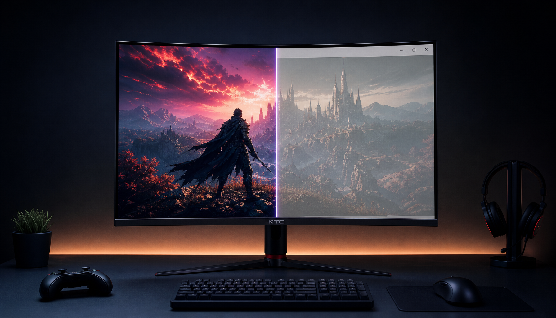
The risk increases when you edit full-screen on a large panel. A 32-inch 4K monitor gives excellent detail for image review, and one monitor buying guide notes that 4K is useful for designers and photographers, especially at larger sizes. The tradeoff is that larger panels expose more edge and corner behavior, so uniformity becomes more important as screen size grows.
Calibration Helps, But It Does Not Magically Fix the Whole Panel
Calibration is still essential. A colorimeter measures known color patches, calibration software compares those readings against targets, and the system creates a monitor profile to improve color and tone behavior. A strong calibration workflow helps you set a sensible white point, gamma, and luminance, and Michael Breitung’s photo workflow recommends Gamma 2.2 as a practical default for most displays.
The catch is that most standard calibration measures one location, usually the center of the screen. If the center is accurate but the bottom-right corner is green and dim, the profile cannot make that corner physically match the center. A color-management forum discussion makes the same practical point: calibration cannot fix brightness, color, or white-point variation across different areas when the panel itself is uneven.

That means a monitor can verify well at the center and still mislead you at the edges. For a productivity user, that may be acceptable. For a retoucher adjusting skin, product color, skies, gradients, or print soft proofs, it can become expensive in time and confidence.
Uniformity Compensation: Useful, With Tradeoffs
Some professional and prosumer monitors include uniformity compensation. This feature adjusts zones of the panel to make brightness and color more consistent. It can be genuinely valuable for editing, but it often comes with tradeoffs such as reduced peak brightness, reduced contrast, or locked picture controls.
A 32-inch professional monitor review measured this clearly: Uniformity Compensation improved color uniformity variation from a visible Delta E result to a much lower one, while also carrying a contrast penalty in previous testing. That is the real decision: do you want deeper contrast for games and movies, or more predictable color and brightness for editing?
Setting Choice |
Main Benefit |
Main Cost |
Best Fit |
Uniformity compensation on |
More consistent image across the panel |
Lower contrast or locked controls may occur |
Photo, design, proofing, layout review |
Uniformity compensation off |
Better native contrast and more control access |
Corners or edges may vary more |
Gaming, media, casual office work |
Center-only calibration |
Better center accuracy |
Edges may still mislead edits |
General use and budget workflows |
Measured uniformity report |
Shows where the panel is weak |
Requires a meter and time |
Color-critical buying or validation |
If your monitor offers this feature, test both modes with your real workload. A dimmer but more even display is often better for editing than a punchier display with a colored corner.
How to Check Whether the Monitor Is the Problem
Start with the image. Move the photo around the screen without changing the edit. Put the suspicious area in the center, then near each corner. If the “problem” changes appearance based on screen position, the monitor is involved. If the issue stays with the image content regardless of location, your edit or file probably needs attention.

Next, run a visual uniformity check. One editing workflow article recommends a simple approach using full-screen plain colors, especially for spotting fading edges or blotches on older editing displays. A simple screen uniformity check is not a lab test, but it is fast and useful before you lose hours correcting phantom problems.
Use normal editing brightness first, then try a dimmer room. Full-screen white reveals brightness falloff and warm or cool zones. Mid-gray is excellent for dirty screen effect and tint bands. Black reveals glow, bleed, and clouding. Red, green, and blue can expose uneven color behavior. A practical screen uniformity test can help detect dirty screen effect, backlight problems, and visual inconsistencies before they affect daily use.
For a more disciplined home test, warm the monitor up for 20 to 30 minutes, sit at your normal viewing distance, then step back 1 to 2 ft. Check the same patterns in daylight and in your normal editing light. A flaw that stays in the same physical area is panel uniformity. A flaw that changes with lamp position, window glare, or viewing angle is more likely your setup.
When the Issue Is Setup, Not the Panel
Not every uneven-looking screen is defective. Large monitors viewed too close can make the edges appear different because your angle to the panel changes. This is especially true on VA and TN panels, but even IPS is best viewed close to center axis. Curved ultrawides can help immersion and reduce edge distortion for large-format work, while office guidance commonly places 24- to 27-inch displays in the practical comfort zone.
Ergonomic placement matters too. A monitor should usually sit about an arm’s length away, with the top of the screen at or slightly below eye level. Home-office guidance recommends a slight backward tilt of about 10 to 15 degrees to reduce glare, with viewing distance around 20 to 24 inches for many desk setups. If you are editing on a 34-inch ultrawide from 18 inches away, your neck, eyes, and panel angles are all working against precision.
Room lighting also changes perception. A glossy OLED in a bright room may show reflections that mimic contrast shifts. An LCD in a pitch-black room may exaggerate glow and corner bleed. Bias lighting behind the monitor, reduced brightness, better scaling, and glare control can make a marginal display feel much more consistent.
Panel Type and Workflow Tradeoffs
IPS remains a strong default for editing because it typically offers better viewing angles and color consistency than TN. VA panels deliver deeper blacks, which can be appealing for games and video, but dark uniformity and viewing-angle shifts can complicate shadow decisions. OLED gives excellent black depth and shadow separation, though brightness behavior can vary depending on scene content.

For photographers exploring HDR, Greg Benz highlights OLED’s deep-shadow strength while noting automatic brightness limiting as a real limitation: small highlights may get very bright, but full-screen brightness can drop significantly. That makes an HDR OLED powerful in controlled lighting, but not automatically better for every bright-room editing workflow. The HDR OLED monitor decision should include lighting, calibration support, brightness behavior, and your actual delivery format.
Gaming monitor buyers face a similar tradeoff. Current gaming recommendations show that esports displays still chase extreme refresh rates, while OLED, Mini LED, and higher-resolution options dominate more immersive categories. A fast gaming monitor can be excellent for play and general work, but for editing you still need measured color, stable gray behavior, and acceptable corner-to-corner consistency.
When to Replace or Return the Monitor
If a tint, patch, band, or glow appears in normal editing work and affects decisions near the center of the screen, treat it as a serious defect. Minor edge variation on a budget or very large display may be tolerable if it disappears during normal work. A visible center-zone color cast is different; that can directly distort your judgment.
Return or exchange the display if the flaw is repeatable, visible at normal brightness, and tied to your main workload. This is especially important during the return window. Take photos in normal lighting, run built-in diagnostics if available, and document the issue with white, gray, and black screens.
If replacement is not possible, build a safer editing routine. Keep the image area you are judging in the center. Use the edges for panels, timelines, toolbars, chat, browser windows, or reference notes. Recheck local edits by moving the image around the screen. Calibrate regularly, keep brightness appropriate for the room, and avoid making final color calls in a known weak zone.
The Practical Answer
Your monitor can absolutely cause you to over-edit certain areas of an image. Calibration improves target behavior, but it usually cannot repair spatial uniformity defects across the panel. For reliable creative work, test uniformity, edit critical details near the center, use compensation when its tradeoffs make sense, and choose your next display based on measured consistency rather than headline brightness or refresh rate alone.


