


Color shifts happen when your design app, operating system, monitor, and final output device interpret color through different profiles, gamuts, brightness levels, or viewing conditions. The fix is a controlled color pipeline from file setup to calibrated display output.
Color Spaces Do Not Always Match
Design software works inside a defined color space, such as sRGB, Display P3, wide-gamut RGB, or CMYK. Your monitor then tries to reproduce those color values inside its own physical gamut, which may be narrower, wider, or poorly mapped.
For web work, sRGB remains the safest baseline because it is the default color space for most online content and mainstream displays. A wide-gamut monitor can still make web assets look oversaturated if sRGB content is shown without proper gamut control; the issue is color translation, not panel quality.
In creative apps, embedded profiles matter because they tell color-managed software how to interpret the file. Without the right profile, the same red, blue, or gray can shift between an image editor, a browser, a game engine, and a client’s laptop.

Monitor Settings Can Override Your Intent
Most displays ship with picture modes built for showroom impact: high brightness, boosted contrast, cooler whites, and extra saturation. That can look exciting in a store or game lobby, but it can mislead design decisions.
Accurate display output depends on calibration, which adjusts white point, luminance, contrast, and gamma so the screen tracks a known target. Hardware profiling goes further by creating an ICC profile that describes the monitor’s real behavior, helping color-managed apps display files more predictably through an ICC profile.

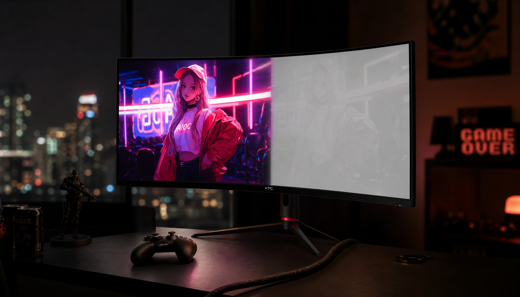
Panel type also matters. IPS displays are typically stronger for consistent viewing angles, while VA panels often deliver deeper contrast but can shift more off-center; that viewing-angle behavior is one reason IPS panels are often favored for color-sensitive work.
Brightness, Gamma, and White Point Change Perception
Even if hue is technically close, the image can feel wrong when brightness or tone response is off. A monitor that is too bright may push you to darken an image, only for the final export or print to look muddy elsewhere.
Gamma controls how midtones transition from black to white. A common desktop target is 2.2, which supports predictable contrast across Windows, macOS, web, and productivity workflows.
White point controls whether neutral whites appear cool, warm, or balanced. Many design and video workflows target daylight-like white, while print preview may require different assumptions because paper reflects light instead of emitting it.
A precise monitor target is workflow-dependent, so web design, print proofing, cinematic grading, and competitive gaming should not all use the same display mode.
Output Devices Have Their Own Limits
A monitor emits RGB light; a printer lays down inks on paper. That alone creates a major color shift risk because RGB screens can show colors that CMYK printing cannot reproduce.
Color management reduces those surprises by translating between devices with profiles, but it cannot make every color physically possible. A neon green that looks electric on an OLED portable screen may flatten on matte paper or shift under warm office lighting.

For print, soft proofing and printer-specific profiles help you preview the final result before production. For brand-critical work, standardized spot-color references, proof prints, and clear vendor specs are more reliable than trusting screen appearance alone.
A Faster Fix Checklist
Use this practical workflow before blaming the monitor:
- Set the document color space for the destination: sRGB for web, appropriate profiles for print.
- Use the monitor’s sRGB, wide-gamut RGB, or Display P3 mode only when it matches the job.
- Calibrate and profile the display with a colorimeter for serious design work.
- Keep room lighting consistent and avoid glare or auto-brightness.
- Soft proof print work with the correct output profile before approval.

For gaming monitors, office displays, and portable smart screens, the winning setup is the same: choose the right mode, measure when accuracy matters, and keep every device speaking the same color language.


