


Dynamic contrast is worth using only when you want extra punch for casual viewing in a bright room. For calibrated work, competitive gaming, HDR accuracy, and consistent office color, it usually does more harm than good.
Does your monitor look exciting in one scene, then oddly dim, gray, or crushed in the next? A simple test with a dark game corridor, a bright spreadsheet, and a movie highlight can reveal whether dynamic contrast is improving visibility or quietly fighting your settings. Here is how to decide when to leave it off, when to try Low, and how to protect a calibrated display setup.
What Dynamic Contrast Actually Does
Dynamic contrast is a display processing feature that changes brightness, contrast, or gamma as the picture changes instead of holding one stable calibrated image. A normal contrast setting is fixed; dynamic contrast reacts scene by scene. That reaction can make dark scenes look deeper and bright scenes look more vivid, but it also means the monitor is no longer showing a consistent tone curve.

The key distinction is native contrast versus processed contrast. Static contrast ratio measures the brightest white and darkest black a display can produce under a defined condition, while dynamic contrast compares brightness behavior across changing scenes or processing states. That is why a monitor with real native contrast around 1,000:1, 2,500:1, or 3,000:1 may advertise a dynamic figure in the millions.
In practical terms, dynamic contrast is not the same as better panel hardware. A VA panel with strong native black depth, a Mini LED monitor with good local dimming, or an OLED with pixel-level black control changes light output more precisely. Basic dynamic contrast often shifts the whole image, which can make blacks look darker while also reducing midtone visibility.
Why It Can Look Better at First
Dynamic contrast earns its place when the room or content is working against the screen. In a sunny home office, a portable screen beside a window can look flat because ambient light raises perceived black levels. A Low dynamic contrast setting may restore some perceived depth for sports, streaming video, animated content, or older video that was never mastered with modern HDR displays in mind.
That benefit is perceptual, not magical. Dynamic contrast can make black tones darker and white tones brighter, which often reads as a crisper image during video playback. If you are watching a daytime football game while answering messages on a second screen, that extra pop may be more valuable than perfect grayscale tracking.
For casual single-player gaming, it can also add drama. A fantasy RPG in a bright living room may feel less washed out with dynamic contrast on Low, especially if the monitor has weak native contrast. The feature is most defensible when the goal is enjoyment, the content is not color-critical, and you can quickly disable it when detail starts disappearing.
Where It Ruins Calibration Consistency
Calibration depends on repeatability. When you calibrate brightness, white point, gamma, and color response, you are building a stable reference. Dynamic contrast breaks that stability because the monitor keeps changing the image after your calibration target has been set.

For creative work, this is the deal-breaker. If you are grading a dark product render, adjusting shadow detail in a photo, or checking UI contrast for a software dashboard, dynamic contrast can trick your eye. A shadow may look acceptably deep because the monitor dimmed the scene, not because the file actually contains the right tonal separation. Native or static contrast is more reliable, especially when judging shadows, highlights, ambient occlusion, and dark-scene depth.
The same problem affects office productivity, though the stakes are different. In spreadsheets, dashboards, documents, and coding windows, you want stable text contrast and predictable whites. If dynamic contrast dims a mostly dark IDE, then brightens a mostly white document, your eyes keep adapting. Over a long work session, that inconsistency can feel like fatigue even if the screen looked impressive at first.
A simple real-world check is to open a white document, switch to a dark web page, then return to the document. If the white page visibly blooms, dims, or ramps for a moment, dynamic contrast is interfering with consistency.
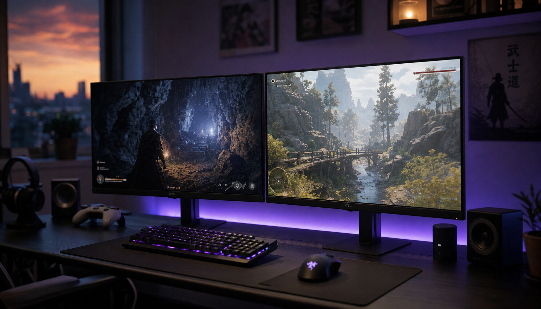
Gaming: Immersion Versus Readability
For competitive play, dynamic contrast is usually the wrong trade. Fast FPS, racing, fighting, and esports titles reward stable visibility and low latency. If a dark corner changes brightness after you move the camera, your eye has to re-judge the scene. If bright muzzle flashes clip, you may lose target detail at the worst moment.

Dynamic contrast in gaming can deepen dark rooms and sharpen explosions, but the same processing can crush shadow detail or clip highlights. That means the feature can make a game look more cinematic while making it less readable. In a competitive shooter, a better-looking tunnel is not better if an enemy blends into crushed blacks.
There is also input lag to consider. Some modern monitors process quickly enough that casual players may not notice the delay. Still, even a small delay or image shift matters more in high-speed play than it does in movies or casual RPGs. The performance-driven default is simple: turn dynamic contrast off for ranked play, then tune brightness, gamma, black equalizer, or HDR settings instead.
HDR, Local Dimming, and the Better Alternatives
Dynamic contrast is weakest when it tries to imitate hardware it does not have. Local dimming can control zones of the backlight. OLED can turn pixels off individually. HDR content can carry brightness information designed to preserve highlights and shadow detail. Dynamic contrast often works after the fact, trying to reshape the image globally or semi-globally.

For projectors and larger screens, the distinction becomes even clearer. Software dynamic contrast changes the video signal, while hardware-based dimming adjusts the light source itself. That matters because hardware dimming can deepen blacks without necessarily crushing the whole image in the same way a blunt software boost might.
If your monitor supports true HDR and the content is mastered for HDR, start there. If it has local dimming, test the local dimming levels before reaching for generic dynamic contrast. If it is an OLED or QD-OLED, manage room light carefully because ambient light can still weaken perceived blacks, but do not assume dynamic contrast is needed just because the option exists.
How to Set It for Different Uses
Use Case |
Recommended Setting |
Why It Works |
Competitive gaming |
Off |
Keeps latency, visibility, and scene response more predictable |
Calibrated photo, video, or design work |
Off |
Preserves gamma, shadow detail, and repeatable judgment |
Office productivity |
Off or very mild |
Stable text and white backgrounds matter more than punch |
Casual video in a bright room |
Low |
Can improve perceived depth when glare washes out the image |
Cinematic single-player games |
Try Low |
Useful only if it adds atmosphere without hiding detail |
HDR movies or HDR games |
Usually Off |
HDR tone mapping and display hardware should do the heavy lifting |
The best test is not a settings menu; it is familiar content. Use one dark scene with visible shadow detail, one bright scene with clouds or light effects, and one everyday productivity screen. If the monitor makes the dark scene punchier without hiding objects, keeps highlights from blowing out, and does not make documents pulse in brightness, Low may be usable for that mode.
Buying Advice: Do Not Trust Giant Contrast Numbers
A monitor advertised at 50,000,000:1 or 80,000,000:1 is almost certainly leaning on dynamic contrast math rather than real native contrast. Those numbers do not tell you whether text will look crisp, whether a dark game will reveal detail, or whether your calibrated profile will stay stable.
A more useful comparison starts with panel behavior. Many IPS office monitors sit near 1,000:1 native contrast, which is fine for documents, web work, and general productivity. Many VA panels reach higher native contrast, often around 3,000:1, making them stronger for dark entertainment and immersive gaming. OLED and strong local-dimming displays are in another class for black depth, though they bring their own tradeoffs around brightness, room reflections, cost, and burn-in management.
Also consider ambient light. Real-world contrast can fall sharply in brighter indoor environments, so a screen that looks excellent in a dark test room may look ordinary near a window. For office displays and portable smart screens, brightness, reflection handling, coating quality, and viewing angle often matter as much as the contrast spec.
The Practical Verdict
Use dynamic contrast as a situational enhancement, not a default display philosophy. It can make casual video and single-player games look more vivid, especially on modest panels in bright rooms. It should be off for calibration, color work, competitive gaming, HDR accuracy, and long productivity sessions where consistency is the whole point.
A high-performance display setup should feel powerful because it is predictable. Start with native contrast, proper brightness, room control, and accurate gamma; then treat dynamic contrast as a temporary boost you can switch on when spectacle matters more than precision.


