

Text fringing on older OLED monitors has long frustrated graphic designers and content creators who need both razor-sharp text for UI work and accurate colors for creative applications. In 2026, manufacturers have addressed this at the hardware level by adopting new subpixel layouts that better align with operating system font rendering, making OLEDs far more viable for mixed productivity and color-critical workflows.

Why Software Couldn't Fix the OLED Text Problem
Windows ClearType and macOS font rendering were originally engineered around the standard vertical RGB stripe layout found in most LCD panels. When older OLEDs used triangular arrangements in QD-OLED or WRGB structures in WOLED, the mismatch produced visible color fringing on high-contrast edges of small fonts and fine lines. As this Microsoft PowerToys discussion illustrates, ClearType adjustments and third-party tools like BetterClearTypeTuner could reduce but never eliminate the issue because the underlying physical subpixel geometry did not match the software assumptions.
For hybrid users spending hours in design tools, browsers, and spreadsheets, this created a persistent "text tax" that made many earlier OLEDs unsuitable for serious productivity. The limitation was not a software bug that could be patched; it required a hardware redesign of the subpixel layout itself. This is why many prosumer buyers in past years defaulted to Mini-LED or high-end IPS panels despite OLED's superior contrast and per-pixel lighting.
For deeper background on how different layouts affect rendering, see our guide to What Subpixel Layout Is and Why RGB and RGBW Panels Look Different.
The Physics of 2026 Subpixel Layouts
Samsung's 2026 QD-OLED panels adopt a vertical V-Stripe layout that aligns red, green, and blue subpixels in a manner closer to traditional RGB stripe assumptions while optimizing emitter heat distribution. This change replaces the triangular arrangement that previously caused most fringing complaints. Similarly, LG is shifting its 4th-generation Tandem OLED and select 5K panels toward a standard RGB-stripe structure, moving away from the traditional WRGB layout in higher-density models.
Industry standards from the International Committee on Display Metrology (ICDM) emphasize that effective resolution and legibility depend heavily on subpixel architecture, not simply the stated pixel count. These 2026 layouts therefore deliver measurable improvements in edge definition and perceived sharpness without sacrificing the core OLED advantages of infinite contrast and per-pixel control.
The shift also addresses color purity. Older WRGB designs relied on a white subpixel that could dilute saturation in bright areas. Pure RGB configurations in the new panels maintain intended hue and volume even at higher luminance levels. As this FlatpanelsHD report and TFT Central coverage detail, these changes respond directly to prosumer feedback on text clarity and color accuracy.
How Layout Changes Unlock True Color Volume
The removal of the white subpixel in 2026 WOLED and the refined V-Stripe in QD-OLED eliminates a key historical weakness: washed-out highlights. In older panels, boosting brightness with the white subpixel often desaturated specular highlights such as sunlight reflections or neon elements, forcing designers to over-saturate files to compensate. Newer pure-RGB layouts preserve skin-tone warmth, accurate blood tones in high-key lighting, and intended saturation in HDR content even above 1,000 nits.
This brings meaningful workflow benefits. UI/UX designers working on fine 1pt lines and high-density interfaces see reduced color fringing. Colorists and photographers gain more reliable parity between software preview and final output, reducing the need for repeated corrections when moving files between calibrated displays. In dark-room creative environments, 2026 OLED panels now deliver color volume that is highly competitive with top Mini-LED options.
For context on measuring such improvements, read our explanation of What Delta E Values Actually Mean for Your Creative Work and the growing need for creator-to-consumer color matching tools.

Verifying Clarity: Real-World Testing for Creatives
Synthetic benchmarks rarely capture the full picture. The most reliable check is opening your primary creative applications—Photoshop, Figma, Premiere, or Illustrator—and examining 1pt text, fine UI elements, and high-contrast interfaces at your typical scaling setting. Run the monitor at its native resolution with a full 4:4:4 chroma signal path; any deviation can introduce artifacts that mimic fringing even on improved panels.
A practical checklist includes:
- Confirm neutral gray ramps show no obvious tint shifts.
- Check skin tones and specular highlights in sample HDR images for desaturation.
- Verify Delta E values remain low (under 2 is generally excellent for creative work) using calibration software.
- Test both Windows ClearType and macOS font smoothing to ensure the new layouts perform consistently across operating systems.
Our guide on How to Verify Your Display Calibration Is Actually Working and the differences in 8-bit vs 10-bit display bit depth can help refine this process. Remember that software tuning still has limits; the 2026 hardware improvements reduce the need for heavy post-processing but do not make every scaling scenario perfectly artifact-free.
OLED vs. Mini-LED in 2026: The New Decision Threshold
With text fringing drastically reduced and color volume improved, 2026 OLED panels have become a strong choice for graphic designers, content creators, and hybrid users whose workflows involve varied content rather than static interfaces all day. The previous trade-off between text clarity and contrast has largely been resolved at the panel level.
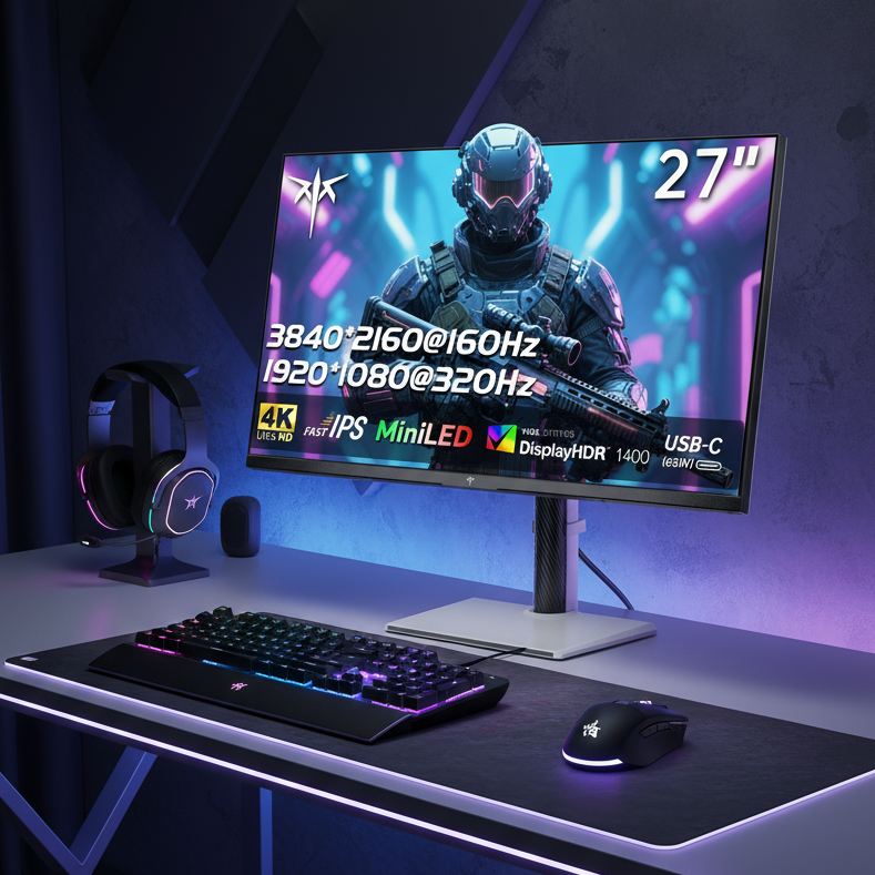
The remaining boundary centers on burn-in risk for heavy static UI use. Users spending more than eight hours daily on unchanging grids—such as extensive Excel work, CAD, or IDE coding—may still prefer Mini-LED for zero long-term image retention risk. Models like the KTC Mini LED 27" 4K 160Hz HDR1400 Gaming Monitor offer high-zone local dimming and full ergonomic stands that suit bright-room productivity while delivering strong HDR performance.
For color-critical creative work in controlled lighting, the improved 2026 OLED options, such as the KTC OLED 27" 2K 240Hz Gaming Monitor, now provide per-pixel accuracy and deep blacks that many creators will find preferable. Our earlier comparison of MiniLED vs. OLED for gaming remains relevant but should now be read through the updated lens of subpixel-driven clarity rather than legacy fringing concerns.
Ultimately, evaluate your daily "static UI duty cycle." If varied creative content dominates, a 2026 OLED with V-Stripe or RGB-stripe layout likely removes the old barriers. If your workflow features persistent toolbars and spreadsheets, a high-quality Mini-LED remains the lower-risk choice for longevity.
FAQs
Do 2026 OLED Subpixel Layouts Completely Eliminate Text Fringing?
New V-Stripe and RGB-stripe designs drastically reduce color fringing on small fonts and UI elements by better matching Windows ClearType and macOS rendering assumptions. However, minor artifacts can still appear in certain non-native scaling scenarios or with imperfect signal paths, so testing in your actual software remains essential.
Can Software Fixes Like ClearType Tuner Fully Resolve OLED Text Issues?
Software tools can mitigate but not eliminate fringing caused by mismatched subpixel geometry. The 2026 hardware changes address the root physical mismatch, making software adjustments far more effective as a secondary refinement rather than a primary solution.
How Much Better Is 2026 OLED Color Accuracy for Graphic Design?
By removing the white subpixel in many WOLED designs and refining QD-OLED layouts, these panels maintain higher color volume and saturation in bright highlights. This leads to more predictable skin tones, specular highlights, and HDR grading, reducing the need to over-compensate in creative software.
Should I Choose OLED or Mini-LED for Mixed Creative and Productivity Work in 2026?
For workflows with varied content and manageable burn-in exposure, 2026 OLEDs now excel in contrast, color volume, and text sharpness. Heavy static UI users (8+ hours of unchanging interfaces) should consider Mini-LED models for zero image retention risk, even though their color accuracy is competitive.
What Should I Test Before Buying a 2026 OLED Monitor for Design Work?
Run your primary creative apps at native resolution with 4:4:4 chroma. Check 1pt text, fine lines, neutral grays, and HDR highlights for fringing or desaturation. Verify calibration with tools that measure Delta E, and confirm the panel uses one of the new RGB-aligned layouts rather than older WRGB or triangular designs.
Do Newer OLED Layouts Improve Performance in macOS as Well as Windows?
Yes. While ClearType receives the most discussion, the shift to standard RGB stripe and V-Stripe geometries also benefits macOS font rendering and subpixel antialiasing. Real-world testing across both platforms is still recommended because scaling behaviors differ slightly between operating systems.
Will 2026 OLED Monitors Replace Mini-LED for All Creator Workflows?
Not universally. OLED now leads in dark-room precision, infinite contrast, and improved text clarity, but Mini-LED retains advantages in sustained peak brightness for very bright rooms and zero burn-in risk for all-day static interfaces. Match the panel to your specific duty cycle and lighting conditions.