


Outdoor cafe readability depends on fighting sunlight, glare, and reflections; indoor office readability depends on matching screen brightness to room lighting for comfort. A portable monitor that feels crisp at a desk can look faded outdoors unless it has higher brightness, a matte surface, and smart placement in shade.
Ever open your laptop at a sidewalk table and watch your second screen turn into a gray mirror? In real portable-monitor use, moving from a controlled office to open shade can shift the practical target from roughly 100–150 nits for comfort to 500–700 nits for workable outdoor visibility. Here is how to choose, set up, and tune a portable display so you can actually read it where you work.
Why Ambient Light Changes Everything
Portable monitors are usually bought for mobility, but readability is not mobile by default. A display’s rated brightness, measured in nits, describes how much visible light it can emit toward your eyes; higher nit ratings generally improve visibility in bright spaces, especially when the environment is trying to overpower the screen. For office and travel displays, portable monitor brightness affects visibility, battery life, comfort, and where the monitor can be used effectively.
The difference between an outdoor cafe and an indoor office is not just “more light.” Outdoors, the sky itself becomes a giant light source, glossy panels reflect faces and clothing, and even open shade can be far brighter than a typical desk. Indoors, the bigger risk is often the opposite: a screen that is set too bright for long reading sessions, making white documents look like a light panel instead of paper.
Outdoor Cafe Readability: Brightness Headroom Matters
At an outdoor cafe, a 250–300 nit portable monitor may be acceptable only when you are under deep shade and the screen is angled away from the sky. Many standard portable monitors live in that range, which is why they can look fine in a hotel room yet become difficult to use at a patio table. Outdoor display guidance commonly treats 1,000 nits as the beginning of true sunlight-readable performance, while some industrial screens go well above that for direct or sustained sun.
A practical cafe example is simple: if you are reviewing a spreadsheet at 11:30 AM near a windowed storefront, 300 nits may force you to lean forward and increase text scaling. Move under an umbrella, rotate the monitor so the panel does not reflect the bright street, and a 400–500 nit portable screen becomes much more usable. In open shade with changing light, 500–700 nits is the safer range; in partial sun, 1,000 nits or more is the performance target.

Brightness alone still will not save a bad setup. Glossy panels can look sharper indoors, but outdoors they often reflect the sky, your shirt, and passing cars. A matte or anti-glare surface diffuses reflected light, while anti-reflective treatment reduces mirror-like reflections. For rugged and professional displays, optical bonding can also reduce internal reflections by removing the air gap between layers, which helps preserve contrast under strong ambient light.
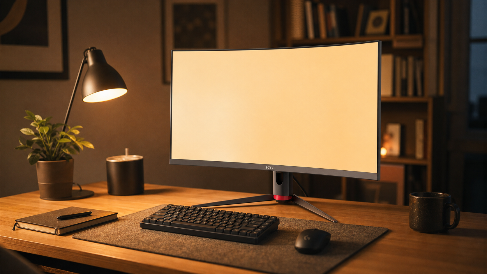
Indoor Office Readability: Comfort Beats Maximum Brightness
In an office, the winning setting is rarely maximum brightness. A bright monitor can feel impressive for five minutes and tiring after two hours. For daytime office work, a useful starting point is around 100–150 nits, or roughly 30%–50% brightness on many monitors, then adjusting until a white document on screen looks similar to white paper on the desk. That “paper match” method is consistent with ergonomic guidance that display brightness should match room lighting rather than dominate it.

Natural daylight can improve the feel of a workspace, but it needs control. A desk near a window can support alertness and visual comfort, yet direct reflections across a portable screen will increase effort and reduce readability. Good lighting is not about making the room bright everywhere; natural lighting works best when it supports focus without putting glare on the display.
A typical office example: a 15.6-inch 1080p portable monitor at 250 nits can be perfectly serviceable next to a laptop for email, dashboards, and documents. If the office has bright windows, you may raise it to 120–150 nits, tilt it slightly downward, and avoid placing it directly opposite the window. In a dimmer room, the same monitor may need to drop below 100 nits to keep white backgrounds from feeling harsh.
Cafe Versus Office: The Practical Difference

Setting |
Main Readability Problem |
Practical Brightness Target |
Best Surface |
Setup Priority |
Indoor office |
Eye fatigue from mismatch between screen and room |
About 100–150 nits for long work |
Matte or low-reflection preferred |
Match screen white to paper |
Bright office near windows |
Reflections and uneven daylight |
120–150+ nits as needed |
Matte or anti-glare |
Control window glare first |
Outdoor cafe in shade |
Washed contrast and sky reflections |
500–700 nits preferred |
Matte or anti-glare |
Face away from sun |
Outdoor cafe in partial sun |
Screen washout |
1,000+ nits |
Matte, anti-reflective, bonded if possible |
Add shade or hood |
Direct sun |
Heat, glare, battery drain, low contrast |
1,500+ nits preferred for sustained use |
Outdoor-grade treatment |
Avoid if using consumer gear |
The key tradeoff is that higher brightness gives outdoor flexibility but costs power. A 550 nit portable display gives more headroom than a 250 nit budget model, but running it near full brightness will draw more energy from the laptop or battery bank. Brightness guidance notes that higher brightness can preserve visibility in bright environments, but it also increases power demand.
What to Buy for Each Environment
For mostly indoor office use, do not overpay for extreme brightness unless your desk is exposed to strong daylight. A 250–350 nit portable monitor can be a strong value if it has a stable stand, single-cable video input, usable contrast, and a non-glossy finish. Budget-focused travel workers often get more real productivity from a sturdy 15.6-inch 1080p screen than from a fragile premium panel with poor ergonomics.
For mixed office and cafe work, 400 nits should be treated as the practical floor, not a luxury. Testing-focused roundups often show many portable monitors around 300–400 nits, with some value models landing lower; portable monitors vary widely in brightness, connectivity, stands, refresh rate, and price. If your work includes reviewing dense documents, code, design comments, or spreadsheets outdoors, a brighter 16:10 panel is usually more valuable than 4K resolution on a dim glossy screen.
For frequent outdoor cafe use, prioritize brightness, matte treatment, and power delivery before resolution. A 1080p or 1200p 1,000 nit matte display can be more useful outdoors than a 4K 300 nit glossy display because readability is about effective contrast, not just pixel count. Industrial and sunlight-readable displays often exceed 1,000 nits, and sunlight readable monitors are commonly positioned for outdoor or high-ambient-light use rather than ordinary desk environments.
Setup Moves That Improve Readability Fast
The fastest outdoor improvement is shade. Sit with the monitor facing away from the sun, use a wall, umbrella, awning, or laptop hood, and keep bright clothing out of the screen reflection when possible. Clean the screen before you judge brightness, because fingerprints scatter light and make a panel look worse than its specs.

The fastest indoor improvement is matching. Open a blank document, place a sheet of white printer paper beside the monitor, and adjust brightness until both whites look similar under the same room lighting. If the screen looks like a lamp, lower it; if text looks gray and you lean forward, raise it slightly or reduce glare.
High-contrast modes and larger text can help outdoors, but they are support tools, not substitutes for brightness and shade. For long sessions, increase scaling before you strain, especially on 14-inch and 15.6-inch portable displays. For gaming or competitive play on a patio, refresh rate matters only after readability is solved; a 300 Hz panel is wasted if glare keeps you from tracking targets.
Pros and Cons by Setting
Indoor offices favor efficiency, comfort, and consistency. The pros are lower power draw, easier color judgment, fewer heat concerns, and stable readability across a full workday. The cons are glare from windows, eye fatigue if brightness is set too high, and cramped ergonomics if the portable monitor sits too low.
Outdoor cafes favor brightness headroom and adaptable setup. The pros are flexible work location, better use of natural light, and a more open environment for short creative or review sessions. The cons are heavy battery drain, unpredictable reflections, possible overheating, weaker color confidence, and reduced readability on standard glossy 250–300 nit screens.
FAQ
Is 300 nits enough for an outdoor cafe?
Sometimes, but only in controlled shade. A 300 nit portable monitor can handle indoor work and some shaded cafe tables, but it will struggle in open shade, bright reflections, and partial sun. If cafe use is routine, look closer to 500–700 nits, and consider 1,000 nits if sunlight exposure is common.
Should I choose matte or glossy?
Choose matte or anti-glare for outdoor cafe use and most office productivity. Glossy can look punchy indoors, but it becomes a liability when the sky, windows, or overhead lights reflect across the screen.
Does higher brightness improve color accuracy?
Not directly. Brightness can improve perceived contrast in strong ambient light, making details easier to see, but color-critical work still depends on panel quality, gamut, calibration, and lighting control.
A portable monitor is only productive when the environment lets your eyes trust it. For the office, tune brightness down to the room; for the cafe, buy enough brightness headroom, control reflections, and create shade before expecting the panel to perform.


