


Gamma controls how your display shapes brightness between black and white, especially in midtones and shadows. Set it well, and games, spreadsheets, photos, and movies look deeper, clearer, and closer to the creator’s intent.
Do dark game corners look muddy on your monitor, while office documents feel either harsh or washed out? A quick grayscale check can expose lost shadow detail, overbright midtones, or a display preset that is working against your room lighting. You’ll learn what gamma does, which setting to choose, and how to adjust it without chasing random picture modes.

What Gamma Means in Display Settings
Gamma is the curve that connects a digital signal to visible screen brightness. A display does not treat a 50% gray signal as “half as bright” in a straight-line way; instead, gamma bends the response so midtones and shadows land where human vision expects them. The basic idea is a nonlinear luminance operation, and the common power-law description explains why changing the exponent can brighten or darken the image without simply raising the backlight.
For a practical example, one display test found that a 50% signal landed near 52 nits while peak white was about 240 nits, not the 120 nits you would expect from a linear half-brightness assumption. That result is the point: gamma protects depth by keeping midtones from floating too high.
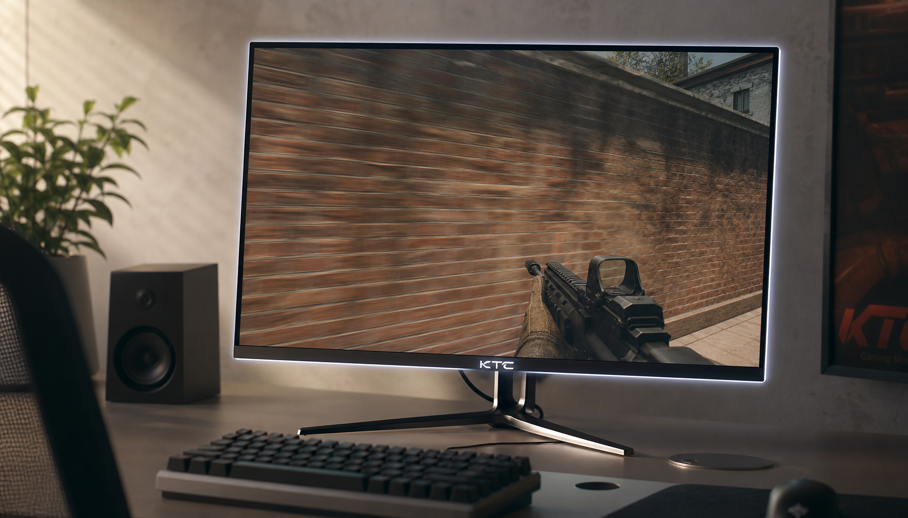
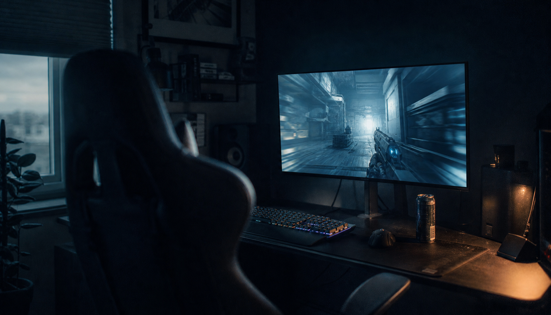
This is why gamma feels different from brightness. Brightness usually moves black level, contrast usually shapes white level, and gamma changes the journey between them. In a tactical shooter, that journey decides whether a dark doorway has visible texture or becomes a flat black patch. In a spreadsheet-heavy office setup, it decides whether gray gridlines look crisp or whether the whole screen feels hazy after an hour.
Why Gamma Exists
Gamma exists because displays, cameras, video files, and eyes do not all respond to light in the same way. Human vision is more sensitive to small changes in darker tones than in bright ones, so image systems encode tonal information in a way that gives shadows enough precision. Gamma-correction material explains that gamma encoded images store tonal steps more efficiently, especially where our eyes notice banding and crushed detail most.
There is also a display-history reason. Older CRT monitors had a natural nonlinear response, so image and video systems evolved around correction curves that made pictures look right on those screens. Lawrence Berkeley National Laboratory’s Radiance notes describe monitor output as a power law, with typical older monitor behavior varying by hardware and brightness or contrast settings.
Modern LCD, OLED, mini-LED, and portable smart screens no longer behave exactly like old CRTs, but the content pipeline still expects controlled tone response. That is why your monitor menu may offer gamma 1.8, 2.0, 2.2, 2.4, or presets named “Mode 1” and “Mode 2.” The label is simple; the visual result can be decisive.
Gamma 2.2, 2.4, and Other Common Settings
For most computer use, gamma 2.2 is the dependable starting point. It aligns closely with sRGB-style desktop work, web content, productivity apps, and many SDR games. Graphics programming guidance describes 2.2 as a practical default that approximates many displays and connects closely to the sRGB color space, which is why game engines and monitor presets often orbit that value.
Gamma 2.4 is usually darker and more contrast-rich. It can look more cinematic in a dim room because it holds midtones lower and gives dark scenes stronger depth. The tradeoff is that in a bright office or sunlit living room, 2.4 can bury shadow detail, making games and movies look impressive at first glance but harder to read.
Setting |
Best Fit |
Visual Effect |
Main Risk |
Gamma 1.8 |
Legacy workflows or unusually dim-looking displays |
Brighter midtones |
Washed-out blacks and weak depth |
Gamma 2.2 |
Gaming monitors, office displays, web, SDR desktop use |
Balanced tone and shadow visibility |
Can look slightly flat in a dark theater setup |
Gamma 2.4 |
Dark-room movie viewing and cinematic SDR playback |
Deeper contrast and darker midtones |
Crushed shadows in bright rooms |
Custom or BT.1886-style mode |
Calibrated video displays |
Better match to video mastering intent |
Needs careful setup and room control |
For portable smart screens, 2.2 is usually the value-oriented choice because the environment changes constantly. A 16-inch portable display used beside a laptop in a hotel room, airport lounge, or client office needs readable midtones more than theater-grade darkness. If the panel has weak black levels, pushing gamma too high often hides flaws instead of improving the picture.
How Gamma Affects Gaming
Gamma is performance-relevant because visibility is performance-relevant. In competitive games, too-high gamma can crush dark corners, reducing enemy visibility. Too-low gamma can lift the whole scene, making dark areas easier to see but also flattening depth, washing out textures, and making highlights less readable.
A good gaming setup starts with the monitor at gamma 2.2, the GPU output left at default, and the game’s own brightness or gamma screen adjusted only after the monitor is stable. Game engines often apply their own rendering and correction steps, and graphics programming guidance warns that gamma correction should happen at the final output stage because doing it at the wrong point can make lighting calculations look physically wrong.
The practical test is simple. Load a game scene with deep shadows, bright sky, and mid-gray surfaces. If shadow detail disappears even when the game’s calibration logo says it should be barely visible, lower gamma slightly or use the game’s internal control. If the scene looks foggy and black objects never look black, raise gamma back toward 2.2 or reset the monitor preset.

How Gamma Affects Office Work and Creative Tasks
Office displays benefit from stable, neutral gamma because most productivity work happens in midtones: text antialiasing, gray UI panels, charts, dashboards, and document backgrounds. A gamma setting that is too low can make white pages glare harder and gray interfaces look thin. A setting that is too high can make dark-mode apps lose separation between panels.
For photo editing, product review images, or content creation, gamma matters even more. Standard image files commonly assume an encoding near 1/2.2, while the display side compensates so the final picture appears natural. If your monitor’s gamma is off, you may brighten a product photo to fix your screen, then publish an image that looks wrong everywhere else.
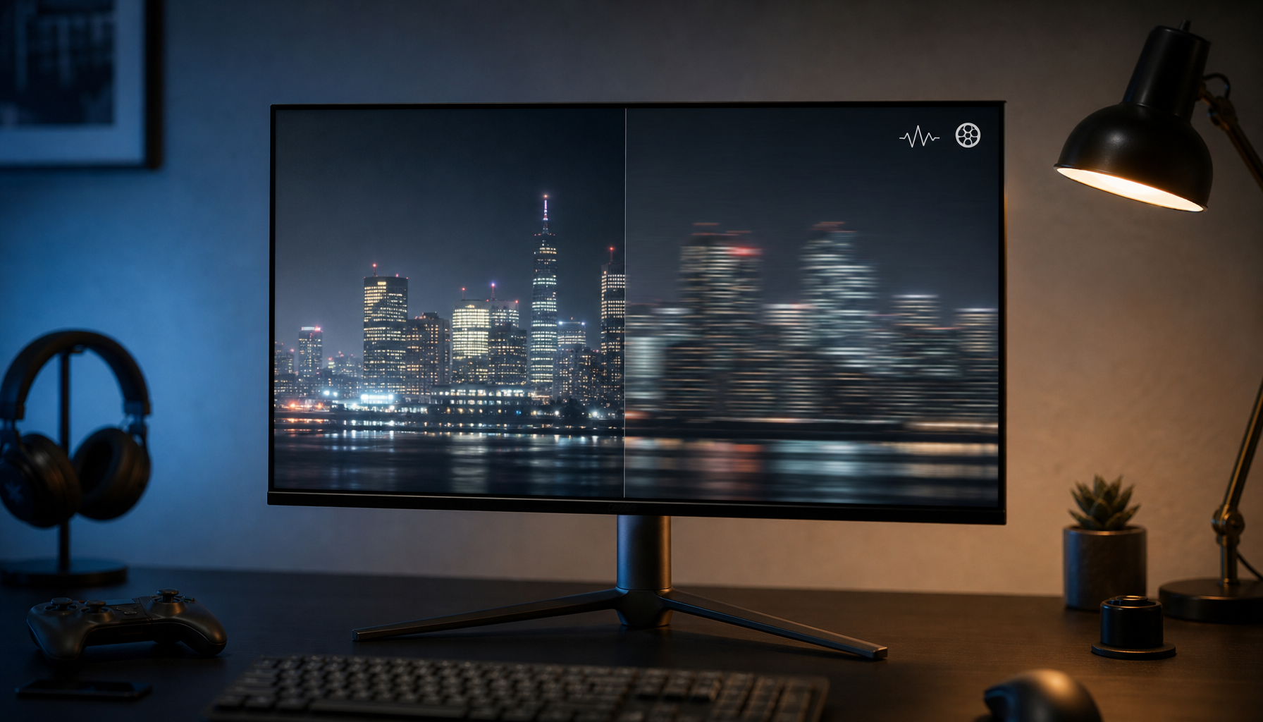
On a multi-monitor desk, mismatched gamma is one of the fastest ways to spot an uncalibrated setup. Drag a neutral gray browser window from one screen to another. If one screen makes it look smoky and the other makes it look dense, the difference may not be color temperature; it may be gamma tracking.

How to Set Gamma Without Overcomplicating It
Start with the monitor’s standard, sRGB, creator, or custom mode rather than vivid, racing, movie, or dynamic contrast modes. Set brightness for the room first, because a monitor at 350 nits in a dim apartment can make every gamma choice feel wrong. Then set contrast near the factory default unless a test pattern shows clipping.
Next, choose gamma 2.2 for general use. Use a grayscale ramp or black-level test pattern and check whether the darkest visible steps are distinct without making black look gray. MIT’s gamma test directions emphasize viewing the pattern at correct size and using distance or squinting to compare numbered swatches, which is useful for a quick visual sanity check even if it does not replace a colorimeter.
If your monitor offers only “Gamma 1,” “Gamma 2,” and “Gamma 3,” do not assume the middle option is correct. Test each preset against the same grayscale image. The right one usually preserves near-black detail, keeps mid-gray from glowing, and avoids bleaching bright textures.
Pros and Cons of Changing Gamma
Changing gamma can solve real viewing problems. It can recover shadow visibility in games, make web content look more natural, improve perceived contrast, and help a portable screen adapt to changing light. It is also a no-cost adjustment, which makes it one of the highest-value settings in a monitor menu.
The downside is that gamma can become a shortcut for the wrong problem. If your screen is too bright, lower brightness before lowering gamma. If whites are clipped, fix contrast before changing gamma. If colors look oversaturated, check color mode or gamut clamp before blaming gamma. Poor gamma can waste a display’s dynamic range, but gamma cannot rescue a panel with weak native contrast or heavy glare.
Best Gamma Settings by Use Case
For a gaming monitor used in mixed lighting, gamma 2.2 is the best first setting. Adjust inside the game only when a title provides its own visibility screen. For esports, a slightly lower effective gamma can improve dark-area visibility, but it should be treated as a competitive preference, not accurate image reproduction.
For office productivity, stay near 2.2 and tune brightness to the room. That combination usually gives the best balance of readable text, controlled whites, and clean gray UI separation.
For movies in a dark room, try 2.4 or a video-focused preset if the display has enough shadow detail. One gamma comparison frames 2.2 as better for brighter spaces and darker cinematic viewing as better at 2.4, which matches the practical experience of switching between desk work and night viewing.
For portable smart screens, use 2.2 as the reliable baseline. If the screen is outdoors, near a window, or connected to a handheld gaming device, a lower gamma-like game setting may help visibility, but avoid making black permanently gray.
The Bottom Line
Gamma is not a mystery setting to ignore; it is the tone-control backbone between black and white. Start at 2.2, adjust brightness and contrast first, then move gamma only when the room, content, or game clearly calls for it. A well-set display does not just look better; it lets the screen give you the information you paid for.


