

Some apps still look terrible on high-DPI displays because they were built for an older 96 DPI world, then stretched, blurred, or mis-sized by the operating system. The screen is sharp; the app’s scaling logic is usually the weak link.
High Resolution Is Not the Same as High-DPI Support
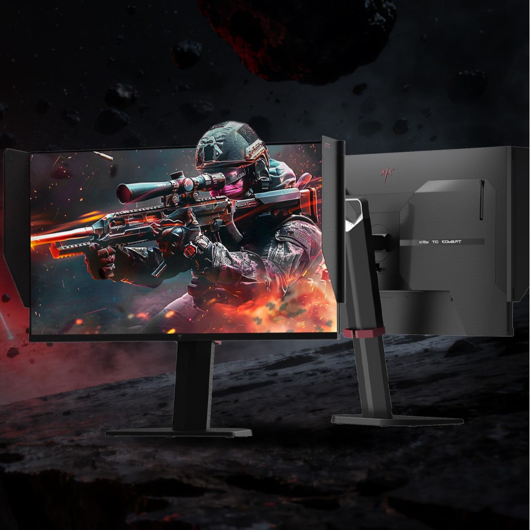
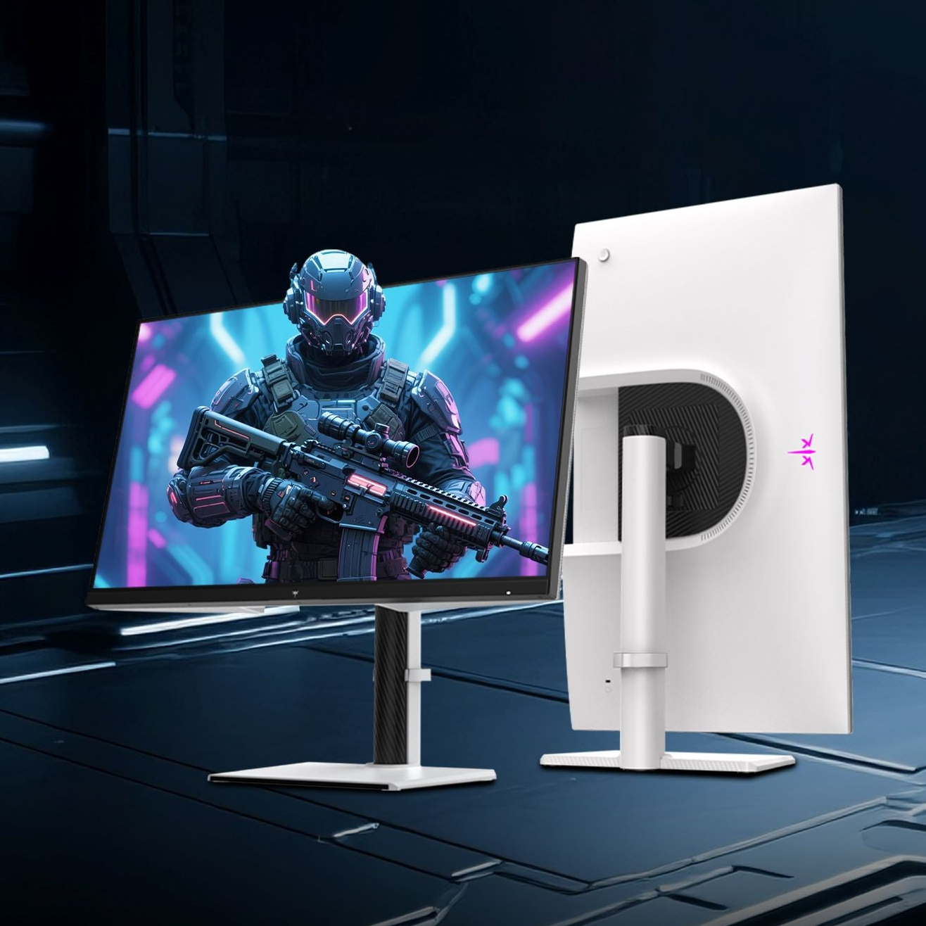
A 4K monitor gives you far more pixels than a 1080p screen, but software still has to know how large menus, buttons, icons, and text should appear. If an app assumes every display behaves like a low-density monitor, its interface can become tiny, oversized, or fuzzy.
That is why an old utility may look rough on a premium gaming monitor while a browser looks clean. Modern apps often use density-aware layout units and scalable assets, while legacy desktop apps may still rely on fixed pixel dimensions.

For designers and developers, the key distinction is that screen density is about how many pixels fit into physical space, not just the resolution number; PPI describes density more accurately than raw pixel count.
The Big Culprit: Fixed-Pixel Interfaces
Many older apps were designed around fixed pixel sizes: a 32-pixel icon, a 400-pixel dialog, or a toolbar that never expected 150% or 200% scaling. On a high-DPI laptop or monitor, those choices break fast.
The operating system tries to help by scaling the app, but that can turn crisp UI into a soft bitmap. This is why text may look smeared, icons may look enlarged, and panels may feel slightly off even when the app is usable.
A common baseline is 100% scaling, often treated as 96 DPI. At 150% scaling, the interface needs to become 1.5 times larger without losing clarity. Apps that cannot redraw themselves properly at that size are the ones that disappoint.
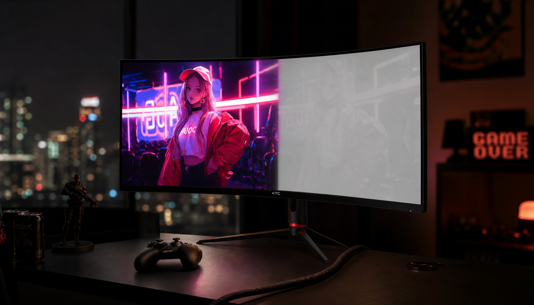
Mixed-Monitor Setups Make It Worse
The hardest setup is also one of the most common: a high-DPI laptop beside a standard external monitor. A 15-inch 4K laptop might run at 200% scaling, while a 24-inch 1080p office display runs at 100%.
If an app cannot adapt when dragged between displays, it may look perfect on one screen and comically large or unusably small on the other. Users have reported mixed-DPI pain, where the interface failed to resize correctly across monitors.

For productivity, this matters. A dual-display workflow should feel seamless, not like switching between two different eras of software.
What Users Can Try Before Replacing the App
The operating system includes compatibility tools that can improve older desktop apps, especially legacy GDI-based software. The most useful option is often the per-app high-DPI override.
Try this quick path:
- Right-click the app shortcut or .exe.
- Open Properties, then Compatibility.
- Select Change high DPI settings.
- Enable Override high DPI scaling behavior.
- Test System, then System (Enhanced).

The System Enhanced option can make some older apps render text and interface elements more cleanly, but it is not universal. Bitmap icons, custom graphics, and older rendering engines may still look soft.
Compatibility scaling can make an app usable, but true high-DPI support from the developer is still the cleaner long-term fix.
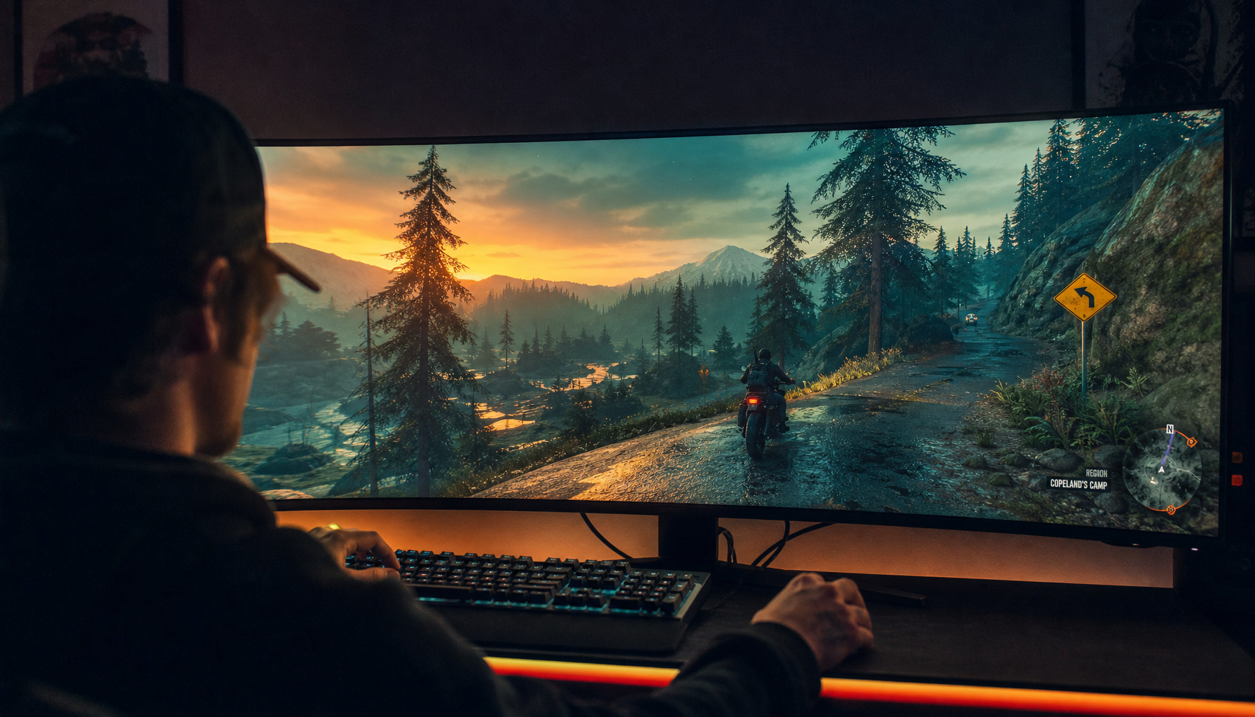
What Better Apps Do Differently
Well-built high-DPI apps do not simply stretch old pixels. They scale layouts, redraw text at the target density, load sharper image assets, and respond when the app moves between displays.

That is why modern creative tools, browsers, office suites, and games tend to feel more natural on premium monitors. They respect the panel’s density instead of treating it like a magnified 1080p screen.
For buyers, the lesson is simple: a high-performance display deserves software that can keep up. For developers, the mandate is even clearer: support high-DPI properly, test across mixed-monitor setups, and never assume one pixel size fits every screen.


