


Syntax highlighting can look faded, muddy, or nearly identical when a display handles contrast, gamma, color gamut, coating, or sharpness poorly. The fix is partly software settings, but the biggest gains often come from choosing and tuning a monitor for readable sRGB code colors rather than chasing only refresh rate, HDR, or size.
Have you ever moved the same code editor from a laptop to a gaming monitor and suddenly lost the difference between comments, strings, variables, and errors? In controlled color-coded reading tasks, non-analogous color schemes and two-color groupings helped people find information faster under strict time limits, which shows that color separation matters when your eyes are scanning quickly. This guide explains why displays change the way syntax colors look and how to buy or adjust a monitor so code stays clear.

Why the Same Code Theme Looks Different on Different Displays
Syntax colors depend on more than hue
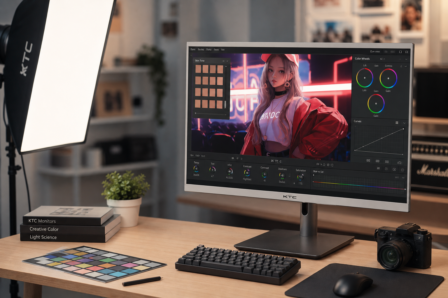
A code theme may define a keyword as blue, a string as green, and a comment as gray, but your eye does not read those colors as pure labels. It reads the difference between the foreground color, the background, the surrounding text, and the display’s brightness behavior. Color accessibility depends on hue, saturation, and especially luminance, while room lighting, viewing distance, font size, pixel density, and display conditions can all change perceived separation color accessibility.
That is why two monitors can show the same #4caf50 green differently. One may make it crisp against a dark editor background; another may push it toward gray, glow it slightly, or compress it into the same brightness range as blue and yellow. For syntax highlighting, the problem is often not “wrong color” in a simple sense. It is that the monitor makes different tokens land too close together in perceived brightness or saturation.

Contrast ratio is not the whole answer
A color-coded reading study standardized text-to-highlight contrast at about 5.55:1, above the common 4.5:1 accessibility threshold for normal text, yet users still performed differently depending on the color scheme. Across 123 tasks with an 8-second limit per item, non-analogous schemes improved overall performance, dichromatic schemes reduced response time, yellow-inclusive schemes were faster and more preferred, and red-inclusive schemes were slower and least favored color-coded reading study.
For monitor shoppers, that means a technically acceptable contrast ratio does not guarantee that code colors will feel distinct. If your editor theme uses several colors with similar luminance, a weak display can make them merge. This is especially noticeable on dark themes where comments, inactive code, line numbers, and muted variables often sit in a narrow gray-blue range.
Display Traits That Make Syntax Highlighting Look Washed Out
Color accuracy, gamut, and gamma
For coding, the most predictable target is still sRGB because browsers, many editor themes, and much everyday screen content are built around it. A monitor with poor sRGB tracking can undersaturate colors so they look dull, or oversaturate them so a carefully balanced theme becomes loud and uneven. Practical accuracy testing often looks at sRGB gamut area, white balance error, color temperature, gamma, and color error; useful targets include more than 90% but less than 110% sRGB gamut area, grayscale and color error below 3, gamma around 2.2, and color temperature near 6500K color accuracy.
Gamma is a major reason washed-out code happens. If a monitor lifts dark grays too much, a dark theme loses depth and muted syntax colors become chalky. If gamma crushes darker tones, comments and dimmed code can sink into the background. A quick check is to open your editor with a dark theme and compare normal text, comments, selected text, and line numbers; if everything below mid-gray looks either foggy or clipped, the issue is probably not your theme alone.
Panel contrast and black depth
Panel contrast affects how much separation exists between background, text, and muted syntax colors. A low-contrast display makes black backgrounds look gray, which can reduce dark-mode clarity, while high contrast can make light tokens stand out more cleanly against a dark editor dark-mode clarity.
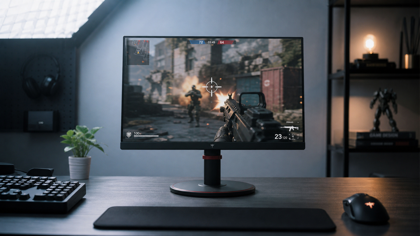
This matters for gaming monitors because many buyers focus on refresh rate first. A high-refresh-rate display can feel excellent for motion, but if its black levels are weak or its default picture mode is tuned for punchy games instead of stable desktop color, a dark editor may look flat. For code, motion clarity is useful when scrolling, but static legibility comes from contrast, gamma, sharpness, and color consistency.
HDR and wide-gamut modes
HDR and wide-gamut modes can make games and video look more dramatic, but they can also make code themes look wrong when regular sRGB desktop content is stretched into a wider color space. Blues may become electric, reds may dominate, and muted grays can pick up a color cast. If your syntax highlighting looks different after enabling HDR, a vivid mode, or a game preset, switch the monitor back to an sRGB, standard, creator, or custom mode and compare.
The goal is not to avoid wide-gamut monitors. It is to make sure they provide a restrained desktop mode for coding. A display that can cover a wider gamut but also clamp accurately to sRGB is more useful than one that only offers oversaturated presets.
Panel, Coating, and Text Sharpness Issues
Matte coatings, glossy coatings, and glare
A matte coating can reduce reflections from windows and overhead lights, which helps during long coding sessions. The tradeoff is that some matte surfaces add a faint haze, reducing perceived vibrancy and edge clarity. Glossy coatings can preserve stronger color and contrast in a controlled room, but they can also reflect lamps, bright walls, or your own shirt, making dark themes harder to read.
A practical setup test is simple: place the monitor where you normally code, open a file with comments, strings, errors, and selected text, then turn on the lighting you actually use at night and during the day. If comments become hard to distinguish only when the room is bright, the coating and peak brightness matter more than the theme. A display with adequate brightness and a glare-controlled surface will usually be easier to live with than a more vivid screen that constantly reflects your workspace.

Pixel density and subpixel clarity
Syntax highlighting fails faster when text edges are already soft. High resolution and high pixel density make fonts sharper, which helps long coding sessions because color boundaries around small glyphs become easier to see crisper fonts.
A 27-inch 2560×1440 monitor is often a practical middle ground because it gives more code space than 1080p while usually remaining usable at arm’s length without aggressive scaling. A 4K display can look cleaner, especially at 27 or 32 inches, but operating system scaling and app behavior need to be comfortable for your workflow. Ultrawide monitors add horizontal room for side-by-side files, while portrait or taller displays show more vertical code; both can help, but neither fixes poor contrast or color tuning by itself.
Choosing Monitor Specs for Clearer Syntax Highlighting
What matters most for code readability
When buying a display for coding, prioritize resolution, pixel density, contrast, sRGB behavior, viewing angles, coating, and ergonomics before flashy color modes. Programming monitor guidance commonly emphasizes size, eye-care features, connectivity, and high pixel density, while HDR, very high refresh rate, and ultra-low response time are usually less important for coding than for gaming or media work programming monitor priorities.
That does not mean gaming features are useless. A 120 Hz or higher refresh rate can make scrolling, window movement, and mouse tracking feel smoother. But if the same monitor ships in an aggressive game mode with boosted saturation, altered gamma, edge enhancement, or dynamic contrast, those settings can hurt code color separation. For a mixed gaming-and-coding setup, use one calibrated or standard profile for work and a separate game profile for play.

Comparison table: what to check before buying or tuning
Parameter |
What It Changes in Code |
Better Target for Syntax Highlighting |
Warning Sign |
sRGB coverage and clamp |
Whether theme colors look intended or exaggerated |
Close to full sRGB with an accurate sRGB/standard mode |
Greens and reds look neon, or all colors look dull |
Gamma |
Brightness spacing between dark, mid, and light tones |
Around 2.2 for typical desktop use |
Comments vanish or dark themes look gray |
Contrast |
Separation between background and text |
Strong native contrast for your preferred light or dark theme |
Black editor background looks foggy |
Pixel density |
Font edge sharpness and color boundary clarity |
1440p at 27 inches or higher-density options if scaling works |
Thin fonts shimmer, blur, or look uneven |
Coating |
Reflection control and perceived clarity |
Matte for bright rooms, glossy only in controlled lighting |
Reflections hide dark syntax colors |
Viewing angle |
Color consistency across large or side displays |
Stable color when viewed off-center |
Side monitor colors shift when angled |
Refresh rate |
Motion smoothness while scrolling |
Useful bonus, not the main readability spec |
Smooth scrolling but poor static text clarity |
For ultrawide monitors, also check uniformity. A very wide panel can look different at the far left and right edges if viewing angles are weak or the curve creates reflections. For portable monitors, confirm the panel type, USB-C power behavior, brightness, and whether the display can run a restrained color mode rather than a single oversaturated preset.
Fixes You Can Try Before Replacing the Monitor
Start with display settings
First, disable dynamic contrast, vivid color, black equalizer, blue-light modes that heavily warm the image, and any game preset that changes gamma. Then choose an sRGB, standard, custom, or creator-style mode if available. Set brightness for the room rather than maxing it out; a monitor that is too bright can make light themes tiring and dark themes look washed by eye adaptation.
Next, check your operating system’s scaling and font rendering. Small fonts can make color differences harder to perceive, especially on portable monitors or dense 4K panels. 16px text is generally readable for normal vision, but users with reduced acuity may need much larger text, and very large text can eventually slow reading font size and luminance. For coding, moving from a cramped 12 px editor font to 14-16 px often improves both shape recognition and color separation.
Then adjust the editor theme
If the monitor is basically sound, change the theme before replacing hardware. Prefer non-analogous syntax colors for categories you must distinguish quickly: for example, avoid making comments, strings, and function names all muted blue-green. Research on color-coded reading found that contrasting, non-analogous schemes helped users locate labeled text faster than more similar schemes, even when contrast ratios were controlled non-analogous schemes.
Use fewer colors if your theme feels noisy. Some critics of syntax highlighting argue that too many token colors can break reading flow and pull attention toward surface syntax rather than meaning syntax highlighting. A practical compromise is to keep strong colors for comments, strings, errors, search matches, and changed lines, while letting ordinary identifiers and punctuation stay closer to the main text color.
Action checklist
- Set the monitor to sRGB, standard, custom, or creator mode for coding.
- Turn off dynamic contrast, vivid color, black equalizer, and aggressive game presets.
- Match brightness to the room; do not use maximum brightness unless glare requires it.
- Use a code font size around 14-16 px as a starting point, then adjust for distance and eyesight.
- Pick a theme with clear luminance differences, not just different hues.
- Test comments, strings, errors, selections, and search highlights on both light and dark themes.
- If using multiple monitors, tune each one separately instead of assuming one profile fits all.
Special Cases: Gaming, Ultrawide, and Portable Setups
Gaming monitors
A gaming monitor can be excellent for coding if it has stable text clarity and a sane color mode. The problem is that many gaming presets are designed to make shadows, enemies, or effects pop, not to preserve editor colors. If syntax highlighting looks pale after switching from a laptop to a high-refresh display, check the picture mode before blaming the panel.
For hybrid use, save separate profiles. Use a work profile with moderate brightness, correct gamma, and restrained sRGB color. Use a gaming profile for higher brightness, HDR, variable refresh features, or genre-specific tuning. Keeping those separate prevents your code editor from inheriting settings meant for fast motion and high contrast game scenes.
Ultrawide and multi-monitor desks
A single wide display can reduce bezel gaps and make side-by-side coding comfortable, but it can also create window-management and viewing-angle issues. Large single-screen setups, including common 3440×1440 ultrawides, provide a wide workspace, while very large displays may require better tiling habits and can make full-screen apps take over too much space ultrawide workspace.
For syntax colors, the key is consistency across the panel. If the far left side looks warmer or dimmer than the center, your file tree, terminal, and editor may not match visually. Curved panels can help keep edges facing you, but they can also introduce reflection patterns depending on lighting, so evaluate them at your actual desk depth.
Portable monitors
Portable displays are convenient for travel, laptop coding, and temporary dual-screen setups, but they often compromise brightness, contrast, coating, or color controls. A portable monitor connected by USB-C can simplify a desk because one cable may carry display signal and power, but convenience does not guarantee color accuracy.
When shopping for a portable coding display, look for enough brightness for the places you work, a panel with stable viewing angles, readable pixel density, and manual controls for brightness and color mode. If the display only has vague presets like “movie,” “game,” and “eco,” it may be harder to make syntax highlighting consistent with your main monitor.
FAQ
Q: Why do comments look readable on one monitor but almost invisible on another?
A: Comments are often styled in low-saturation gray, blue-gray, or green-gray. If a monitor has weak contrast, lifted blacks, poor gamma, or a matte haze, those muted colors can collapse into the editor background. Increase comment brightness or saturation in the theme, then check whether the monitor’s gamma or black-level settings are making all dark tones too similar.
Q: Is dark mode worse for syntax highlighting?
A: Not automatically. Dark mode can be excellent on a display with strong contrast and clean gamma, but it exposes weak black levels quickly. Light mode can be more readable on low-contrast monitors or in bright rooms, though very high brightness may cause fatigue. Test both with your normal lighting instead of assuming one is universally better.
Q: Should I buy a high-refresh-rate monitor for programming?
A: A high refresh rate can make scrolling and cursor movement feel smoother, but it should not outrank text clarity, contrast, gamma, sRGB behavior, and ergonomics. For a monitor used mainly for coding, treat high refresh as a useful bonus. For a mixed gaming and programming setup, make sure the display has a neutral work mode as well as gaming modes.
Practical Next Steps
If your syntax highlighting looks washed out, start with settings before replacing hardware: use a neutral color mode, disable game-style processing, adjust brightness, and try a theme with stronger luminance separation. If those changes do not help, the limiting factor is likely the display’s panel contrast, gamma behavior, coating, pixel structure, or color accuracy.
For a new monitor, do not buy only by size, refresh rate, or advertised color volume. Choose a display that makes text sharp, keeps sRGB content controlled, offers stable viewing angles, handles glare in your room, and lets you save a work-friendly profile. Clear code color is not about making every token brighter; it is about making the right differences easy to see for hours.
References
- What Color Scheme is More Effective in Assisting Readers to Locate Information in a Color-Coded Article?
- Web Accessibility: Understanding Colors and Luminance
- Using Color to Enhance Spreadsheet Accuracy and Usefulness
- A Case Against Syntax Highlighting
- Code Colorizing and Readability
- The Ideal Monitor Setup for Programming
- The Impact of Colour Themes on Code Readability
- Applying Color Theory to Digital Displays
- How to Choose the Best Portable Monitor for You


