


A work monitor fits your home decor when you treat it as both a performance tool and a design object, balancing size, panel quality, stand choice, cable routing, lighting, and the visual frame around the screen.
Does your home office look calm until the monitor wakes up and turns the desk into a command center you never meant to show guests? A cleaner setup can reclaim desk space, reduce visual clutter, improve viewing comfort, and make long work sessions feel more intentional without sacrificing screen quality. Here is how to make the display look integrated, not imposed.
Why Monitors Clash With Home Decor
A monitor is usually the darkest, most geometric object in a room. It has a black glass face, visible cables, a technical stand, and often a scale that competes with art, lamps, shelves, and furniture. That is why a good screen can still look wrong in a living room corner, bedroom office, or open-plan apartment.
The core mistake is choosing a monitor only by specs or only by looks. For serious work, the screen must still perform. Graphic and visual workflows depend on accurate color, stable viewing angles, and enough resolution to judge detail; graphic design monitors are commonly evaluated around color reproduction, resolution, calibration, and connectivity for that reason. The aesthetic solution is not to hide quality. It is to make quality visually disciplined.
Start With Scale: The Monitor Must Fit the Desk and the Room
A 32-inch screen can look premium in a dedicated office and overwhelming on a 42-inch writing desk. A 24-inch or 27-inch display often fits better in mixed-use rooms because it gives you real workspace without turning the desk into a media wall. For many office, design, and productivity users, a 27-inch display at 1440p or 4K is the practical sweet spot: it keeps text readable, gives room for side-by-side windows, and still leaves space for a lamp, notebook, speakers, or small plant.

Desk depth matters as much as screen width. Minimal desk guidance often recommends at least 2 ft of depth, while dual-monitor setup guidance commonly places screens about 20 to 40 inches from your eyes; dual-monitor workspaces also benefit from tight spacing between displays to reduce head movement. In a real room, that means a 27-inch screen on a shallow console may look stylish in photos but feel cramped after two hours of spreadsheet work.
Setup Type |
Best Visual Fit |
Practical Tradeoff |
24-inch single monitor |
Small rooms, bedroom desks, compact nooks |
Less room for multitasking |
27-inch single monitor |
Most home offices and hybrid work desks |
Needs decent desk depth |
29-34 inch ultrawide |
Clean alternative to two screens |
Wider visual footprint |
Dual 24-27 inch monitors |
Finance, coding, operations, heavy multitasking |
More cables and stronger need for symmetry |
Choose a Display That Looks Calm From Every Angle
Panel type affects both performance and how refined the setup feels. IPS panels are widely favored for creative and productivity work because they hold color and contrast more consistently from angled views. That matters in a home setting where the screen may be seen from a sofa, doorway, or dining area, not just from the chair.
For design-sensitive work, a monitor should prioritize color accuracy and viewing stability over decorative extras. Monitor guidance for creative work recommends IPS monitors for better color accuracy and stable colors at different viewing angles. The decor implication is simple: a good panel lets you place the display naturally in the room instead of forcing a perfect straight-on viewing position that may disrupt furniture layout.
TN panels can be fast and inexpensive, which is useful for some gaming-first setups, but they tend to have weaker viewing angles and color consistency. VA panels can offer stronger contrast and deeper blacks, which may look rich in dim rooms, though they are not always the best choice for color-critical work. IPS remains the safest all-around choice when the same screen must handle office productivity, creative review, and a polished home-office look.
Use the Stand, Arm, or Shelf as the Design Bridge
The stock monitor stand often determines whether a setup looks intentional or temporary. A bulky black stand can break the visual line of a wood desk, while a slim metal arm can make the display appear lighter. A desk shelf can also help by lifting the monitor to a better height and creating a horizontal design layer beneath it.
Aesthetic desk setup sources consistently treat the desk, storage, and accessories as one visual system, not separate purchases; aesthetic desk setup guidance often starts with infrastructure such as a durable desk, monitor stand, keyboard tray, drawers, and cable-friendly accessories. In practice, a walnut desk shelf under a black monitor can connect the screen to warm furniture, while a matte white monitor arm can disappear against a white wall.

Ergonomics should set the boundaries. The top of the screen should sit near eye level or slightly below, and your neck should stay neutral. If the monitor looks good only when it is too low, the setup is not finished. Use a riser, shelf, or arm that matches the room materials, then fine-tune height and tilt for comfort.
Hide the Cables Before You Buy More Decor
Visible cables are the fastest way to make a premium monitor look messy. Cable management is not a cosmetic afterthought; it is the structure that lets the monitor blend into the room. A clean setup usually needs a rear cable channel, hook-and-loop ties, an under-desk tray, and a power strip mounted where it is accessible but not visible from the main sightline.
Home office design advice repeatedly connects organization with better mood and smoother workflow; smart storage keeps equipment within reach but out of sight. For a monitor, that means routing power, video, USB-C, webcam, light bar, and speaker cables as one controlled bundle instead of letting each line find its own path.
A simple count helps. If your monitor has power, video, USB upstream, webcam, speaker, and light-bar cables, you may have six lines leaving one screen area. Add a laptop charger and phone cable, and the desk can show eight visible cords before you even place a notebook. A single under-desk tray and one rear cable sleeve can reduce that visual load to one neat drop.

Match the Monitor to the Decor Style
A monitor does not need to be invisible. It needs to have a visual role. In a minimalist room, choose a slim-bezel display, a single-color desk mat, a low-profile keyboard, and hidden storage. In a warm traditional room, use a wood shelf, brass lamp, fabric pinboard, or framed art to soften the black rectangle. In an industrial room, a black arm, dark wood desktop, metal lamp, and exposed shelving can make the monitor feel deliberate.
The best home-office designs make furniture match the broader home rather than looking like a generic cubicle; home office furniture can also create work-life boundaries through location, curtains, closet offices, or a dedicated room. This matters when your monitor lives in a guest room or living space. A visual boundary, such as a curtain, bookcase, wall color block, or compact desk zone, helps the display feel assigned rather than abandoned.
Color discipline does more than style the desk. If your monitor is black, repeat black once or twice through a lamp, picture frame, chair base, or speaker grille. If the room uses light oak and white, choose white accessories and let the black screen be the single contrast point. If you have dual monitors, matching sizes and bezels will usually look calmer, though a vertical secondary screen can work well for code, chat, or documents when space is tight.
Control Light So the Screen Does Not Fight the Room
Light is where decor and display performance meet. Natural light can make a workspace feel energized, but glare can make even a premium monitor unpleasant. The goal is side light, not direct light. Place the screen perpendicular to a window when possible, use curtains or blinds to cut reflections, and add a desk lamp or monitor light bar for evening work.
Desk setup guidance often recommends natural light with glare control, while minimal setup advice warns that poor lighting can contribute to eyestrain and headaches; positioning near windows is also often paired with gradual layout refinement. A practical test is simple: if you keep pushing brightness high just to read comfortably in the afternoon, the room lighting is not supporting the monitor.
Warm ambient lighting makes a screen feel less harsh in a living area, while cooler task lighting can help focus during detailed work. Avoid placing bright bulbs behind your head where they reflect in the panel. Bias lighting behind the monitor can also soften the contrast between the bright screen and a dark wall, especially for evening gaming, editing, or long spreadsheet sessions.
Build the Wall Around the Screen
The wall behind the monitor can either expose the screen as a black block or absorb it into a composition. A single large artwork, two balanced frames, a cork board, a shallow shelf, or a painted color zone can give the eye a larger design field. The key is scale. Tiny objects around a large monitor make the screen look even bigger.
For home offices, designers often recommend balancing personalization with control: art, plants, and accessories should make the space feel finished without becoming distracting; personalization supports comfort and motivation. A 27-inch black monitor against a blank white wall can look severe. The same monitor below a 36-inch framed print, with a plant on one side and a lamp on the other, reads as part of a workstation.

Avoid overdecorating the immediate sightline. If your work involves design review, writing, coding, or competitive gaming, busy wallpaper directly behind the display can compete with the screen. Use texture and art around the monitor, but keep the central viewing zone visually quiet.
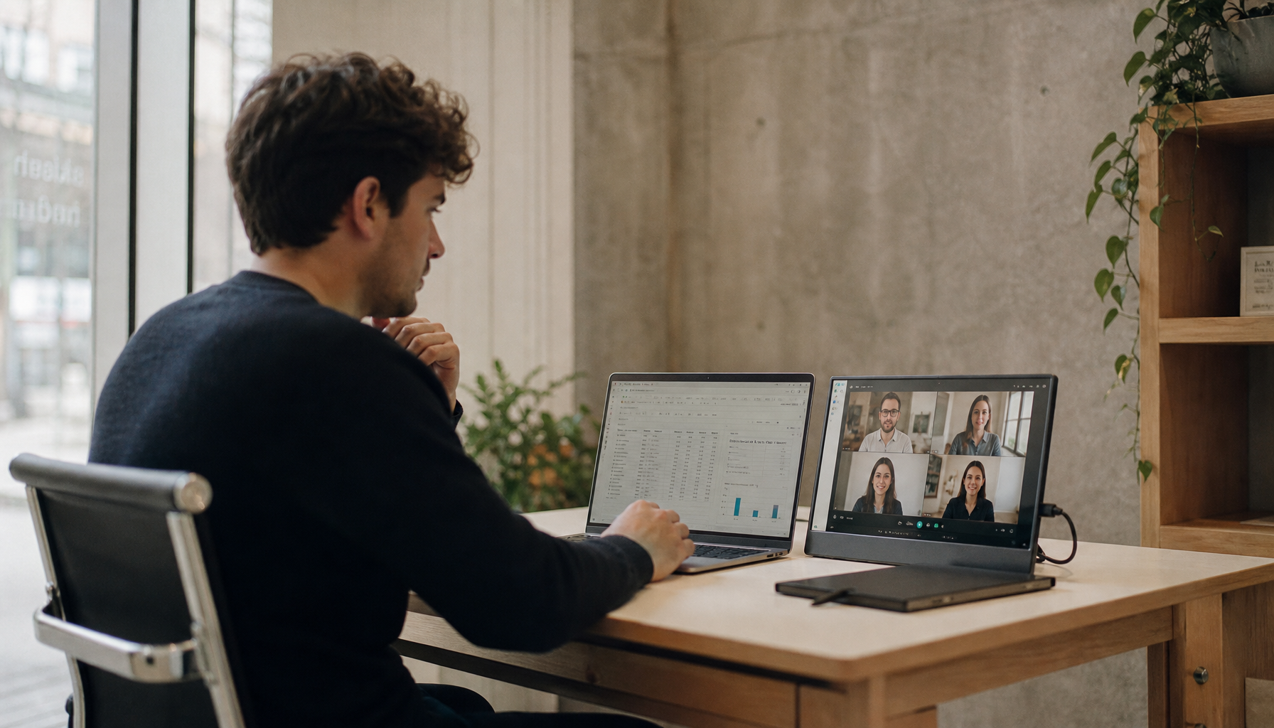
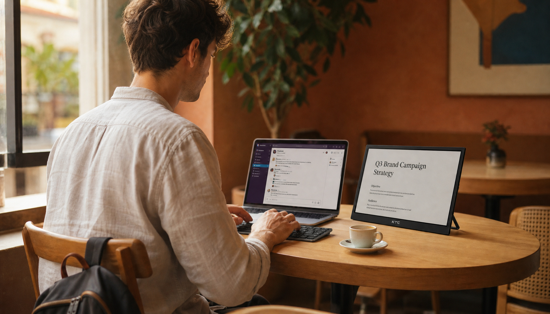
When Multiple Monitors Are Worth the Aesthetic Cost
Dual monitors can be visually demanding, but they are justified when the workflow needs persistent reference material. Developers, analysts, project managers, streamers, and finance users often gain more from two screens than from a perfectly minimal desk. The aesthetic challenge is to make the pair look like one tool.
A dual setup works best when the displays share size, height, brightness, and bezel style. If they differ, give each a purpose: place the primary screen centered and make the secondary vertical for documents, chat, dashboards, or timelines. Home office setup guidance notes that multiple monitors can support productivity by letting users reference documents, email, and data at the same time. That benefit is real, but only if the setup remains comfortable and organized.
An ultrawide monitor can be a cleaner alternative. It removes the center gap and reduces cable count, but it can dominate a small desk. For decor-first spaces, a 29-inch or 34-inch ultrawide on a clean arm often looks more refined than two mismatched office monitors. For performance-first work, two matching 27-inch displays may still be better for your daily workflow.
Pros and Cons of Making the Monitor a Design Feature
Treating the monitor as part of the decor has clear upside. The room feels more finished, the desk becomes easier to maintain, and the setup is more pleasant to use for long sessions. It also encourages better choices around ergonomics, lighting, storage, and cable routing.
The downside is that aesthetic decisions can become expensive or restrictive. A beautiful low-profile monitor may lack the ports you need. A thin stand may not adjust enough. A white monitor may match the room but offer weaker specs than a better black model at the same price. For work that depends on accurate color, resolution, or refresh performance, function should set the floor and style should refine the final choice.
A Practical Setup Formula
Start with the screen size your work actually needs, then choose a panel and resolution that protect performance. Put the monitor on an adjustable arm or shelf that matches the desk material. Route every cable before adding decor. Add one task light, one background or side light, and one visual anchor behind the screen. Finish with two or three repeated materials or colors so the monitor belongs to the room.
A strong home monitor setup is not about hiding technology. It is about giving the display a clear job, a clean physical footprint, and a visual language that respects the rest of the home. When the screen performs well and looks settled, the desk stops feeling like borrowed office equipment and starts working like a focused, comfortable workspace.


