


Contrast ratio affects eye strain most when it changes how easily your eyes can separate text, shadow detail, and bright UI elements from a dark background. The best comfort usually comes from usable contrast, matched brightness, low glare, and correct signal settings, not simply the highest contrast number on the box.
Ever finish a late-night gaming session, code review, or dark-mode spreadsheet run with dry eyes, gray-looking text, or dull pressure behind your brow? A practical calibration pass can make dark scenes readable without blasting your eyes with bright highlights or burying detail in black. You’ll learn how contrast works, when high contrast helps, when it backfires, and how to tune a monitor for long dark-content sessions.
What Contrast Ratio Really Means
Display contrast ratio is the difference between the brightest white and darkest black a monitor can show. For dark-content viewing, that matters because your eyes spend hours trying to distinguish near-black UI panels, game shadows, subtitles, cursor edges, and small text against a low-luminance background. The Canadian Centre for Occupational Health and Safety defines image contrast as the ratio between white and black brightness a monitor can reproduce, and it notes that office displays are usually described by static contrast rather than dynamic contrast.
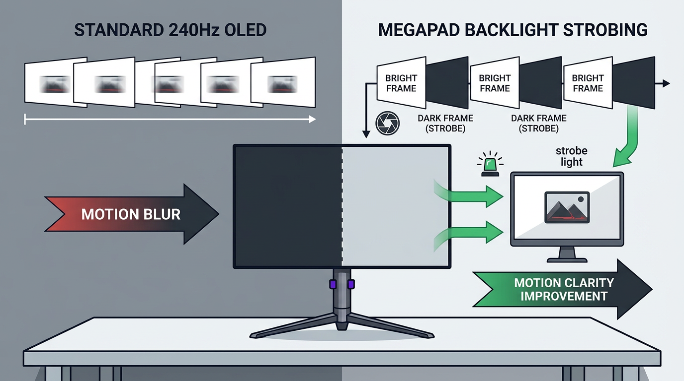
Static contrast is the useful everyday number. It describes bright and dark tones in the same image, which is what matters when your HUD, browser tabs, IDE, or video timeline stay on screen together. Dynamic contrast is less useful for productivity and competitive play because it can shift brightness scene by scene. In dark games or video, that shifting may make black levels look dramatic, but it can also cause unstable shadow visibility.
A monitor advertised at 1,000:1 may be perfectly serviceable for office work, while a VA, OLED, or higher-contrast IPS panel can look deeper and more dimensional in dark scenes. Still, more contrast is not automatically more comfortable. CCOHS notes that the human eye can perceive contrast changes up to about 1,000:1, while differences above 500:1 become less noticeable in many practical viewing situations. That does not make premium contrast pointless; it means you should judge it by readability, black detail, and glare control rather than a spec-sheet race.
Why Dark Content Can Feel Comfortable at First, Then Fatiguing
Dark mode often feels calmer because it reduces the amount of bright light coming from the display. That is valuable in a dim room, especially when a white document or browser page feels like a flashlight. But during extended viewing, your visual system still needs clear edge definition. If the monitor is too dim, if text contrast is weak, or if blacks are crushed, your eyes work harder to resolve fine detail.

Screen-related discomfort is not usually permanent eye damage; it is often temporary digital eye strain from long near-focus work, dryness, glare, and poor setup. The American Academy of Ophthalmology states that digital screen use can cause blurry vision, aching, dryness, tearing, stinging, and irritation, while recommending brightness adjustment, glare reduction, regular breaks, and increased contrast to reduce visual effort.
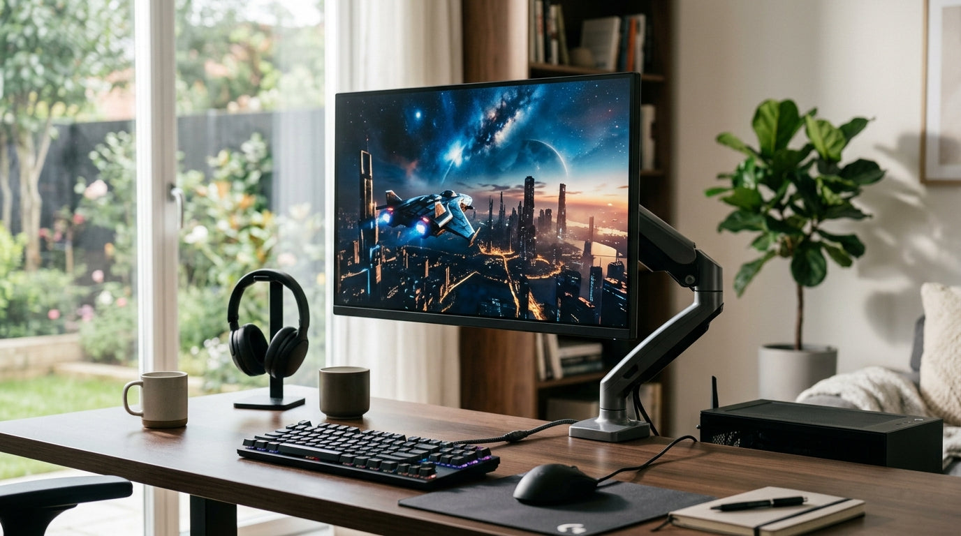
The dark-content trap is simple: you lower brightness to make the screen gentler, then compensate by squinting at gray text, compressed shadows, or faint UI lines. In a real setup, that might look like a 32-inch 4K monitor in a dark apartment, set to very low brightness, running a code editor theme with charcoal panels and medium-gray text. The screen is no longer glaring, but the letters have poor separation, so every line costs more effort.
High Contrast: The Benefits and the Tradeoffs
High usable contrast gives dark scenes more depth, makes black backgrounds look less washed out, and helps separate light text from dark UI. For pro gaming, that can make enemy silhouettes, map geometry, and low-light transitions easier to read. For productivity, it can make dark dashboards, terminal windows, and editing timelines feel cleaner.
The tradeoff is that high contrast can become harsh when bright elements sit inside a dark interface. White subtitles, spreadsheet cells, browser pages opened beside a dark app, or full-bright HUD markers can feel piercing if the room is too dark or the monitor is set too bright. Display-ergonomics research emphasizes that excessively bright screens are a major cause of eye fatigue, while screens that are too dark can also strain the eyes because content becomes harder to see.
There is also a signal-path problem that gets mistaken for “bad contrast.” A forum discussion of HDMI range and black-level mismatches shows a common PC-monitor issue: mismatched settings can make blacks look foggy or crush dark detail, while forcing the wrong RGB range may clip usable black and white levels. That thread is not clinical evidence, but it mirrors a real troubleshooting pattern in monitor tuning: users chase contrast settings when the actual issue is limited RGB, incorrect black level, or TV-style processing over HDMI.
Scenario |
What You See |
Likely Comfort Issue |
Better Adjustment |
High contrast, high brightness, dark room |
Bright text feels sharp but piercing |
Glare-like discomfort from bright elements |
Lower brightness and add soft room light |
Low brightness, dark theme |
Text looks gray or muddy |
Insufficient text separation |
Raise brightness slightly or increase text contrast |
Deep blacks with lost shadow detail |
Game areas look dramatic but unreadable |
Black crush |
Check RGB range and reduce aggressive contrast |
Washed-out blacks |
Dark mode looks foggy |
Limited range or elevated black level |
Match GPU output and monitor input range |
OLED with static dark UI |
Excellent blacks, persistent fixed panels |
Burn-in risk for static elements |
Use screen protection and avoid fixed high-contrast layouts |
The Comfort Zone: Contrast, Brightness, and Room Light Together
The strongest eye-comfort setups balance screen brightness with ambient lighting. For a typical office environment, ergonomic display guidance recommends display brightness around 100 to 150 nits and suggests comparing a white screen with white copy paper under the same room lighting as a practical adjustment method; room lighting that is far brighter or darker than the display can increase fatigue.

For dark-content viewing, translate that into a simple field test. Open the dark app or game you actually use, then place a mostly white window beside it for a moment. If the white window feels painfully bright, the display is too bright for the room. If the dark app looks comfortable but text edges feel vague, the display or theme contrast is too low. If shadow detail disappears, the black level or contrast setting is too aggressive.
A strong monitor setup for long sessions usually has moderate brightness, readable text contrast, a matte or low-reflection surface, and enough indirect room light that the screen is not the only bright object in your field of view. Anti-glare treatment matters because reflections reduce effective contrast. Eye-fatigue guidance recommends non-glare panels or low-reflection films for regular PC work, while the AAO also recommends reducing glare with a matte filter when needed.
Dark Mode, Positive Polarity, and Text Legibility
Dark mode uses light content on a dark background, sometimes called negative polarity. Light mode uses dark content on a light background, or positive polarity. Neither is automatically superior for every user or task. CCOHS notes that positive polarity is less affected by glare and resembles printed text, while user preference should guide the choice.
For long reading, positive polarity often feels more stable because black text on a light background keeps pupils smaller and letter edges crisp in many rooms. For late-night gaming, video editing, trading dashboards, and terminal-heavy workflows, negative polarity can be more immersive and less glaring. The decision should follow the task. A dark IDE with crisp off-white text may be excellent for coding at 10:00 PM, while a long legal document may still read better in light mode with reduced brightness.
Color contrast also matters. CCOHS warns that colors at opposite extremes, such as bright blue and red, can be harder on the eyes because the eye has to refocus between them. In practical terms, avoid neon-blue text on black for long work sessions, and be careful with red alert text on saturated blue panels. For performance setups, save aggressive color contrast for status cues, not body text.
Monitor Type Matters, But Settings Still Decide Comfort
OLED panels can turn pixels off for true black, so dark content looks exceptionally deep. That is powerful for cinematic games, HDR video, and immersive viewing. The downside is that static productivity layouts can create burn-in risk over time, especially with fixed taskbars, HUDs, or bright UI elements. CCOHS notes that OLED monitors can produce very high contrast by turning off pixels for black, while carrying a permanent burn-in risk from static images.
VA panels often deliver stronger native contrast than standard IPS, which can make dark content more satisfying at a value price. IPS panels typically trade some black depth for wide viewing angles and consistent color, while newer higher-contrast IPS variants improve that balance. Uniformity also matters: if one corner is brighter or cooler than another, your eyes may notice uneven dark fields during long sessions. Panel guidance describes screen uniformity as consistent brightness, color, and appearance across the panel, which is especially important when judging visual detail.
For portable smart screens, the issue is often ambient light. A compact display used near a window, on a coffee table, or beside a laptop may need more brightness to overcome reflections. But raising brightness should restore detail, not create a harsh viewing surface. The target is clean separation: black stays black enough, gray detail remains visible, and text does not shimmer or blur against the background.

How to Tune Contrast for Extended Dark-Content Viewing
Start with the monitor in its standard or sRGB-like picture mode if available, because extreme gaming presets often exaggerate contrast, sharpness, and shadow boosting. Set brightness to match the room before touching contrast. In a normal home office or gaming room, many displays land in a comfortable range well below maximum brightness, though the exact on-screen percentage varies by model.
Next, use a black-level and white-level test pattern. You should be able to distinguish near-black steps without turning the whole image gray, and you should see near-white steps without losing highlight detail. If black steps vanish, reduce contrast or adjust black equalizer settings. If whites merge together, lower contrast. If the image looks washed out over HDMI, confirm that the GPU and monitor both use matching full or limited RGB range.
Then tune the content itself. For games, a shadow-boost feature can be useful when it raises dark detail without lifting the entire screen. For productivity, increase editor text brightness or font weight before cranking monitor contrast. For video, avoid dynamic contrast if it causes visible pumping in dark scenes. For office work, the AAO’s recommendation to increase contrast is best understood as improving readability, not pushing the monitor to a harsh maximum.
Finally, protect the eye surface. Contrast tuning cannot fix reduced blinking. The AAO notes that people normally blink about 15 times per minute, but only about 5 to 7 times per minute while using computers or digital devices. During dark-content work, add deliberate blink breaks, look across the room regularly, and keep airflow from blowing directly at your eyes.
Pros and Cons of Higher Contrast for Eye Comfort
Higher Contrast Can Help When |
Higher Contrast Can Hurt When |
Text and UI edges become easier to separate |
Bright text on black feels piercing in a dark room |
Dark game scenes retain depth and shape |
Near-black detail gets crushed |
Reflections are controlled with matte surfaces and room lighting |
Reflections compete with dark content and reduce effective contrast |
Brightness is matched to the environment |
Brightness is left near maximum for hours |
Signal range is correctly configured |
HDMI or RGB mismatch clips blacks or whites |
When to Change the Monitor, Not Just the Settings
If you constantly fight washed-out blacks, poor uniformity, visible flicker, harsh reflections, or unreadable dark scenes, a better panel may be the more reliable fix. Display-ergonomics research explains that PWM dimming can create flicker by rapidly switching the backlight on and off, while DC dimming adjusts power more directly. Flicker-reduced displays may feel easier for sensitive users, though responses vary by person.
For gaming, prioritize usable contrast, low input lag, high refresh rate, and dark-scene visibility controls that do not destroy image balance. For office productivity, prioritize text clarity, matte coating, stable brightness, ergonomic adjustment, and enough contrast for dark themes without forcing you into extreme settings. For portable screens, prioritize brightness headroom, anti-glare treatment, and readable scaling, because these displays often live in changing lighting conditions.
The right contrast ratio is not the biggest number. It is the display behavior that lets you stay locked into the content without squinting, tearing up, or losing detail. Tune brightness first, verify black and white levels, control glare, and let contrast serve readability. That is how dark content becomes immersive instead of exhausting.


