


Contrast ratio can look weaker in daily use because spec sheets often describe ideal or dynamic measurements, while your eyes see panel behavior, room light, reflections, calibration, and content all at once.
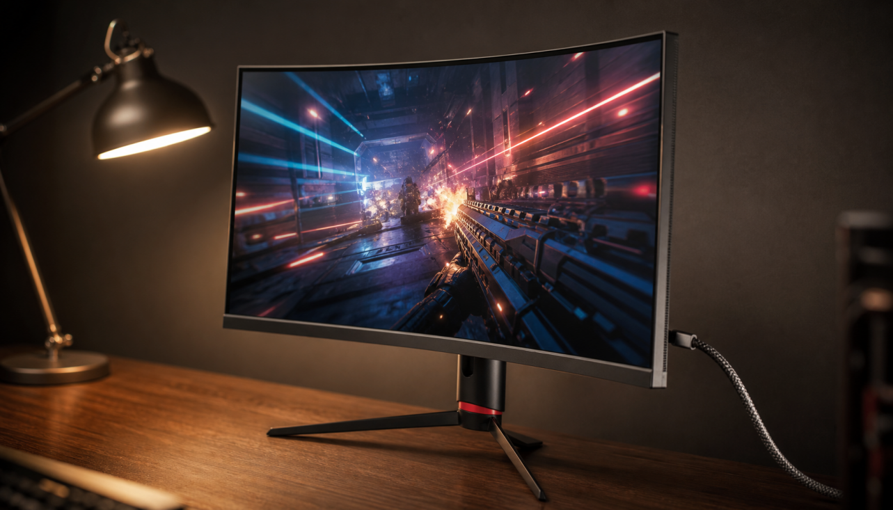
Ever bought a monitor with a huge contrast number, then watched a dark game scene turn gray in your office lighting? A simple check of static contrast, room brightness, and black-level handling can quickly explain why a “1,000,000:1” claim may feel less dramatic than expected on your desk. Here’s how to read the number, predict what you’ll actually see, and choose the right display for gaming, productivity, or portable screen work.
What Contrast Ratio Really Means
Contrast ratio compares the brightest white a display can produce with the darkest black it can produce. If a monitor is rated at 1,000:1, its white output is 1,000 times brighter than its black output; screen contrast ratio directly affects perceived depth, clarity, shadow detail, and image punch.
In practice, contrast is not just a bigger-is-better trophy number. A 27-inch IPS office monitor at 1,000:1 can look clean and readable for spreadsheets, coding, and email. The same 1,000:1 panel in a dark horror game may reveal grayish blacks, flatter shadows, and less separation between a doorway, a wall, and a dark enemy model. That is why contrast matters more when content contains deep blacks, bright highlights, or subtle tone transitions.

Why Spec Sheets Often Look Better Than Your Desk
The biggest disconnect comes from measurement type. Static contrast measures bright white and dark black under stable conditions, often at the same time or in a controlled pattern. Dynamic contrast allows the display to change brightness over time, so the manufacturer can compare a very bright scene against a heavily dimmed dark scene. That produces larger numbers, but dynamic contrast ratio can depend on processing, backlight behavior, and test conditions that do not match a real game, document, or video frame.
A simple example makes this clear. If a monitor produces 300 nits of white and 0.3 nits of black in the same scene, the static contrast is 1,000:1. If the same monitor lowers its backlight during an all-black screen, the measured black level may drop far lower, creating a much larger dynamic figure. That number may be technically real under that test, but it does not mean a bright HUD element, subtitle, or white cursor can sit beside perfect black without glow.
Spec tables also rarely explain whether the number is native, static, dynamic, peak, or ambient. Native or static contrast is the better indicator of panel capability, while peak and dynamic figures describe best-case moments. Extreme ratios such as 1,000,000:1 are often dynamic rather than native, so shoppers should treat them carefully unless the measurement type is explicit.
Native Panel Contrast: IPS, VA, OLED, and LED Displays
Panel technology sets the floor for real-world contrast. LCD monitors use a backlight, so black depends on how well the panel blocks that light. IPS panels are popular for color consistency, viewing angles, and productivity comfort, but many IPS gaming and office monitors sit around the 1,000:1 class. VA panels often deliver deeper blacks, which can make movies and dark games more immersive, though motion handling and viewing-angle behavior vary by model.
OLED and QD-OLED change the equation because each pixel can emit its own light and turn off for black. That is why modern gaming recommendations often emphasize OLED for contrast and response time; OLED gaming monitors are frequently highlighted for deep blacks, strong color, and high refresh rates. OLED is especially strong for gamers who prioritize black levels, contrast, responsiveness, and image quality.

For portable smart screens and compact productivity monitors, the tradeoff is different. A 1,000:1 to 3,000:1 LCD can be perfectly usable for writing, dashboards, travel work, and second-screen workflows; most LCD monitors fall in that everyday range. The practical question is whether you need cinematic black depth or dependable clarity in varied lighting. For an airport lounge, coworking desk, or bright kitchen table, reflections and brightness may matter as much as the advertised contrast ratio.
Display Type |
Real-Use Strength |
Common Tradeoff |
IPS LCD |
Color consistency, office clarity, broad viewing angles |
Blacks can look gray in dark rooms |
VA LCD |
Stronger native black levels for movies and atmospheric games |
Some models show motion smearing |
Mini LED LCD |
Higher HDR impact with local dimming |
Blooming or dimming artifacts can appear |
OLED/QD-OLED |
Pixel-level blacks and elite perceived contrast |
Brightness behavior, price, and burn-in management matter |
Portable LCD |
Convenient productivity and travel use |
Room light and coating strongly affect perceived contrast |
Room Light Can Crush Contrast
Your room is part of the display system. Ambient light bounces off the screen surface, lifting perceived black levels. A monitor that looks rich in a dim room can look washed out beside a window, even if its specification never changes. Ambient contrast ratio reflects how environmental light affects viewing quality, and brighter rooms can reduce the real contrast your eyes perceive.
Picture a portable monitor rated at 1,200:1. In a controlled room, dark UI panels may look reasonably deep. Under overhead office lights or near a sunny window, reflected light can turn those same dark panels charcoal gray. Raising brightness can help white areas punch through the environment, but it does not always restore black depth because the screen surface is still reflecting light.

For real use, control the room before blaming the panel. Angle the screen away from windows, reduce direct overhead reflections, and choose a matte or effective anti-reflective finish when the display will live in bright spaces. For gaming at night, lower room light and avoid a lamp directly behind you. For productivity, a modest bias light behind the monitor can reduce eye strain without flooding the panel surface.
Local Dimming Helps, But It Is Not Magic
Local dimming darkens parts of an LCD backlight behind dark image areas. On a strong Mini LED display with many dimming zones, this can lift HDR impact and deepen blacks in mixed scenes. On weaker implementations, the same feature can create blooming around bright objects, crush shadow detail, or dim the whole image awkwardly.
This is why two monitors with similar “HDR” labels can feel completely different. A basic HDR400 IPS monitor may accept an HDR signal but still lack the brightness, contrast, and dimming control needed for convincing HDR. A better Mini LED or OLED display can show a bright explosion, white UI element, or moonlit edge with much stronger separation from black.
For competitive gaming, be cautious with aggressive dynamic contrast and local dimming modes. They may make a demo scene look punchier, but they can also hide detail in dark corners or shift brightness during play. For single-player immersion, a well-tuned local dimming mode can be worth using. For esports, consistency often beats spectacle.
Calibration, Settings, and Measurement Details Matter
Contrast is also affected by settings that users often change casually. The brightness or backlight control usually raises and lowers the whole image on LCDs, so the contrast ratio may not change much. The contrast control, black level, gamma, RGB range, and dynamic contrast settings can change whether shadow and highlight detail remains visible.

A measurement workflow can treat contrast as a display characteristic after profiling or verification; calibrated display reports can show whether your actual unit behaves like the spec. Colorimeter correction can also affect measurement accuracy, especially with unusual backlight technologies, so home measurements are most useful when the instrument and correction are appropriate.
There is a related lesson from accessibility testing. When sampling text color, anti-aliased edges can be lighter than the true body of the letter, so testing should focus on the solid text area rather than the smoothed edge; anti-aliasing can make a measurement less representative. Display measurement has the same principle: where, how, and under what conditions you measure changes the number.
For text legibility, do not confuse monitor contrast ratio with web color contrast ratio. Accessibility contrast compares foreground and background colors, not panel black depth. Important visual content should meet at least 4.5:1 contrast for readability, which is a design requirement rather than a monitor hardware rating.
How to Judge Contrast Before You Buy
Start by separating use case from marketing. For office productivity, prioritize text clarity, brightness control, ergonomics, coating quality, and a stable image. A mainstream IPS display can be the right call even if its contrast ratio is modest, because spreadsheet grids, documents, code editors, and browser tabs benefit from sharpness and consistency.
For immersive gaming, movies, photo work, and HDR, native contrast becomes more important. OLED or QD-OLED is the cleanest answer when deep blacks and fast pixel response matter most. VA can be a strong value choice for dark-room contrast if the specific model handles motion well. Mini LED can be excellent for bright HDR highlights, but only when local dimming is dense and well controlled.
For portable smart screens, ask where the display will actually live. A higher contrast number is useful, but a brighter panel with a good coating may outperform a theoretically higher-contrast panel in a bright room. If you often work near windows or under strong lights, perceived contrast depends heavily on reflection handling.
The best buying move is to compare native or static contrast first, then check brightness, panel type, surface finish, local dimming behavior, and independent reviews. A display advertised as 1,000:1 can be excellent for reliable office work. A display advertised as 1,000,000:1 can still disappoint if that number is dynamic, the room is bright, or the dimming algorithm gets in your way.
How to Improve Contrast on the Monitor You Already Own
Set the monitor to a sensible picture mode first, usually sRGB, standard, creator, or a well-reviewed calibrated preset. Avoid vivid modes for serious work because they often inflate color and crush detail. Then adjust brightness for the room rather than maxing it out by habit.
Check black level and gamma with familiar content. If dark scenes hide too much detail, a small gamma adjustment can help without pretending to create deeper blacks. Turn dynamic contrast off for desktop work and evaluate it carefully for games or movies. If your monitor has local dimming, test it with real content: a dark game menu with a white cursor, subtitles over a night scene, and fast movement across dark backgrounds will reveal blooming and brightness pumping quickly.
Finally, control reflections. Move the display a few degrees, dim the nearest lamp, close a shade, or add soft backlighting behind the monitor. These changes cost little and often improve perceived contrast more than another round of menu tweaking.

The Bottom Line
Contrast ratio looks different in specifications because the spec is a controlled measurement, while real use is a system: panel type, measurement method, room light, screen coating, calibration, dimming behavior, and content all interact. For dependable buying, trust static or native contrast first, treat dynamic claims as marketing context, and match the display to the way you actually play, work, and move between screens.


,%20room%20light,%20and%20calibration.
)