


Room lighting does not change a monitor’s actual output, but it can change how your eyes judge white, gray, contrast, and saturation. A stable, neutral setup makes the same screen look more consistent across editing, gaming, and everyday work.
Does your calibrated monitor look clean during the day, then suddenly too blue or too yellow under your desk lamp at night? A practical controlled-light setup can make the same screen look more consistent from one session to the next. The key is choosing sensible room-light targets, monitor settings, and workflow checks that keep color decisions reliable.
Why Room Lighting Changes What “Accurate” Looks Like
Your eyes constantly adapt to the light around you. If the room is warm, your brain may normalize that warmth and push your on-screen color decisions cooler. If the room is very cool, you may do the opposite and over-warm images, video, or presentation assets without realizing it.

That is why ambient light hitting a monitor can visibly change perceived color even when the display itself has not changed. A monitor showing the same neutral gray can feel different beside a yellow lamp, a blue daylight window, or a green-tinted wall. For color-critical work, the screen is only one part of the viewing system; the room is the other half.
Color temperature describes whether a light source appears warm, neutral, or cool. In display and lighting work, it is usually expressed in Kelvin, such as 5000K, 6500K, or 7500K. A lower value looks warmer and more amber. A higher value looks cooler and more blue. The goal is not to chase the highest number; it is to match the room to the work.

The Practical Target: Stable, Neutral, and Repeatable
For most creators, office users, and serious gamers, the best starting point is neutral room light that stays consistent. Neutral room lighting close to 5000K is commonly recommended for color-sensitive work because it reduces the visual tug-of-war between your display and your surroundings.
For the monitor itself, 6500K remains the most useful all-around white point for sRGB, Rec. 709, general web content, and many productivity workflows. Monitor calibration targets often pair D65/6500K with gamma 2.2 and a luminance range around 100 to 120 cd/m². In plain terms, screen white should look like a standard daylight-balanced reference, contrast should follow the common computer standard, and brightness should not overpower the room.
Use Case |
Room Light Direction |
Monitor White Point |
Brightness Guidance |
Photo editing for screens |
Neutral, consistent light |
6500K |
Match room brightness without glare |
Print-oriented editing |
Controlled, neutral light |
Often 6500K in common workflows, with print viewing checked separately |
Lower brightness helps avoid dark prints |
Office productivity |
Neutral to slightly cool light |
6500K or native/sRGB mode |
Comfortable and readable, not piercing |
Competitive gaming |
Room consistency matters less than visibility |
6500K to cooler presets by preference |
Prioritize visibility without eye strain |
Warmer, dimmer surroundings |
Warmer display mode only if color accuracy is not critical |
Reduce brightness before judging color |
A real-world example helps: if you edit a product photo under a warm table lamp at night, a white plastic keyboard in the image may look too yellow to you. You cool it down until it looks neutral. The next morning, under daylight, that same keyboard may look slightly blue. The monitor did not change; the room trained your eyes differently.
Brightness Is the Silent Color Problem
Color temperature gets the attention, but brightness often causes the bigger mistake. An overly bright monitor makes images look punchy and clean on screen, then disappointing in print or on other displays. It is also a common reason prints come back too dark, because the editor lowers exposure to compensate for a screen that is brighter than the room supports.

The practical move is simple: make the display feel like it belongs in the room. In a dim workspace, target the lower side of the typical color-work range. In a brighter office, move slightly higher while keeping glare off the panel. If your room light changes from sunny window light at 10:00 AM to a warm lamp at 9:00 PM, your brightness and color judgment are no longer anchored to the same reference.
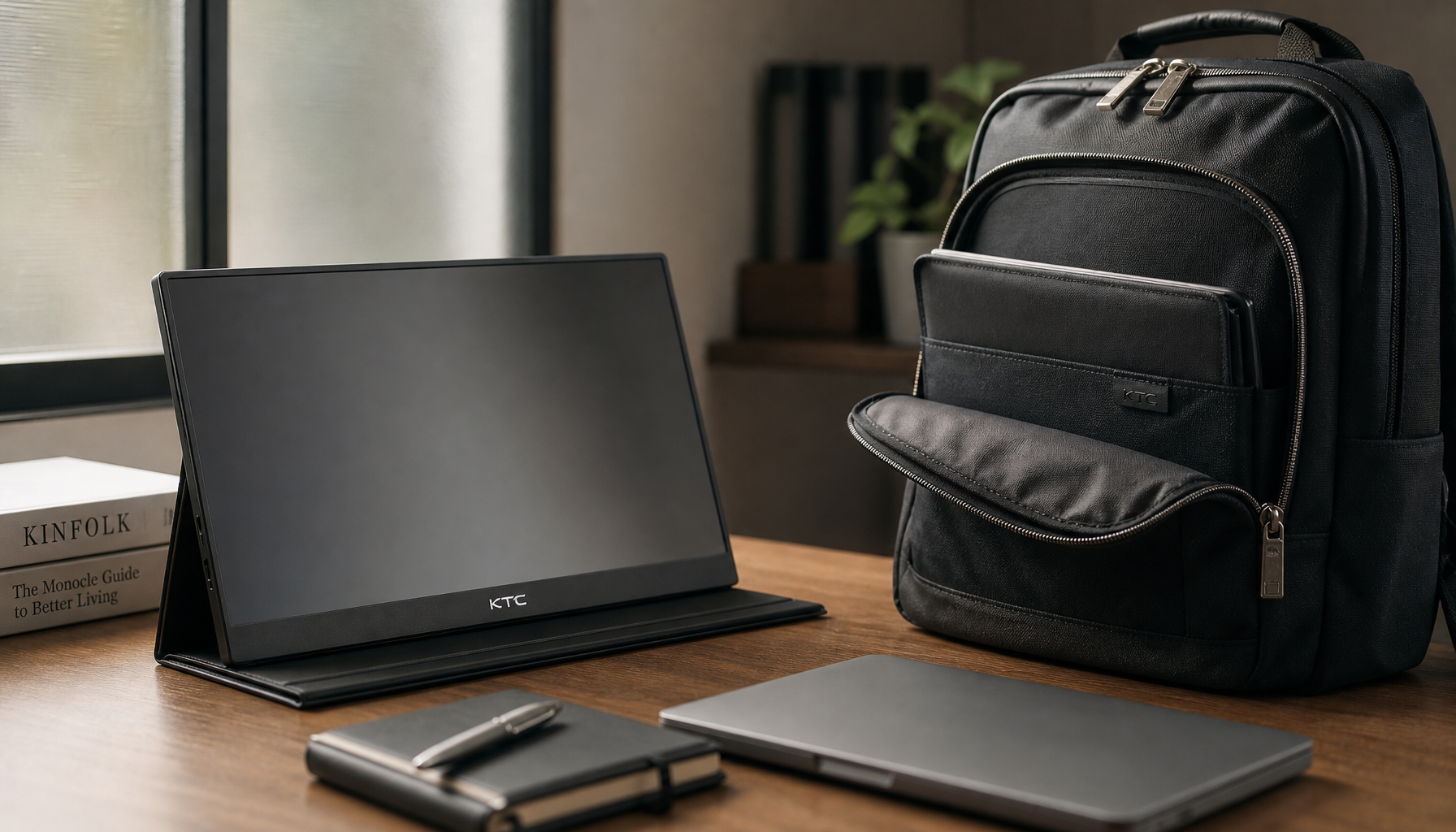
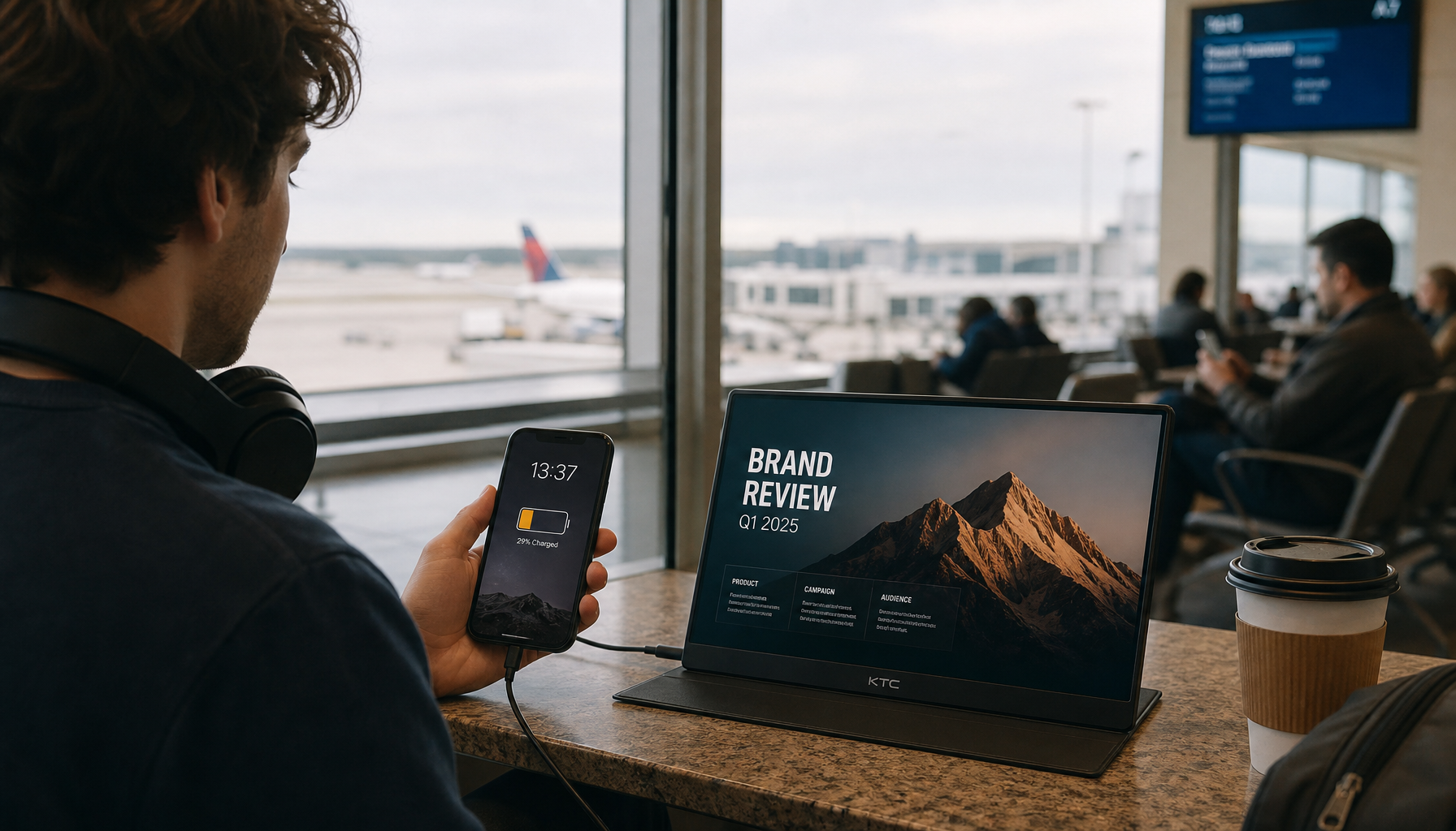
This matters for office displays too. Spreadsheets, dashboards, and design documents may not demand studio-grade calibration, but a screen that is far brighter than the room increases fatigue and makes whites feel harsh. For a portable smart screen used beside a laptop, matching both displays to the same brightness and white point will do more for daily trust than any flashy preset.
Gaming: Accuracy, Visibility, and Immersion Are Different Goals
Gaming monitors introduce a useful tradeoff. Color accuracy is not always the same goal as competitive visibility. The best overall color temperature is a strong baseline for natural-looking games, videos, and desktop use. But some FPS players prefer cooler settings around the 7000K range because a cooler image can make dark-scene details feel sharper.
That does not mean cooler is more accurate. It means cooler can be more tactical. For a competitive shooter, raising color temperature may help separate enemies from shadows on certain panels. For a cinematic RPG, 6000K to 6500K usually preserves the intended mood better. For late-night sessions, warmer settings can feel easier on the eyes, but they should not be used when judging color for thumbnails, video edits, or brand assets.
The performance-driven approach is to save separate monitor presets. Use an sRGB or calibrated preset for creative work and general browsing. Use a visibility preset for competitive gaming. Use a warmer comfort preset at night when color judgment is not the priority. The mistake is letting one mode do every job.

Pros and Cons of Matching Room Light to Your Monitor
A controlled lighting setup gives you repeatability. Your edits, game visuals, and work documents look more predictable because your eyes are adapting to the same environment each time. It also makes calibration more meaningful, since the monitor profile is not fighting a different light source every session.
The downside is that strict control can feel less flexible. Closing blinds, avoiding mixed bulbs, and using neutral walls may be inconvenient in a multipurpose room. A fully controlled grading suite is not realistic for every apartment, dorm, or home office. Still, the value-oriented move is not perfection; it is reducing the biggest variables first.
Choice |
Upside |
Tradeoff |
Neutral single light source |
More consistent color perception |
Less decorative flexibility |
Closed blinds during editing |
Fewer daylight shifts |
Room may feel less open |
Neutral wall color near screen |
Less color reflection |
Requires room changes |
Hardware calibration |
More reliable profiles |
Added equipment cost |
Multiple display presets |
Better fit for work, gaming, and night use |
Requires discipline to switch modes |
How to Set Up Your Room Without Overbuying Gear
Start by removing mixed light. Avoiding mixed lighting is one of the most practical pieces of color advice because sunlight, incandescent bulbs, fluorescent tubes, and cheap LEDs can all push your perception in different directions. If your workspace has a window, use blinds when doing color-critical work. If you use lamps, choose one stable light source rather than several competing ones.
Place light so it does not hit the screen directly or reflect back into your eyes. Indirect light is usually better than a lamp behind your chair, because rear light can create reflections, shadows, or a visible glow across the panel. Keep brightly colored objects and painted walls away from the screen area when possible. A red wall beside your monitor can influence how neutral grays and skin tones feel.
Then set the monitor. Warm it up for about 30 minutes before serious adjustment. Reset to factory defaults if the display has been heavily tweaked. Use sRGB mode or a calibrated profile for accuracy work. Disable auto brightness and comfort-focused color shifts when judging color. Those features can be useful for comfort, but they change the visual reference.
For professionals and serious hobbyists, a colorimeter is worth it. Hardware calibration tools measure what your display is actually doing instead of asking your eyes to guess. For budget-conscious users, a good IPS or OLED monitor in sRGB mode, stable room light, and sensible brightness can still produce a major improvement over random presets.
Calibration Is Not a One-Time Event
A calibrated display is a reference, not a force field. Calibration improves confidence because it moves the monitor closer to a known standard and gives you a way to verify the result. But if you calibrate in a dark room, then edit beside a bright window, your perception has changed.
For demanding work, recalibrate every few weeks or whenever your lighting setup changes. For lighter office and content tasks, recalibrating less often may be acceptable if the display is stable and the room does not change much. The more the result matters financially, such as for client video, product photography, ad creative, print sales, or brand color approvals, the more disciplined the lighting and calibration should be.

A simple test is to open a neutral gray image or white document in the morning, afternoon, and evening. If it appears to shift from clean white to blue-white to yellow-white across the day, your room is driving perception. Fix the room before blaming the monitor.
Short FAQ
Should my room lighting match 6500K exactly?
Not always. For monitor-based sRGB and video work, 6500K on the display is a strong default, while neutral room lighting around 5000K to 6500K is usually workable. Consistency matters more than hitting a perfect number with a cheap bulb.
Is warm light bad for monitor color accuracy?
Warm light is not bad for comfort, but it is risky for judging color. If you edit under a warm lamp, your eyes may compensate and lead you to make images too cool. Use warm light for relaxed browsing or night gaming, not final color decisions.
Does room lighting affect OLED and LCD monitors differently?
The perception issue affects both. OLED may hold deep blacks better, while LCD behavior depends on panel type and backlight quality, but glare, wall color, and ambient color temperature still influence what your eyes think they see.
Final Takeaway
Room lighting temperature can affect how accurate your monitor appears, even when the panel is calibrated. For the most reliable setup, use stable neutral lighting, control glare, keep the display near 6500K for accuracy work, and match brightness to the room. That is the practical path to a screen you can trust for play, productivity, and serious visual decisions.


