


Artifacts become more visible when a content zone is too large for the content resolution or too small for the detail inside it. The practical goal is simple: keep each zone close to the content’s native pixel shape, avoid aggressive scaling, and give text-heavy content enough physical space to stay readable.
Does your dashboard look crisp in preview but soft, blocky, or noisy once it is split across a real screen? A simple zone-to-resolution check can prevent blurry logos, jagged text, crushed video, and unreadable sidebars before you publish. Here is how to size zones so gaming visuals, office dashboards, and smart-screen layouts look intentional instead of compromised.
Why Zone Size Changes What You Notice
A display does not show content in the abstract; it shows pixels mapped onto a physical screen. Display resolution is commonly expressed as width by height, such as 1920 x 1080, but perceived sharpness also depends on screen size, viewing distance, scaling, and image processing. That is why a 1080p clip can look clean in a small window and rough when stretched across a 65-inch meeting-room display.
Zone size matters because zoning divides one display into smaller canvases. A full-screen 4K display has 3840 x 2160 pixels available, but a sidebar taking one quarter of the width may only have 960 x 2160 pixels before software scaling, margins, and layout chrome reduce the usable area. If you put a dense website, spreadsheet, or 1080p video into that sidebar, the display system must shrink, crop, or resample the content. Each choice can expose artifacts.
In hands-on display setup, the most common failure is not a bad panel. It is a mismatch between the content’s intended canvas and the zone it is forced into. A product video may be sharp, while the adjacent price ticker looks rough because the text was authored too small. A gaming feed may look smooth in the hero zone, while a low-resolution webcam or map overlay looks noisy because it has been enlarged beyond its useful detail.

The Core Relationship: Input Pixels, Zone Pixels, and Physical Size
A zone has two sizes at once. It has a pixel size, such as 1280 x 720, and a physical size, such as a 28-inch-wide region on a larger display. Artifact visibility rises when either one is wrong for the content.
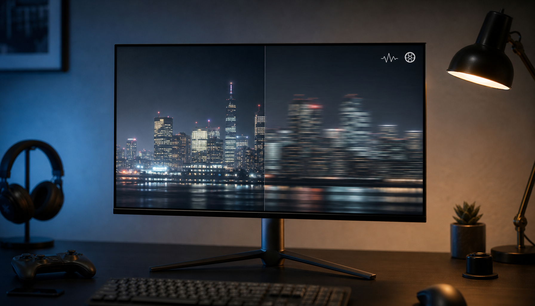
A higher resolution usually improves clarity because more pixels can represent finer detail, but only when the content, display, and hardware path can preserve that detail. If 720p content is stretched to fill a 4K hero zone, the panel cannot invent real detail. Upscaling can smooth edges, but it can also create blur, ringing, shimmering, or blockiness depending on the content and scaler.
Downscaling has a different risk. A 4K spreadsheet or full website squeezed into a narrow zone may still contain plenty of pixels, but the important information becomes too small for viewers. In that case, the artifact is not only visual softness; it is failed communication. Thin strokes, small icons, dense gridlines, and compressed UI labels become the first casualties.
Zone-to-content relationship |
What usually happens |
Artifact risk |
Best use |
Zone matches native content resolution |
Minimal scaling is needed |
Low |
Video, game capture, product visuals |
Zone is much larger than content resolution |
Content is enlarged |
Blur, blockiness, jagged edges |
Simple graphics or high-quality upscaling |
Zone is much smaller than detailed content |
Content is reduced |
Tiny text, lost detail, moire-like shimmer |
Dashboards redesigned for the zone |
Zone has a different aspect ratio |
Content must crop, letterbox, or stretch |
Distortion, cut-off UI, black bars |
Reframed or zone-specific assets |
Why Upscaling Makes Artifacts More Obvious
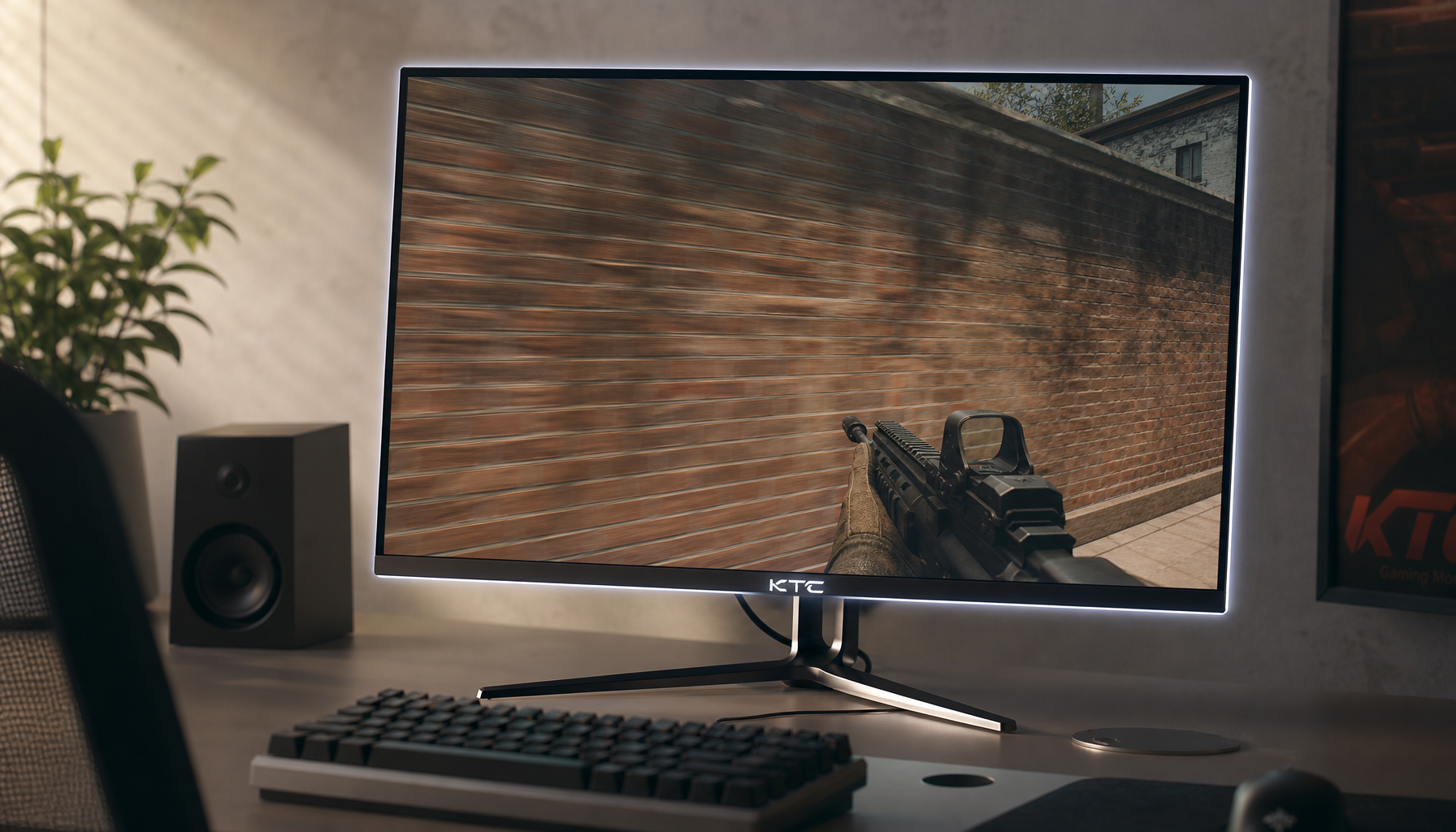
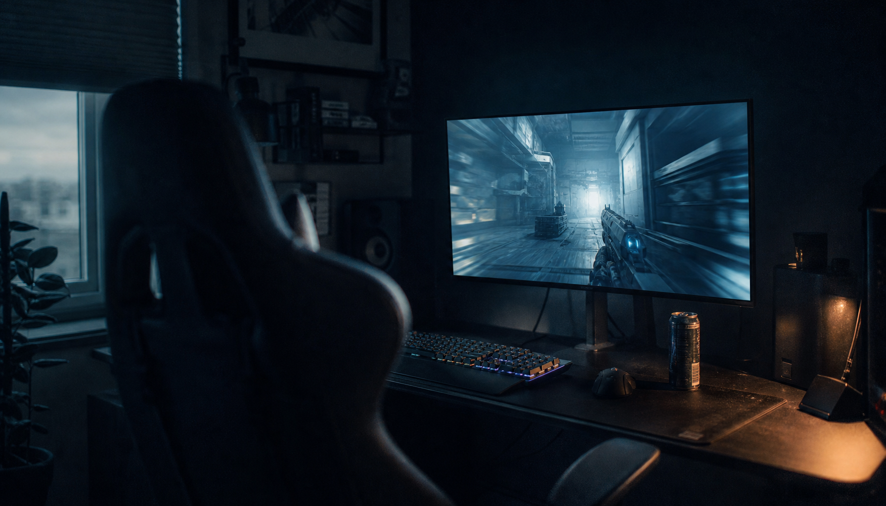
Upscaling is the classic artifact amplifier. A 1280 x 720 file displayed in a 1920 x 1080 zone must be enlarged by 50% in each direction. On a 4K panel, that same 720p file stretched full-screen becomes a far more aggressive enlargement. Compression blocks, aliasing, noise, and soft edges that were tolerable at the native size become easier to see.
This is especially important for gaming monitors and performance displays. Gaming resolution choices depend on hardware capability, budget, and preference because sharper resolutions demand more graphics power. The same thinking applies to zones: do not assign a low-resolution capture to a hero zone unless the content is simple, stylized, or viewed from far enough away that the scaling is hidden.
A practical example is a 4K lobby screen with a hero video zone occupying about three quarters of the panel width. If that zone is roughly 2880 pixels wide, a 1080p video must be enlarged to fit. It may still look acceptable for slow footage or broad visuals, but UI footage, gameplay HUDs, small text, and product close-ups will reveal the mismatch quickly. For those cases, author the hero asset at 4K or at the exact zone dimensions.
Why Shrinking Content Can Be Just as Bad
A smaller zone can hide compression noise, but it can destroy readability. Digital signage zoning works best when one primary hero area leads attention and secondary areas support it, because too many dense zones create visual overload. The issue is not only aesthetic; viewers have limited time and distance to decode the screen.
A website that reads well full-screen on a 46-inch display may fail in a sidebar because the text size, line length, and images were designed for a larger canvas. The content may technically be high resolution, but the zone does not provide enough physical space for its detail. In office productivity displays, this shows up as tiny calendar entries, clipped spreadsheet columns, or dashboards where every chart label competes for attention.

For smart screens and portable displays, the same rule becomes more personal. A 15-inch portable monitor can show a 1080p dashboard sharply at close range, but splitting it into three zones may make each zone too small for live data. In that setup, a single focused view with larger typography often outperforms a layout that tries to show more information.
Viewing Distance Decides How Forgiving the Layout Is
Artifact visibility is not only about pixels; it is about where the viewer sits or stands. Display size planning often considers viewing distance, mounting height, and the detail level of the content because a screen used for precise drawings has different demands than one used for general slides.
If a viewer is close, they can see scaling artifacts, jagged diagonals, compression blocks, and soft text. If they are farther away, those defects may disappear, but small information may disappear with them. That tradeoff is why conference-room screens, classroom displays, and retail signage should be tested from the actual farthest and closest viewing positions, not only from the desk where the layout was designed.
For example, a 4K display in a small meeting room may support a multi-zone productivity layout because viewers are seated close enough to read details. The same layout in a reception area may fail because people glance at it from 12 ft away while walking. The correct fix is not always a higher-resolution panel. Often, it is fewer zones, larger type, and content built specifically for glanceable viewing.
Aspect Ratio Mismatch Creates Its Own Artifacts
Even when resolution is adequate, aspect ratio can break the presentation. Monitor aspect ratio describes the proportional relationship between width and height, with 16:9 being the standard format for most gaming and video content. When a 16:9 file is placed into a tall sidebar or an ultrawide banner, something must give.
Stretching is the worst option because it distorts people, UI elements, game geometry, and product images. Cropping can work for cinematic visuals, but it may cut off scoreboards, captions, buttons, or legal text. Letterboxing preserves the image but wastes valuable zone space. The cleanest approach is to create alternate assets for common zone shapes rather than forcing one master asset into every region.
For gaming content, this is especially visible in HUD-heavy titles. A 16:9 gameplay clip cropped into a vertical promo zone may remove minimaps, ammo counters, or objective markers. For office dashboards, a wide chart placed into a narrow column may compress axis labels until they become decorative noise. For portable smart screens, a vertical social feed in a horizontal zone often leaves empty space or oversized text blocks.

Practical Rules for Cleaner Zones
Start by matching the zone’s pixel dimensions to the content’s native dimensions whenever possible. If the zone is 1920 x 1080, use 1080p assets. If the zone is 3840 x 2160, use 4K assets for hero visuals. If the zone is a custom 1200 x 800 region, export graphics and dashboard views for that exact shape instead of relying on the player to resize them.
Use the monitor’s native resolution as the baseline. Fixed-pixel displays need scaling when the incoming format does not match the panel’s physical pixel grid, and non-native inputs can reduce sharpness through interpolation. That does not mean every asset must be full-panel 4K, but it does mean the final layout should be designed against the real pixel canvas, not an approximate mockup.
Reserve the largest zone for the highest-value, highest-resolution content. Zoning guidance often favors a clear hero zone because viewers need hierarchy, not equal competition. A performance-driven layout might give the hero zone to gameplay, product video, or a primary KPI board, then use smaller zones for short text, simple icons, weather, or status indicators.
Keep dense content out of narrow zones unless it is redesigned. A spreadsheet screenshot, full webpage, or complex analytics dashboard should not be dropped into a sidebar and expected to remain useful. Rebuild it as a compact view with fewer labels, larger type, simplified charts, and stronger contrast.
Test from real viewing distance. A layout that passes on your cell phone preview may fail on the wall. Stand where the viewer stands, sit where the meeting participant sits, and check the smallest text, the fastest motion, and the most compressed image area. If you notice artifacts during a calm test, the audience will notice them faster in a busy store, office, or gaming setup.

Pros and Cons of Larger and Smaller Zones
Large zones deliver immersion, especially for gameplay, video, product demos, and presentation slides. They give motion room to breathe and make premium panels feel worthwhile. The tradeoff is that low-resolution or heavily compressed content becomes more exposed. A large zone is honest: it reveals the quality of the content.
Small zones are efficient. They let one display carry multiple messages, and they are useful for tickers, status panels, chat windows, schedules, and secondary data. Their weakness is readability. Small zones punish detailed interfaces and make poor typography impossible to ignore.
The balanced approach is to treat every zone as its own display. A hero video zone needs video-grade assets. A KPI zone needs dashboard-grade typography. A ticker needs short copy. A gaming overlay needs enough pixel space for HUD elements. The more each zone is authored for its actual size, the fewer artifacts the display has to hide.
Quick FAQ
Is a higher-resolution screen always the fix?
No. A higher-resolution screen helps only if the content and zone layout can use those pixels. Low-resolution content still needs upscaling, and overcrowded zones can still make high-resolution content unreadable.
Should every zone use 4K assets on a 4K display?
Not necessarily. Full-screen or large hero zones benefit most from 4K assets. Smaller zones can use lower-resolution assets if they match the zone’s actual pixel size and contain simple visuals or large text.
Why does text look worse than video in the same zone?
Text has hard edges and fine strokes, so scaling errors stand out quickly. Video often contains motion, texture, and natural softness that can hide moderate scaling artifacts, especially at normal viewing distance.
Final Word
Zone size is not just a layout choice; it is a signal-quality decision. Match content resolution to zone pixels, respect aspect ratio, simplify dense content, and test from real viewing distance. Do that, and a zoned display feels sharper, calmer, and more powerful without wasting money on specs that the content cannot use.


