


Financial analysts need displays built for dense information, fast comparison, and long-session readability, while graphic designers need displays built for color fidelity, calibration, and visual consistency.
Is your spreadsheet sharp in the center but tiring at the edges after six hours of model review? A better analyst setup can reduce window switching and keep spreadsheets, filings, dashboards, and market data visible at the same time without forcing a color-critical design monitor budget. Here is how to choose display specs by job outcome, not marketing labels.
The Core Difference: Analysts Read Systems, Designers Judge Output
A financial analyst’s screen is a command surface. It may hold a spreadsheet, a reporting dashboard, a PDF filing, a slide deck, an email thread, and a market-data window at once. The display has to keep numbers, chart labels, alerts, and reference documents legible while supporting fast context switching. Financial analysis tools increasingly emphasize dashboards, KPIs, forecasts, variance reports, and consolidated reporting, which makes usable workspace a practical performance requirement rather than a luxury dashboards and consolidated reporting.

A graphic designer’s screen is closer to an output proofing device. The designer is judging whether a brand color is right, whether a shadow is too warm, whether typography holds up at final size, and whether a layout will reproduce correctly across digital or print channels. The U.S. Bureau of Labor Statistics describes graphic designers as professionals who create visual concepts that communicate ideas to clients and consumers, making visual accuracy central to the job rather than cosmetic visual concepts that communicate ideas.

In practice, analysts should spend first on screen real estate, text clarity, ergonomics, and reliable connectivity. Designers should spend first on IPS-class image consistency, wide color gamut, calibration support, and uniformity. Both roles benefit from good monitors, but they are buying protection against different risks.
Screen Size and Layout: Workspace Versus a Faithful Canvas
For financial analysts, a 24- to 27-inch display often hits the best ergonomic range for close spreadsheet work. Competitive modeling guidance notes that monitors above 27 inches can become less efficient for close spreadsheet use because small numbers and cells are harder to scan comfortably close spreadsheet use. That does not mean larger screens are wrong; it means the layout has to match the task. A 34-inch ultrawide can be excellent for a continuous model-plus-dashboard view, while two or three 27-inch monitors may be better when a spreadsheet, filings, and slide decks need stable positions.

A designer can justify a larger single canvas more easily because detail inspection matters. Creative-display guidance describes 27 inches at 2560 x 1440 as a practical balance for design work, while 4K helps designers and video editors fit more detail onscreen and reduce scrolling 4K helps designers. A 27-inch 4K display gives a designer crisp type edges, cleaner image inspection, and more precise workspace for panels and references.
The simple calculation is this: if an analyst tracks a model, a filing, a deck, and a dashboard, four visible zones matter more than one perfectly color-managed canvas. If a designer is retouching a product image where color and fine edges determine approval, one calibrated 27- or 32-inch 4K IPS display can outperform three mediocre screens.
Workload |
Better Display Priority |
Practical Example |
Financial modeling |
Workspace and text clarity |
Spreadsheet on one screen, filing on another, deck on a third |
Market monitoring |
Multiple visible feeds |
Charts, watchlist, news, orders, and alerts visible together |
Brand design |
Color consistency |
Logo color must match the approved palette across deliverables |
Photo or print design |
Calibration and gamut |
Soft proofing requires dependable color behavior |
Resolution: Analysts Need Legibility, Designers Need Detail Integrity
Resolution is not just about sharpness. For analysts, resolution determines how many rows, columns, chart labels, and dashboard cards fit before zooming becomes uncomfortable. Trading-monitor guidance commonly treats 1080p as a minimum, 1440p as the sweet spot for many users, and 4K as useful for dense layouts on larger screens dense layouts on larger screens. A 27-inch 1440p monitor is often a strong analyst default because it keeps text readable without demanding aggressive scaling.
For designers, resolution protects visual judgment. A 4K design monitor shows sharper typography, cleaner image edges, and more accurate layout spacing than a lower-resolution panel at the same size. Creative-monitor guidance often recommends 4K for 27-inch and larger displays, with 5K or 6K reserved for ultra-sharp, high-density visual production. That higher pixel density is not about prestige; it helps catch small alignment, texture, and artifact issues before client review.
The tradeoff is scaling. A financial analyst using 4K on a 27-inch display may end up scaling the interface until the practical workspace gain shrinks. A designer may accept that because image fidelity remains valuable even when interface elements are scaled. For analysts, the question is “Can I read this all day?” For designers, it is “Can I trust what I am seeing?”
Panel Type: IPS Helps Both, but for Different Reasons
IPS panels are the safest shared recommendation, but the reason differs by role. For analysts, IPS provides stable viewing angles across multi-monitor setups. If a side monitor shifts red and green chart colors or makes fine gray gridlines fade when viewed off-axis, fatigue and interpretation errors rise. Trading-monitor research favors IPS for accurate colors and wide viewing angles across multi-screen workstations wide viewing angles.
For designers, IPS is closer to a baseline requirement. Design-focused guidance consistently warns against TN panels because they are fast and inexpensive but weak in color accuracy and viewing angles. VA panels can offer stronger contrast, but they are less predictable for color-critical work. Color-management guidance is direct about the problem: the monitor is often where a digital file is first judged visually, and inaccurate display behavior can make output unreliable inaccurate display behavior.
OLED and mini-LED can complicate the decision. Designers may like deeper contrast and HDR capability, but static toolbars and long editing sessions raise burn-in concerns on OLED. Analysts may appreciate contrast for dark dashboards, but a display full of static spreadsheet ribbons, chart grids, and trading panels also makes burn-in risk worth considering. When reliability and long hours matter, a high-quality IPS or IPS-like panel remains the conservative professional choice.
Color Accuracy: Critical for Designers, Useful but Secondary for Analysts
A graphic designer should care about sRGB, wide-gamut coverage, Delta E, calibration tools, and uniformity because the work depends on controlled visual reproduction. sRGB is suitable for web design and screen-viewed work, while wider gamut coverage is more relevant when higher color precision is needed. For professional design, a monitor that ships with factory calibration or supports reliable hardware calibration is not a nice extra; it is a quality-control device.
Financial analysts still need clean color, but not the same level of precision. Red and green candlesticks, heat maps, variance flags, and dashboard categories must be easy to distinguish. However, an analyst usually does not need elite wide-gamut coverage or Delta E below 2 to make a better call on a forecast variance. Overspending on color-critical features can leave too little budget for a second display, monitor arm, or higher-resolution primary screen.
The practical rule is direct: if color mismatch can cause rejected creative work, failed brand consistency, or print surprises, buy for calibration. If color mainly helps separate chart states and conditional formatting, buy for readability, consistency, and comfort first.
Refresh Rate, Response Time, and Latency: Finance Has Edge Cases, Design Usually Does Not
For most financial analysts, 60Hz to 75Hz is adequate. A faster refresh rate can make scrolling and chart movement feel smoother, but it does not improve a discounted cash flow model by itself. Traders watching short timeframes may benefit from 120Hz or higher, especially when charts update quickly, but mainstream financial modeling does not need gaming-class refresh rates.
Response time is also often misunderstood. Trading-focused notes suggest 5 ms or less is sufficient for most market work, while some professional trading monitors aim lower. Designers usually need accurate pixels more than fast pixels unless the work involves motion graphics, interactive prototypes, or video review. A 1 ms TN monitor with poor color is a weak design tool, even if the spec sheet looks fast.
The finance exception is latency-sensitive trading. If a display or TV adds processing delay through motion smoothing or enhancement modes, the user may feel behind the market. That is why large TVs are poor substitutes for close-range trading and analyst desks: they are built for couch-distance media, not precise text, low-lag interaction, and dense application layouts.
Ergonomics and Connectivity: The Quiet Specs That Protect Long Workdays
Analysts and designers both lose performance when the workstation fights the body. Height adjustment, tilt, swivel, VESA mounting, anti-glare coating, and stable stands matter because many users sit in front of these screens for 8 to 12 hours. A financial analyst may need monitor arms to align two or three screens around a primary spreadsheet display. A designer may need pivot adjustment for vertical layouts, long web pages, or print proofs.
Connectivity can make or break the setup. Analysts using laptops should check whether their machine supports multiple external displays and whether it can drive the chosen resolution at the desired refresh rate. One-cable power and display connections can reduce desk clutter, but high-bandwidth display connections may be more important for daisy chaining. Graphic designers should also check whether their ports and cables can support high-resolution color workflows without limiting refresh rate, resolution, or color depth.
Portable smart screens add another layer. A traveling analyst may benefit from a triple portable 1080p setup for client offices, hotel desks, or hybrid work. The display quality will not replace a calibrated creative monitor, but the value is immediate visibility: model, reference document, and communication window open at once.

Pros and Cons of Each Setup Strategy
A single ultrawide monitor gives analysts a clean workspace with no center bezel, fewer cables, and strong immersion. It works especially well for one large model, a dashboard timeline, or related charts arranged side by side. The downside is less physical separation between tasks, and window management can become messy without good snapping tools.
A dual- or triple-monitor setup gives analysts stronger task separation. One screen can stay dedicated to a spreadsheet, another to filings, and another to dashboards or communication. The tradeoff is more cables, more stands or arms, more graphics requirements, and more adjustment work.
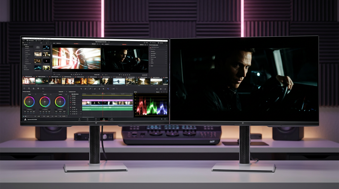
For designers, one premium calibrated 4K IPS display is often better than several average monitors. It creates a trustworthy main canvas. A secondary monitor is still useful for references, file browsing, chat, and tool panels, but the final color judgment should happen on the calibrated screen. The downside is cost: color-accurate monitors can be expensive, and calibration discipline takes time.
Buying Guidance by Role
A strong financial analyst setup starts with a 27-inch 1440p IPS primary monitor, then adds a second or third display if the workflow involves constant document comparison. If the user handles market dashboards or trading platforms, a 34-inch 3440 x 1440 ultrawide display or multiple 27-inch screens can be more valuable than premium color specs. Prioritize sharp text, stable viewing angles, low glare, adjustable mounting, and ports that support the full setup.
A strong graphic design setup starts with a 27-inch or larger 4K IPS monitor, strong sRGB coverage at minimum, wider gamut support when print or high-end visual work requires it, and dependable calibration. Prioritize color accuracy, uniformity, resolution, and ergonomic control. Ignore gaming-first specs unless motion work is part of the job.
The best shared investment is comfort. A monitor that causes neck strain, glare, or constant zooming will reduce performance no matter how impressive the panel looks on paper.
FAQ
Can one monitor serve both financial analysis and graphic design?
Yes, but the compromise should favor the higher-risk task. If the user does serious design work, choose a color-accurate 4K IPS monitor as the primary display and add a second productivity monitor for finance tasks. If the user mainly analyzes financial data and only creates basic visuals, a 27-inch 1440p or 32-inch 4K IPS productivity monitor is usually enough.
Are curved monitors better for analysts or designers?
Curved monitors usually help analysts more because they widen the usable field of view for dashboards, charts, and documents. Designers can use curved displays for large canvases, but flat panels remain safer when judging geometry, alignment, and production-sensitive layout work.
Should analysts buy portable monitors?
Portable monitors make sense for hybrid analysts who need more workspace away from a fixed desk. They are best for documents, dashboards, chat, and secondary tools, not for final color review or advanced creative work.
Choose the screen around the failure you cannot afford. Analysts need to miss fewer details across more information; designers need to trust every visual decision on the canvas. The right display spec is the one that makes the work faster, clearer, and harder to get wrong.


