


Choosing between a matte white and matte black monitor is a practical decision that shapes both the look and the daily usability of your workspace. The finish affects how your desk feels under different lighting, how much maintenance it demands, and whether it harmonizes with your furniture and peripherals. For many users, a white finish works better in bright offices to reduce eye fatigue, while black provides stronger visual contrast in darker gaming setups.

The Visual Weight Factor: How Finish Colors Anchor Your Workspace
Monitor finish color influences the overall perception of your desk more than many realize. Visual weight describes how a monitor's bezel and stand draw the eye and interact with surrounding objects. Matte black often serves as a high-contrast anchor that makes the screen content pop, which many find grounding in professional environments.
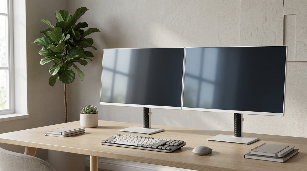
Matte white, on the other hand, tends to blend more softly with light-colored walls and desks, creating an airy feel that can make the entire setup appear larger and brighter. The KTC H27E6 exemplifies a modern high-performance white monitor that delivers 320Hz refresh rates, showing that white finishes no longer require sacrificing speed or image quality.
This choice is not purely aesthetic. It sets the tone for whether your workspace feels focused and contained or open and minimalist. Before considering specific models, assess your room's dominant colors and lighting to avoid a monitor that fights against the rest of your setup.
Bezel Ergonomics: Why Your Room Lighting Dictates the Best Color
Your room's ambient light largely determines which bezel color reduces eye strain more effectively. According to ISO 9241-7 ergonomic standards, white bezels reflect over 80% of light while black bezels reflect less than 20%. This difference changes how your eyes adjust between the screen and its surroundings.
In bright offices with light walls, a white bezel can reduce the contrast step between the monitor frame and background, potentially lowering pupillary strain as noted in guidance from the Canadian Centre for Occupational Health and Safety on display colors. Black bezels create a sharper reference that helps the brain perceive deeper blacks on IPS panels through the simultaneous contrast effect, which can be advantageous in controlled lighting.
The chart below visualizes comfort zones based on typical room brightness and wall colors.
For bright home offices, white often provides better ergonomics. In dark gaming rooms, black typically minimizes distracting frame glow and supports immersion. Check your typical lux level and wall color first before choosing a finish.
The Maintenance Reality: Dust, Fingerprints, and the 'Scuff' Trade-off
Maintenance needs differ noticeably between the two finishes. Matte white does a better job of masking fine dust and skin flakes, making it preferable for users who clean infrequently. Matte black, however, tends to highlight dust particles and oily fingerprints more prominently.
Both finishes benefit from simple care. Consumer Reports guidance on monitor cleaning recommends using only a dry or slightly damp microfiber cloth and avoiding alcohol or harsh chemicals that can polish matte plastic into shiny spots over time. White monitors carry a higher risk of visible dark scuffs from cables or metal objects, though careful handling usually prevents permanent marks.
If you frequently swap peripherals or work in a dusty environment, factor cleaning frequency into your decision. Prevention with proper cable management and gentle handling matters more than the color itself.

Matching the Finish to Your Desk Style: Minimalist, Gaming, and Professional
The best finish depends heavily on your desk materials and overall theme. In minimalist setups with light walls and neutral furniture, matte white blends seamlessly and supports a clean, bright look. However, on small desks the higher reflectance can create a "stand bloom" effect that makes the monitor appear visually larger.
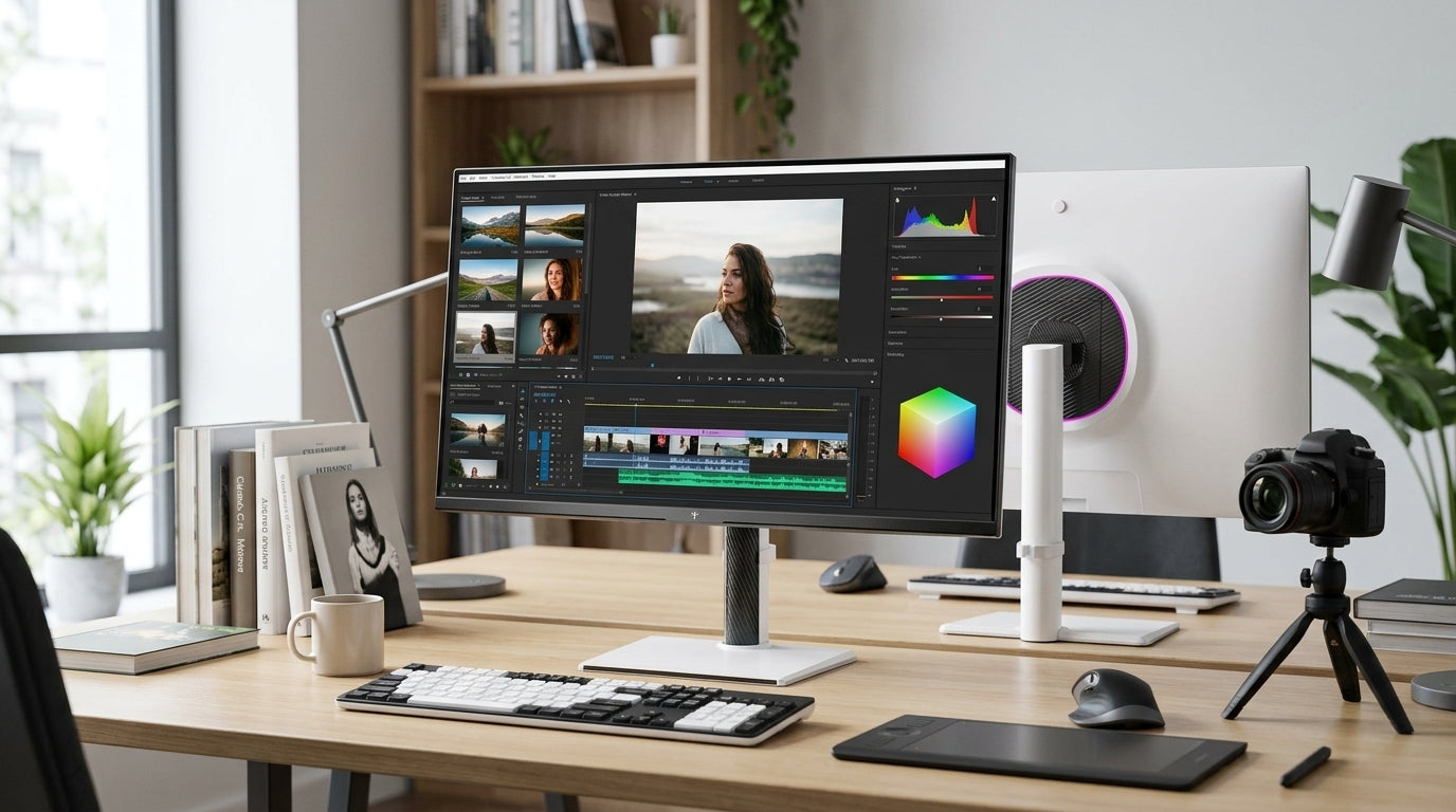
Gaming setups with RGB lighting and dark accents often pair better with matte black. The dark frame disappears against thematic backgrounds and provides the strong contrast many gamers prefer. Professional workspaces typically favor black as the industry standard for focus and accurate color perception.
Dark wood desks (walnut or oak) paired with white monitors can create a "stark skeleton" effect where white cables stand out against the wood, increasing visual noise. In these cases, black usually integrates more quietly. Consider your dominant desk color and cable management style before deciding.
For ergonomic home office advice, see our Home Office Setup Guide: How to Choose the Right Ergonomic Monitor. Dual-monitor users may also benefit from reading Vertical vs. Horizontal: How to Build the Ultimate Dual Monitor Productivity Setup.
The KTC Decision Framework: Which Finish Should You Choose?
Use this framework to match the finish to your conditions:
- Bright office with light walls and desk: Choose matte white to minimize eye strain and create an open feel.
- Dark room or gaming setup with dark accents: Choose matte black for better perceived contrast and immersion.
- Dark wood desk with visible cables: Lean toward black to reduce visual clutter from white cables and stands.
- Low-maintenance preference with infrequent cleaning: White often hides dust better.
- Frequent peripheral changes or high-touch use: Black may show fingerprints more but avoids scuff visibility issues.
KTC offers strong options in both finishes. The KTC 27" 4K 160Hz/320Hz 90W Gaming Monitor | H27P6 suits professional and high-contrast needs in black. For white setups, explore the Gaming Monitor collection or the Office Monitor series to find matching performance models.
Additional guidance on streamlining your workspace is available in How a USB-C Monitor Can Streamline Your Workspace and the The Complete Guide to Finding the Best Monitor for Productivity & a Healthier Workspace.
Frequently Asked Questions
Does a white monitor show more dust than black?
Matte white typically hides fine dust and skin flakes better than matte black. However, white can show dark scuffs from cables or accessories more readily. Choose based on your cleaning habits and expected contact with peripherals rather than dust alone.
Is matte white or matte black better for a minimalist setup?
Matte white generally works better with light walls and neutral furniture common in minimalist designs. It creates a brighter, less imposing presence. On dark wood desks, however, black often creates less visual noise from cables and stands.
Do different monitor finishes affect eye strain?
Yes, through their impact on contrast with the surrounding environment. White bezels can reduce strain in bright rooms with light walls by softening the transition from screen to background. Black bezels often perform better in dimmer spaces by providing a strong contrast anchor.
How do I clean a matte monitor without damaging the finish?
Use a soft microfiber cloth, either dry or lightly dampened with distilled water. Avoid alcohol, ammonia, or household cleaners that can permanently alter the matte texture. Gentle, regular wiping prevents buildup without risk of polishing spots.
Can I mix white and black monitors in the same setup?
You can, but it often creates visual inconsistency that draws attention to the mismatch. If mixing, try to align them with different zones of the desk or use similar stand designs to minimize the contrast between finishes.
What lighting conditions make white monitors look best?
White monitors perform best in rooms with high ambient light and light-colored walls. In these conditions they reduce the harsh contrast between the bezel and background, supporting longer comfortable viewing sessions.
Are white gaming monitors as performant as black ones?
Modern white models like certain KTC options deliver identical panel performance, refresh rates, and response times to their black counterparts. The color choice no longer forces performance compromises.


