


OLED monitors deliver unmatched contrast and near-instant response times that make games pop, yet many hybrid users discover that text in Excel, Word, and browser tabs can appear fringed or slightly soft compared with traditional IPS panels. The difference stems from how OLED subpixel layouts interact with Windows text rendering, but it is not an all-or-nothing problem. For most people who split time between gaming and office work, a few targeted adjustments and the right resolution make OLED perfectly usable for productivity.

The Hybrid Work Dilemma: Why OLED Text Matters
Hybrid workers now spend long hours in spreadsheets and documents on the same screen they use for evening gaming. OLED panels excel at delivering deep blacks and fluid motion, yet many notice that fine text looks less crisp than on their previous IPS monitor. This is especially noticeable in light-mode Excel where thin gridlines and small fonts sit against bright backgrounds.
The core trade-off is simple: you gain exceptional gaming performance (0.03 ms response on models like the KTC G27P6) but may need to address readability for 8-hour office days. Understanding the cause lets you decide whether OLED fits your workflow or whether a high-quality IPS panel remains safer for pure productivity.
The Subpixel Conflict: Why OLEDs Struggle with Text
Windows ClearType technology improves text readability on LCDs by accessing individual sub-pixel components while assuming a standard vertical RGB stripe arrangement (Microsoft ClearType Overview). OLED panels typically use different layouts—WRGB in WOLED or triangular in QD-OLED. This mismatch creates color fringing, sometimes called chromatic aberration, along the edges of black text on white backgrounds.
As explained in technical analyses of QD-OLED and WOLED fringing issues, the non-RGB structures cause slight red or blue edges that become visible at lower pixel densities. Third-generation QD-OLED subpixel shapes have improved the situation, yet the fundamental conflict with ClearType remains.
For a deeper look at how subpixel arrangements affect font rendering, see our guide: What Subpixel Layout Is and Why RGB and RGBW Panels Look Different.
The 140 PPI Rule: Why 4K Changes the Equation
Pixel density offers the most reliable way to reduce visible fringing. At roughly 140 PPI, subpixel artifacts shrink enough to become nearly invisible at typical desk distances. This threshold explains why 27-inch 1440p OLED monitors (approximately 109 PPI) often disappoint for office work while 27-inch or 32-inch 4K models feel far sharper.
The 140 PPI Rule acts as a practical decision threshold. Below 120 PPI, fringing is usually noticeable in light-mode spreadsheets. Between 120 and 150 PPI, many hybrid users find the result acceptable. Above 150 PPI the experience approaches what most people call “Retina-class” for text.
OLED Productivity Comfort by PPI Tier
A decision aid for Excel and office-heavy use: lower PPI tiers tend to be less comfortable for text-heavy work, while higher tiers are better suited to sustained productivity.
View chart data
| Category | Heavy Excel / Office | Hybrid Work + Gaming | Gaming-first |
|---|---|---|---|
| <120 PPI | 1.0 | 2.0 | 3.0 |
| 120-150 PPI | 2.0 | 3.0 | 3.0 |
| >150 PPI | 3.0 | 3.0 | 2.0 |
This chart visualizes the pattern across typical setups. Keep in mind that individual vision sensitivity and exact viewing distance affect the outcome; the tiers serve as planning guidelines rather than absolute cutoffs.

Practical Settings to Improve OLED Text Sharpness
If you already own a 1440p OLED, software tweaks can reduce—but not eliminate—fringing. The open-source BetterClearTypeTuner lets you adjust contrast and grayscale rendering beyond what Windows offers, while MacType provides an alternative text renderer that some users prefer for OLED panels (Better Text Rendering for OLED Displays Guide).
Increasing Windows scaling to 125% or 150% on 4K models also helps by making the effective PPI higher for text. Switching office apps to dark mode hides many fringing artifacts that light backgrounds expose. These steps represent mitigation, not a complete fix; heavy Excel users should still weigh resolution carefully.
OLED vs. IPS: Choosing the Right Tool for Your Workflow
For pure text productivity, IPS panels with standard RGB subpixels remain the gold standard (OLED vs IPS for Productivity Comparison). Modern high-PPI OLEDs have narrowed the gap enough that many hybrid users find them acceptable.
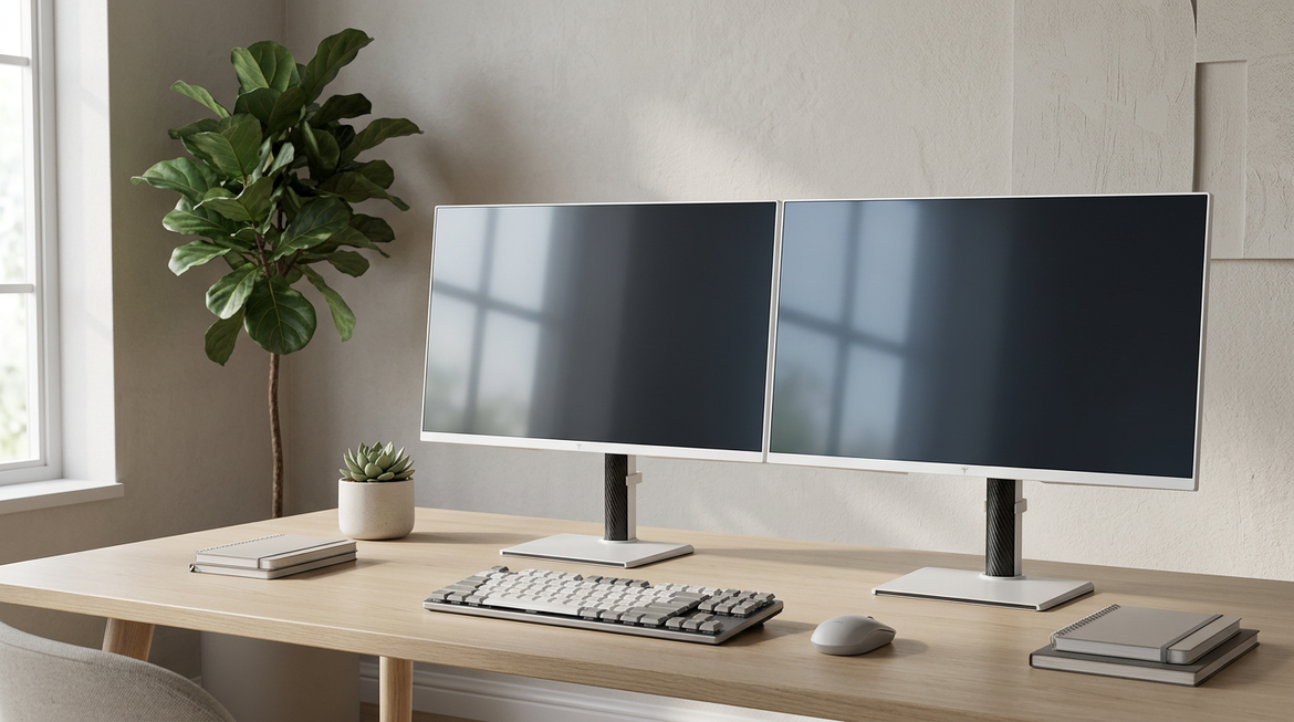
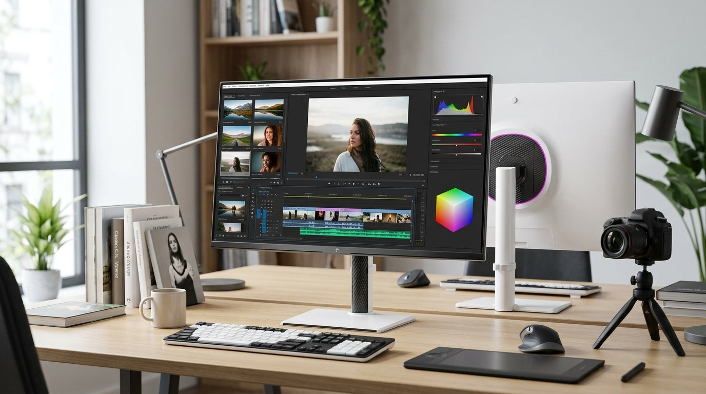
The KTC OLED 27" 2K 240Hz/0.03ms USB-C Gaming Monitor | G27P6 delivers outstanding gaming motion yet carries the typical 1440p OLED text caveats. The KTC 27" 4K 160Hz/320Hz 90W Gaming Monitor | H27P6 offers excellent text clarity alongside strong gaming performance. For dedicated office work the KTC 27" 5K@60Hz 2K@120Hz Home&Office Monitor | H27P3 provides exceptional sharpness at high pixel density.
If your day consists mostly of spreadsheets and documents in light mode, an IPS model is usually the lower-risk choice. If gaming occupies half or more of your screen time, a 4K OLED can deliver the best of both worlds.
Decision Guide: Is Your Workload Ready for OLED?
Decide based on your actual usage rather than marketing claims. Choose a 4K OLED if you want premium contrast and motion and are willing to accept the higher price for improved text rendering. Accept a 1440p OLED only when gaming is your absolute priority and office tasks are secondary or mostly in dark mode.
Stick with a high-quality IPS panel if you spend the majority of your day in Excel or light-mode documents. In that scenario the perfect text clarity of an RGB-stripe layout outweighs OLED’s contrast advantage. Test your own eyes at a retailer when possible—fringing visibility varies by individual.
For broader options explore our Office Monitor and All-OLED Monitor collections, or read related guides such as IPS vs VA Panels: Which is Right for Your Playing Style? and MiniLED vs. OLED: Which Display Technology Wins for Gaming in 2025?.
FAQs
Does ClearType work properly on OLED monitors?
ClearType is designed for RGB stripe layouts, so it cannot fully compensate for the different subpixel structures used in OLED panels. You can still tune it, but results remain a compromise rather than a complete solution.
Can I fix blurry text on OLED completely with software?
Software tools like BetterClearTypeTuner improve contrast and reduce visible fringing, yet they cannot change the physical subpixel layout. Improvements are noticeable but limited, especially at lower resolutions.
Is 1440p OLED good for office work and Excel?
It depends on your tolerance. Many hybrid users find 1440p OLED acceptable when gaming is the main use and office tasks are shorter or use dark themes. Heavy spreadsheet users often prefer 4K or IPS for all-day comfort.
What PPI makes OLED text clarity good enough for productivity?
Around 140 PPI and above is where most people report that subpixel fringing becomes hard to notice at normal desk distances. This generally corresponds to 27-inch or 32-inch 4K panels.
Should I buy an OLED monitor if I work in Excel 8 hours a day?
If your workload is almost entirely light-mode spreadsheets, an IPS panel is usually the safer and more comfortable choice. OLED remains viable if you value contrast and motion highly and are prepared to optimize settings and resolution.
Are newer QD-OLED panels better for text than older WOLED?
Third-generation QD-OLED layouts reduce fringing compared with earlier WOLED designs, yet the improvement is incremental. Resolution and PPI remain more important than panel generation for office readability.


