
In 2026, new vertical RGB and V-Stripe subpixel layouts have made OLED monitors far more usable for text-heavy professional work, but pixel density above 140 PPI remains the decisive factor for most developers, writers, and spreadsheet users. While older triangular or RWBG layouts often produced visible color fringing on fonts and UI elements, the latest panels largely align with how Windows ClearType renders text. This alignment reduces—but does not always eliminate—the softness that previously made many OLEDs feel unreliable for long coding or document sessions. The practical takeaway is straightforward: prioritize 32-inch 4K or higher-density 2026 OLEDs with proper stripe layouts for hybrid gaming-plus-productivity setups, while sticking with high-PPI IPS options like 5K panels when zero artifacts are non-negotiable.

The Subpixel Problem: Why Traditional OLEDs Struggle with Text
Text on many older OLED monitors appears fuzzy or shows colored edges because the subpixel arrangement does not match the assumptions built into desktop operating systems. Windows ClearType, for instance, is optimized for standard vertical RGB stripes found on most LCD panels. It uses subpixel rendering to effectively triple the horizontal resolution for black text on light backgrounds. When an OLED uses a triangular, diamond, or RWBG layout instead, the rendering engine places color incorrectly, producing red or green shadows along character edges—especially noticeable on thin fonts, 1-pixel gridlines, or syntax-highlighted code.
This mismatch is not simply about resolution. It is a question of spatial alignment. Even at the same pixel count, a non-matching layout reduces effective sharpness for productivity tasks. Developers often report that syntax colors bleed or blur, making it harder to parse code quickly. Writers notice jagged curves on letters such as “s,” “g,” or “e.” In spreadsheets, thin borders can shimmer. These issues become more pronounced at typical desk distances of 24–30 inches, where the eye can resolve the artifacts.
The 2026 Hardware Shift: V-Stripe and Vertical RGB Layouts
The biggest change in 2026 is the industry-wide move to vertical subpixel arrangements. Samsung’s V-Stripe QD-OLED and LG’s updated RGB-stripe WOLED panels now align red, green, and blue subpixels in straight vertical columns, matching the logic ClearType expects. As this HDTVTest report on Samsung’s next-generation panels explains, the V-Stripe design significantly improves text edge clarity for document editing and coding compared with previous triangular arrangements.
This hardware-level match reduces the color fringing that plagued earlier OLEDs. Legacy triangular QD-OLED layouts placed subpixels in offset patterns, which conflicted with vertical rendering and created noticeable bleed. The new vertical layouts largely solve that conflict natively, without relying entirely on software compensation. For hybrid users who switch between dark-room gaming and daytime office work, the improvement is meaningful. That said, the benefit is strongest when paired with adequate pixel density; layout alone is not a complete fix.
The 140 PPI Threshold: When Density Masks the Layout
Even with improved layouts, pixel density determines how visible any remaining artifacts will be. A practical threshold of roughly 140 PPI—typical of a 32-inch 4K panel—makes subpixel fringing negligible for most people at normal viewing distances. Below that, such as the 109 PPI of a 27-inch 1440p OLED, the artifacts often remain noticeable during extended reading or coding.
Higher density simply packs more subpixels into each inch, shrinking the physical size of any misalignment so it falls below the threshold of typical visual acuity. A 27-inch 5K IPS panel reaches approximately 218 PPI and serves as the reference-grade choice for users who need pixel-perfect typography with zero visible bleed. The chart below visualizes these practical safety zones.
Note that users with excellent (20/15) vision may still detect minor fringing even at 140 PPI. The zones above therefore represent typical rather than universal outcomes.

Coding, Spreadsheets, and Writing: Scenario-Specific Impacts
Not every productivity task is affected equally. In coding environments such as VS Code or terminals, fringing on thin syntax-highlighted keywords increases cognitive load because developers rely on quick color parsing. Spreadsheets suffer when 1-pixel gridlines shimmer or appear softer than expected, which can make precise data entry feel unreliable. Long-form writing benefits most from the smoother character curves that V-Stripe or vertical RGB layouts provide; letters with rounded shapes look cleaner on light backgrounds.
These differences explain why a monitor that feels acceptable for general writing may still frustrate a developer staring at syntax-colored code for eight hours. The 2026 layout improvements help most in writing and moderate spreadsheet work, while high-density panels remain preferable for precision coding or design review.
Why Software Mitigations Are a Bridge, Not a Cure
Tools like PureType intercept rendering calls and remap subpixel coverage to better match an OLED’s physical geometry. On macOS, BetterDisplay offers similar font-smoothing adjustments. These solutions can reduce symptoms on older panels, yet they cannot replace native hardware alignment. Microsoft community discussions from early 2026 confirm that Windows ClearType still lacks full per-monitor support for non-standard layouts, leaving a gap that software attempts to bridge.
The trade-offs are real. Software remapping adds processing overhead, can introduce minor compatibility issues with certain applications, and does not address the underlying spatial resolution limits of lower-PPI panels. For users on legacy OLEDs it is often worth trying, but 2026 hardware with proper stripe layouts removes the need for these workarounds in most cases. Mac users generally experience fewer problems overall because the operating system’s font rendering is less dependent on strict subpixel alignment.
The Productivity Decision: OLED vs. Mini-LED vs. 5K IPS
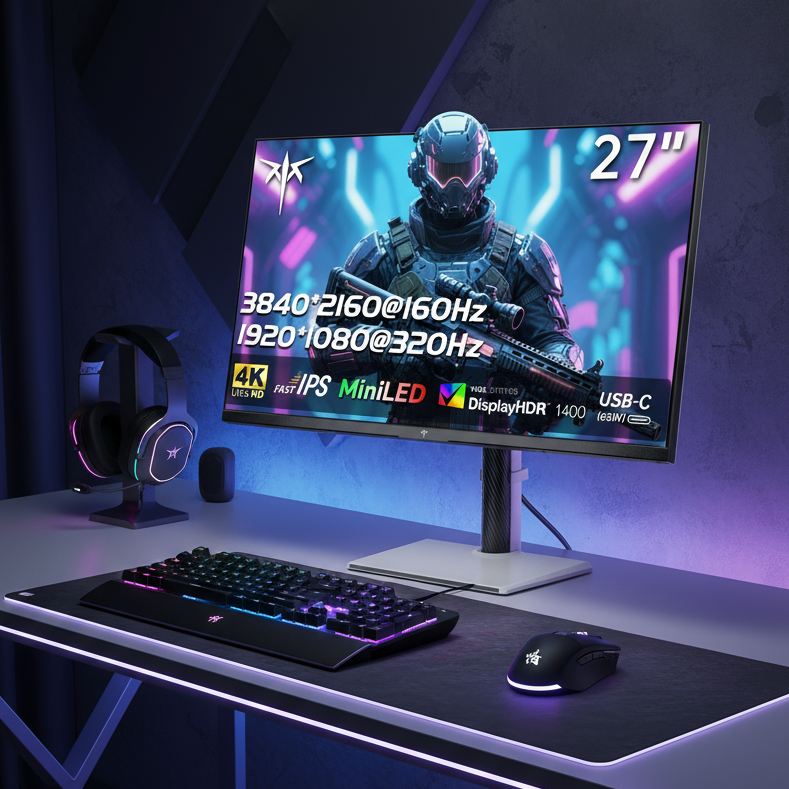
Choosing between technologies depends on your dominant workflow and environment. A 2026 RGB-stripe or V-Stripe OLED delivers excellent contrast and deep blacks that benefit dark-mode coding and media consumption, but it carries burn-in risk during long static UI sessions. Mini-LED panels, such as the KTC M27P6, offer high brightness, strong local dimming, and zero burn-in worry—making them safer for bright offices with heavy spreadsheet or document work.
For pure text precision, the KTC H27P3 5K IPS monitor remains the gold standard at 218 PPI. Its density eliminates almost all fringing without any layout concerns. Hybrid users in darker rooms who value contrast often prefer the latest OLEDs once density clears 140 PPI. Bright-room, all-day productivity users usually find Mini-LED or high-PPI IPS a better long-term fit. The decision ultimately turns on whether your setup prioritizes contrast and color pop or absolute sharpness and zero maintenance risk.
The 2026 Productivity Buyer’s Checklist
Use this practical sequence before purchasing:
- Verify panel layout — Confirm the monitor uses 2026 V-Stripe or vertical RGB stripe rather than legacy triangular or RWBG designs. Manufacturer specs or recent reviews usually disclose this.
- Check pixel density — Target at least 140 PPI (32-inch 4K or equivalent). Avoid 27-inch 1440p OLEDs for primary productivity screens.
- Assess your environment and hours — Bright offices with 8+ hours of static text favor Mini-LED or IPS to reduce burn-in risk and maintain readability. Darker hybrid gaming-plus-work setups can safely use qualified 2026 OLEDs.
- Audit software needs — If buying an older OLED, test PureType or equivalent tools first. For new 2026 panels, this step is usually unnecessary.
- Consider vision and tolerance — If you have excellent visual acuity, lean toward higher-density options even if the chart suggests a panel is “acceptable.”
Following these steps helps avoid the common regret of discovering fringing only after weeks of daily use. For developers and writers, the combination of proper layout and sufficient PPI has finally moved OLED from a gaming-only choice into a viable productivity option in 2026.
FAQs
Can software completely fix text fringing on older OLED monitors?
No. Tools such as PureType improve rendering by remapping subpixels, but they cannot overcome the physical geometry of low-PPI panels or layouts that fundamentally conflict with ClearType. They serve as a useful bridge for legacy hardware yet add overhead and cannot match the native clarity of 2026 vertical-stripe panels at adequate density.
Is 27-inch 1440p OLED usable for coding in 2026?
It is generally not recommended as a primary productivity monitor. At approximately 109 PPI, even the improved 2026 layouts leave fringing visible on thin fonts and syntax highlighting during long sessions. Reserve these models for gaming or secondary displays.
What PPI level makes OLED text artifacts invisible for most users?
Around 140 PPI, typical of a 32-inch 4K panel, is the practical threshold where artifacts become negligible at standard desk distances for typical vision. Users with 20/15 eyesight may still notice minor issues, so 5K or higher remains preferable for the most demanding typography work.
How do V-Stripe and vertical RGB layouts improve text clarity?
They align subpixels in straight vertical columns that match Windows ClearType’s rendering assumptions. This eliminates the color bleed caused by older triangular or offset layouts, producing cleaner character edges and more stable gridlines without relying on software compensation.
Should I choose OLED or Mini-LED for a mixed gaming and office setup?
Choose 2026 OLED with at least 140 PPI and proper stripe layout if your room is controlled and you value contrast and deep blacks. Opt for Mini-LED, such as KTC’s M27P6, when bright ambient light, long static UI hours, or burn-in concerns dominate. Test both where possible.
Does macOS handle OLED text fringing better than Windows?
Yes. macOS font-smoothing algorithms are less dependent on exact subpixel alignment, so users on Apple systems often experience fewer visible artifacts even on older layouts. Windows users benefit more from the 2026 hardware improvements.