


Colors change at different brightness levels because your display, your eyes, and your room all respond differently as luminance rises or falls. The biggest drivers are gamma behavior, backlight or pixel control, ambient light, panel type, and calibration.
Does your game look rich at night, washed out in the afternoon, then strangely green or pink when you dim the screen for late work? A simple brightness, gamma, and room-light check can make the same monitor look more consistent before you spend money on a replacement. Here is how to diagnose the shift and set your display for gaming, office work, portable use, or color-sensitive editing.
The Core Reason: Brightness Changes Perception, Not Just Light Output
Brightness is not just a “more or less light” slider. A display’s brightness setting changes the amount of light coming from the screen, and monitor brightness in nits is commonly used to compare that output across displays. But your eye does not perceive every brightness step equally, so midtones, shadows, and saturated colors can appear to shift even when the actual image file has not changed.
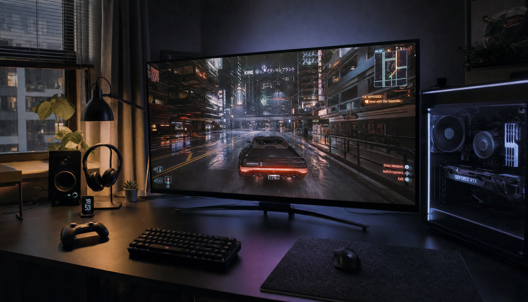
A practical example is a gray website background. At high brightness in a bright room, that gray may look clean and neutral. At low brightness in a dark room, the same gray can look warmer, duller, or tinted because small differences in red, green, and blue output become easier to notice. This is especially obvious on blank documents, code editors, spreadsheet grids, and game menus with large dark-gray panels.
Brightness also affects perceived contrast. When you raise brightness too far in a dim room, blacks can look lifted and colors can feel flat. When you lower brightness too much in a bright room, shadow detail can disappear and colors lose energy. That is why a monitor that seems accurate at 10:00 PM may look underpowered next to a sunny window at 2:00 PM.
Gamma Is the Hidden Curve Behind the Shift
Gamma controls how a display maps digital brightness values into visible tones between black and white. It is different from brightness and contrast: brightness mostly changes the black level, contrast affects the white level, and gamma shapes the middle of the image.

For everyday SDR use, gamma 2.2 is a common baseline for desktop work, web content, productivity apps, and most general monitor use. If gamma is too low, midtones can look pale and washed out. If gamma is too high, the image may look punchy, but dark game areas and shadow detail can become crushed.
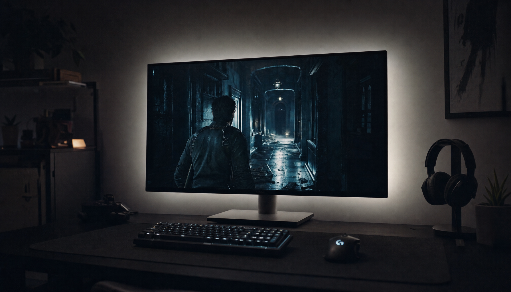
For a real-world check, open a dark game scene or a grayscale test image. Set the monitor to a standard, sRGB, creator, or custom mode, then adjust brightness for your room before touching gamma. If you change gamma first, you may solve one scene and make everything else worse: readable documents become too harsh, videos lose shadow detail, or product photos no longer match other screens.
OLED, LCD, IPS, VA, and Mini-LED Behave Differently
Panel technology matters because displays do not all create brightness the same way. Traditional LCD and LED monitors rely on a backlight shining through liquid crystal layers, while LED monitors are technically LED-backlit LCD monitors. OLED pixels emit their own light, so low-brightness behavior depends more directly on how each red, green, and blue subpixel is driven.

That difference explains why some OLED monitors look spectacular at normal brightness but show a slight tint in dark grays when heavily dimmed. A screen can appear neutral at a comfortable daytime level, then lean green, pink, or blue at very low brightness because the subpixels are not responding identically. This does not always mean the panel is defective. Mild tint at extremely low brightness is common; obvious tint during normal desktop use, strong vertical patches, or uneven gray backgrounds are more concerning.
IPS panels tend to be more stable from different viewing angles, making them a reliable choice for office productivity and creative review. VA panels often deliver stronger contrast, which helps movies and immersive games, but they can lose some shadow clarity under glare or off-axis viewing. OLED delivers true blacks and fast response, while IPS remains a practical choice for long static workdays because IPS panels are less prone to burn-in.
Panel Type |
Why Color May Shift With Brightness |
Best Fit |
IPS |
Usually stable, but factory presets and backlight level still affect white balance and gray tone |
Office work, editing, mixed use |
VA |
Strong contrast, but shadows can look different in glare or from an angle |
Media, immersive gaming, general productivity |
OLED |
Low-gray tint can appear at dim settings because pixels emit their own light |
Premium gaming, HDR, deep blacks |
Mini-LED LCD |
Local dimming can change perceived contrast depending on scene brightness |
Bright rooms, HDR, work-and-play setups |
Ambient Light Can Make the Same Setting Look Wrong
Room lighting is often blamed last, but it should be checked first. Ambient lighting can make the same monitor appear warmer, cooler, flatter, brighter, or more saturated even when the display settings are untouched. A warm desk lamp can make whites look creamy. A bright window can weaken black depth. Mixed bulbs can make neutral grays feel inconsistent from one hour to the next.

For long work sessions, eye-fatigue guidance often recommends matching display brightness to the room rather than leaving factory defaults in place, and display brightness should be adjusted for the surrounding lighting. A simple field test works well: hold a sheet of white copy paper near the monitor under your normal room light, then adjust the screen until a white document looks similar in brightness. It is not a lab-grade calibration method, but it quickly catches screens that are far too bright at night or too dim during the day.
Portable screens are even more sensitive to this. A USB-C portable monitor may look balanced in a hotel room, washed out at a coffee shop, and too blue under office lighting. If you use one for presentations, spreadsheets, or travel editing, save separate picture modes when possible: one for dim rooms, one for bright rooms, and one neutral mode for review.
Factory Modes Often Trade Accuracy for Impact
Most monitors ship in modes designed to impress on a sales floor. High brightness, cool whites, boosted contrast, and vivid saturation make icons and games pop, but they can distort color decisions. A better-looking mode is not always a more accurate one.
Gaming presets can be useful when the goal is visibility. FPS modes often lift shadows so enemies are easier to see; movie modes may deepen contrast; racing or RPG modes may boost saturation for a stronger visual punch. The tradeoff is predictability. If you edit a product image or choose brand colors in a vivid gaming mode, the result may look dull or wrong on a calibrated display, printer, or customer’s phone.
For productivity and web work, start with sRGB, standard, creator, or custom mode. For competitive gaming, prioritize visibility and motion clarity, then accept that color accuracy is being traded for performance. For photo, video, or product review, use a calibrated reference display and treat phones or secondary screens as consumer previews.
Calibration Helps, but It Cannot Fix Everything
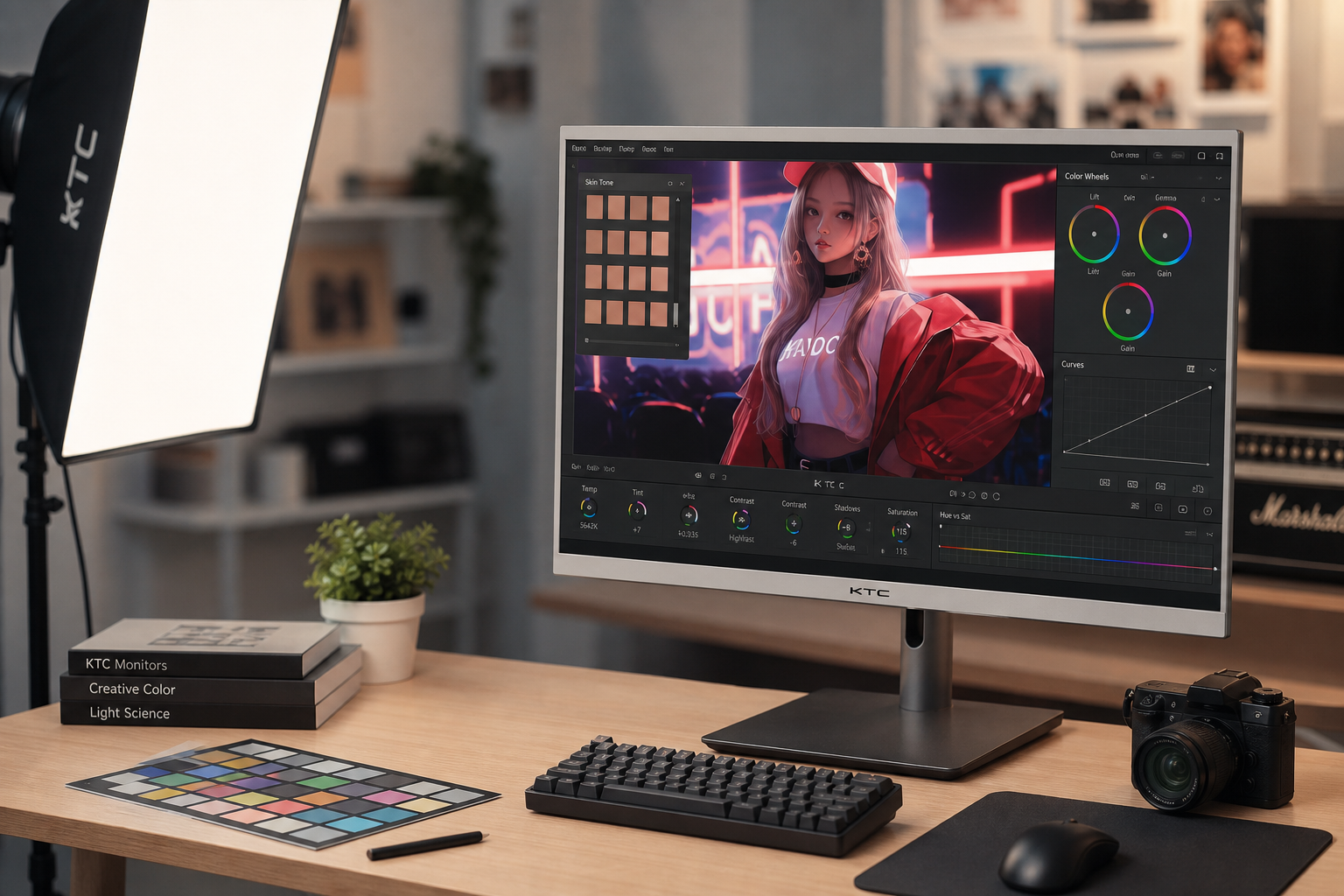
Calibration adjusts the display so white point, gamma, brightness, and color behavior move closer to a known target. Profiling describes that behavior to the operating system and color-managed apps using an ICC profile. Calibration guidance notes that ICC profiles are device-independent tools for improving consistency across monitors, printers, scanners, and other devices.
For serious color work, a hardware colorimeter is still the most reliable route. Built-in operating system tools can improve obvious issues, and phone-based calibration can help casual multi-monitor setups look more consistent, but professional editing needs repeatable measurement. Before calibrating, warm the monitor up for about 20 to 30 minutes, clean the screen, use native resolution, stabilize room lighting, and turn off aggressive dynamic contrast features.
Calibration has limits. It cannot remove direct glare, fix a poor viewing angle, erase OLED low-gray tint, or make two very different panel types match perfectly. It also cannot turn a budget office panel into a professional reference monitor. It can, however, make day-to-day work far more predictable.
Practical Setup for More Consistent Color
Start by choosing one normal working brightness, not the maximum the monitor can reach. For office work, many users are better served by a comfortable SDR level than by chasing peak HDR brightness. If the room changes during the day, use automatic brightness only if it behaves predictably. In one productivity-monitor test, a light sensor reacted poorly to video-call lighting, so manual control may still be better for color consistency.
Set the picture mode to sRGB, standard, creator, or custom. Keep contrast near the factory default unless white details are clipping. Use gamma 2.2 for general use, office tasks, web content, and most SDR games. Choose a neutral white point close to D65 when accuracy matters. Then judge the screen from your normal seated position, centered in front of the panel, because off-axis viewing can create color shifts that no menu setting will solve.
For a dual-monitor desk, match model, resolution, brightness, and picture mode where possible. Multi-monitor work can reduce window switching and keep documents, code, dashboards, or creative tools visible at once, but multiple monitors improve productivity only when the screens are comfortable and consistent enough to use all day. A mismatched side display is fine for chat or email; use the best-calibrated screen for color decisions.

When It Is a Settings Issue and When It Is a Hardware Issue
If colors shift mainly when the room lighting changes, fix the environment first. Reduce reflections, avoid direct sunlight, use diffuse lighting, and stop mixing very warm and very cool bulbs near the desk. If colors shift only in one preset, reset that mode or switch to sRGB. If dark grays tint only at extremely low brightness, especially on OLED, it may be normal panel behavior.
Hardware concern becomes more likely when tint appears at normal brightness, when one side of the screen is visibly warmer than the other, when gray backgrounds show strong patches, or when the same issue remains after testing multiple inputs and picture modes. Large monitors and ultrawides deserve extra attention because edge uniformity can be more distracting than small color-gamut differences.
FAQ
Why does my monitor look more saturated when brightness is higher?
Higher brightness can increase perceived contrast and make colors feel more vivid, especially in a bright room. It may not be more accurate; it may simply be easier for your eyes to separate colors from surrounding light.
Should I use HDR all the time?
No. HDR can improve brightness, contrast, and highlights when the content, monitor, and operating system handle it well. For everyday SDR office work, web browsing, and color review, a stable SDR mode is often more consistent.
Is a phone photo a good way to prove monitor tint?
Use your eyes first. Phone cameras can exaggerate tint, flicker, and exposure differences, so photos are useful as supporting evidence, not as the final judge.
Color consistency is a setup discipline, not just a spec-sheet victory. Control brightness, gamma, room light, and picture mode first; then decide whether the panel itself is holding you back. A reliable display should support the work or game in front of you, not make you second-guess every shade of gray.


